Column-grid poster design made neat and easy
Mark Bloom, aka Mash Creative, walks through how to create perfectly aligned typography using a column-grid system for guidance
A column-grid system is a particularly useful tool for any designer wanting to create perfectly aligned typography. It can be used in both print design projects and in your web designs, to help you achieve pixel-perfect website layouts.
As Swiss graphic designer and teacher Josef Mller-Brockmann puts it: “The grid system is an aid, not a guarantee.” It permits a number of possible uses, and each designer can look for a solution appropriate to their personal style. But one must learn how to use the grid; it is an art that requires practice.
As a general rule of thumb, the more columns you have, the greater the layout possibilities. I typically use columns vertically, but for additional layout options you can also place rows across the page horizontally, to create ‘modules’.
In this tutorial I’ll show you how to set up a column-grid structure the old-fashioned way. Of course, InDesign enables you to create columns (the quick way) with margins and gutters when you create a new document, but by mastering column-grid structures in Illustrator, you can gain a real understanding of the mathematics and principles involved in creating the perfect grid-based design.
Find out about Illustrator CS6's new tools at Creative Bloq.

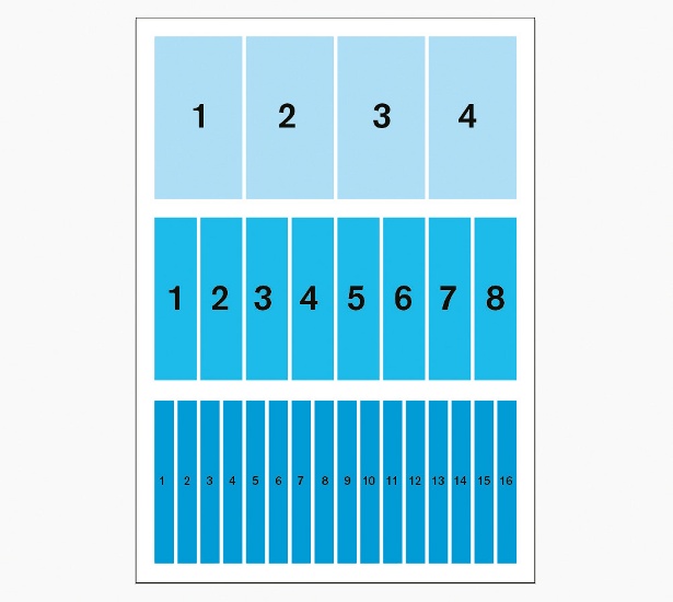
01 In Illustrator, create your document for an A2 portrait poster (mine’s 420x594mm high). Decide how many columns you want for your poster – I find that multiples of four are ideal for this (so 4, 8, 12, 16, 20 and so on). I’m going with 16 in this case, since it should give me plenty to play with. But when designing an A4 brochure or magazine, for example, it would probably be more like eight or nine columns.
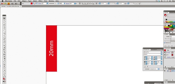
02 Decide on the size of your margins (the distance into your design from the edge of the artboard) and your gutters (the distance between the columns). I’m going for a 20mm margin on each side, with 4mm gutters. This will allow for a decent amount of ‘safe space’ between the borders and the artwork.
03 Now work out where to put your guides – to do this, take your page width (420mm) minus 40mm (the 20mm left and 20mm right margins), which equals 380mm, in this case. Now multiply your gutters. Quick hint: this will be one less than the number of your columns, so in this case 16 columns means 15 gutters. Each gutter is 4mm wide, so I’ve multiplied 4mm (gutter width) by 15 (number of gutters), which equals 60mm.
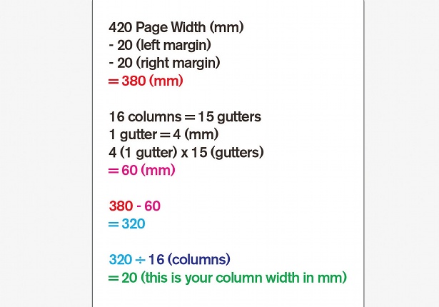
04 To work out your column width, take your gutter width total (in this case, 60) away from your artboard width, excluding margins (380, here) – so 380 minus 60 leaves us with 320. Divide this value by the number of columns (16) and you’ll get your individual column width (20mm). If you’re bad at maths, like me, use a calculator for this.
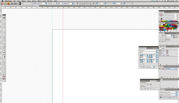
05 Show your rulers (View>Show Rulers) to help you measure, and drag a vertical guide onto the artboard. Using the X co-ordinates, set your first guide to zero. Repeat this again to 20mm (your left margin). Remember that you’ll need to make sure your guides are unlocked (View>Guides>Lock Guides) at this stage.
Sign up to Creative Bloq's daily newsletter, which brings you the latest news and inspiration from the worlds of art, design and technology.
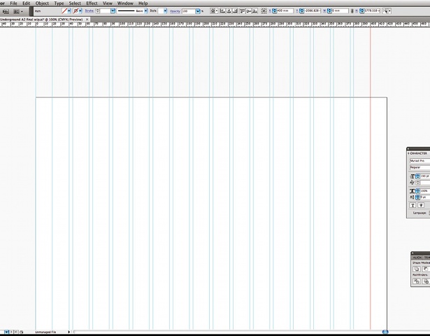
06 Continue setting guides at 40mm (first column), 44mm (first gutter), 64mm (second column), 68mm (second gutter), and so on. Your penultimate guide should be set at 400mm and your last at 420mm. You can repeat this process horizontally, if required, using the Y co-ordinates to create ‘modules’.
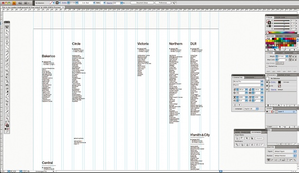
07 The first step to designing your poster is gathering content and pasting it into individual text boxes. In this case I’m designing a poster using the London Underground tube lines as the subject, and I found all of the information I required online. Copy and paste your text into separate text boxes – I’m using the name of the tube line and each of its stations – and loosely start laying out the content.

The Creative Bloq team is made up of a group of art and design enthusiasts, and has changed and evolved since Creative Bloq began back in 2012. The current website team consists of eight full-time members of staff: Editor Georgia Coggan, Deputy Editor Rosie Hilder, Ecommerce Editor Beren Neale, Senior News Editor Daniel Piper, Editor, Digital Art and 3D Ian Dean, Tech Reviews Editor Erlingur Einarsson, Ecommerce Writer Beth Nicholls and Staff Writer Natalie Fear, as well as a roster of freelancers from around the world. The ImagineFX magazine team also pitch in, ensuring that content from leading digital art publication ImagineFX is represented on Creative Bloq.
