How to make information beautiful with a neat typography trick
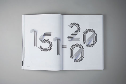
How do you make a densely packed university reference book readable, let alone beautiful? Sawdust came up with the perfect typography-based approach.
Sign up to Creative Bloq's daily newsletter, which brings you the latest news and inspiration from the worlds of art, design and technology.
You are now subscribed
Your newsletter sign-up was successful
Want to add more newsletters?
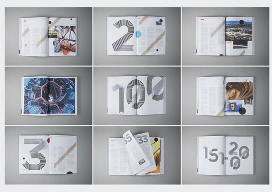
When you've got a publication packed full of information, you need to make it look nice to ensure your reader's attention. From typography to imagery and everything in-between, it's imperative to make your particular publication stand out from the rest.
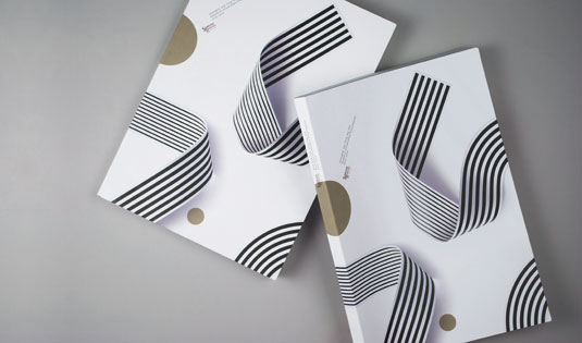
Sawdust is London-based design duo Rob Gonzalez and Jonathan Quainton. The studio was recently asked to turn an information-heavy guidebook - a list of the world’s 200 best research universities - into something more readable and aesthetically pleasing.
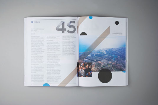
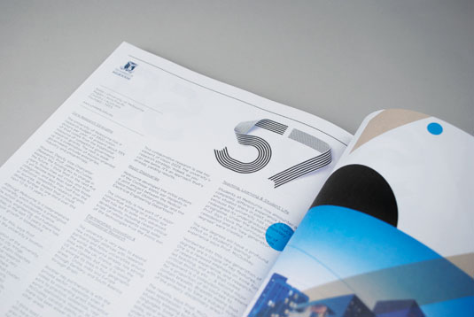
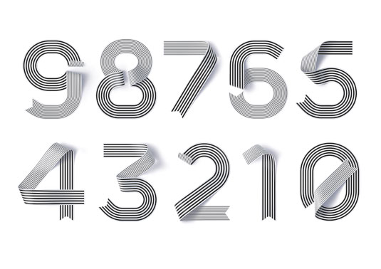
"The brief," Gonzalez recalls, "was to turn this rich but heavy content into a beautiful book that people would want to own for years to come." The result is a smart, understated piece of editorial design, tied together with ribbon-like numbers that give a nod to the cap and gown university students graduate in.
Article continues below 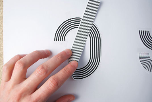

See more work from Sawdust over on their website.
Like this? Read these!
- Great examples of doodle art
- Brilliant Wordpress tutorial selection
- Free tattoo fonts for designers
Have you seen an inspiring new project? Let us know in the comments box below!
Sign up to Creative Bloq's daily newsletter, which brings you the latest news and inspiration from the worlds of art, design and technology.

The Creative Bloq team is made up of a group of art and design enthusiasts, and has changed and evolved since Creative Bloq began back in 2012. The current website team consists of eight full-time members of staff: Editor Georgia Coggan, Deputy Editor Rosie Hilder, Ecommerce Editor Beren Neale, Senior News Editor Daniel Piper, Editor, Digital Art and 3D Ian Dean, Tech Reviews Editor Erlingur Einarsson, Ecommerce Writer Beth Nicholls and Staff Writer Natalie Fear, as well as a roster of freelancers from around the world. The ImagineFX magazine team also pitch in, ensuring that content from leading digital art publication ImagineFX is represented on Creative Bloq.
