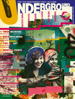
My design classic: Underground magazine
The gritty aesthetic of an 80s music publication strikes a harmoniously disharmonious chord with designer Michael C Place
Sign up to Creative Bloq's daily newsletter, which brings you the latest news and inspiration from the worlds of art, design and technology.
You are now subscribed
Your newsletter sign-up was successful
Want to add more newsletters?
Originality is difficult to achieve. You can design something that you’re really pleased with because it’s fresh and new, then a few months later you’re looking through a design book from the 60s or 70s and you’ll see something similar done decades ago. Maybe it stuck in your head subconsciously. I avoid being influenced by what’s going on out there by slavishly consuming design books. However if I had to pick a design classic it would be Underground magazine, designed in the late 80s by a guy called Rod Clark. When I was at college in York, I bought every issue when it came out.

It’s incredible stuff, a bit like 8vo’s work crossed with a fanzine. It just struck a massive chord with me. It’s really quite gritty, but then almost Swiss too. I think they call it Swiss Punk.
Underground was printed on newsprint, mainly mono, with lurid spot colours in certain sections, and four-colour covers. It had all the passion of a fanzine, cramming an incredible amount into its pasted up spreads – interviews, record and gig reviews, features… All those eclectic 80s bands were in there, from The Jesus and Mary Chain and Gaye Bykers on Acid to Throwing Muses and Voice of the Beehive. Sometimes it carried a coloured flexi disk
The design is all about not being precious. As much as I admire the likes of 8vo, I much prefer a bastard version of something. Rather than something being pure, it’s a mix. There’s a bit of ugliness, or something that’s not quite right. I much prefer putting something that really clashes in there – disharmony for me is really harmonious.
It’s a real nice DIY aesthetic, but it’s just done in such an odd way that I think it made me think about things in a different way. You look at Underground and it’s not sterile. I think that there’s this real, pretty graphic design out there, but it’s just sterile. It has no soul or character.
Learn how to print a poster: the designer's guide, over at Creative Bloq.
Article continues belowSign up to Creative Bloq's daily newsletter, which brings you the latest news and inspiration from the worlds of art, design and technology.

The Creative Bloq team is made up of a group of art and design enthusiasts, and has changed and evolved since Creative Bloq began back in 2012. The current website team consists of eight full-time members of staff: Editor Georgia Coggan, Deputy Editor Rosie Hilder, Ecommerce Editor Beren Neale, Senior News Editor Daniel Piper, Editor, Digital Art and 3D Ian Dean, Tech Reviews Editor Erlingur Einarsson, Ecommerce Writer Beth Nicholls and Staff Writer Natalie Fear, as well as a roster of freelancers from around the world. The ImagineFX magazine team also pitch in, ensuring that content from leading digital art publication ImagineFX is represented on Creative Bloq.
