The secrets behind new tablet's scalable icons
We reveal how design studio Someone created scalable icons for Tesco's new Hudl family tablet.
Design agency Someone was brought in to work on the branding and design work for the Hudl, a new tablet launched by UK-based shopping giant Tesco. As well as advertising, UI, brand communications and point of sale, this also covered the wider Hudl world - encompassing accessories and other ways to personalise Tesco's device.
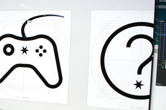
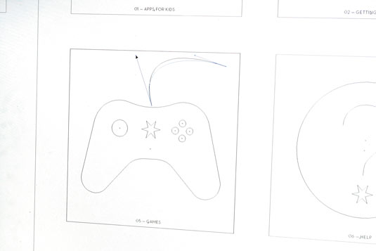
"Using Android's existing assets as a starting block," says design director Karl Randall, "we redrew each icon, aiming for functional delicacy: make the keylines too thin and they would disappear altogether at smaller sizes, while bulky strokes and blocky areas of colour would not make for elegant illustrations.
"Following constructive rounds of client feedback, screen and size testing, we came up with a set of working outlines," he continues. "We then began incorporating the 'brand world', based on a solar system metaphor, into our designs. We decided the shooting star from the Hudl logo would serve as an elegant link between the two."
Article continues below 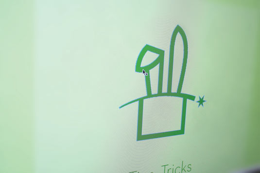
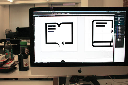
"Our final collection features 17 distinct icons that - we hope - seamlessly incorporate both the elegance of Hudl's brand language and the more functional language required for legibility and clarity at mid-sizes."
For an overview of how Someone created the branding for the Hudl tablet as a whole, read this article.
This article originally appeared in Computer Arts issue 221.
Liked this? Read these!
- The designer's guide to working from home
- Create a perfect mood board with these pro tips
- The ultimate guide to logo design
Sign up to Creative Bloq's daily newsletter, which brings you the latest news and inspiration from the worlds of art, design and technology.

The Creative Bloq team is made up of a group of art and design enthusiasts, and has changed and evolved since Creative Bloq began back in 2012. The current website team consists of eight full-time members of staff: Editor Georgia Coggan, Deputy Editor Rosie Hilder, Ecommerce Editor Beren Neale, Senior News Editor Daniel Piper, Editor, Digital Art and 3D Ian Dean, Tech Reviews Editor Erlingur Einarsson, Ecommerce Writer Beth Nicholls and Staff Writer Natalie Fear, as well as a roster of freelancers from around the world. The ImagineFX magazine team also pitch in, ensuring that content from leading digital art publication ImagineFX is represented on Creative Bloq.
