Vibrant posters mix airbrushed illustrations and loud typography
Tasked with updating the collateral for club night Good Block, Bunker London experimented with airbrushing and loud typography to reflect the party’s vibrant locale.
Sign up to Creative Bloq's daily newsletter, which brings you the latest news and inspiration from the worlds of art, design and technology.
You are now subscribed
Your newsletter sign-up was successful
Want to add more newsletters?
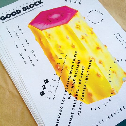
Good Block is focused around African music, left-field Disco, Boogie, and Jamaican music too, mainly from the early '80s. The vibe is fun, eclectic and sometimes strange – it can get a bit abstract and Balearic sometimes. Our main venue is Ridley Road Market Bar in Dalston but we also play in Peckham and other venues.
We wanted the new artwork to reflect the market and Peckham High Street, so it had to have an African feel. Previously I'd got a bit sick of designing flyers and was just scanning in old record covers and changing the colours, but Paul [Kelly] had started learning airbrushing about a year before and suggested we use it to change up Good Block.
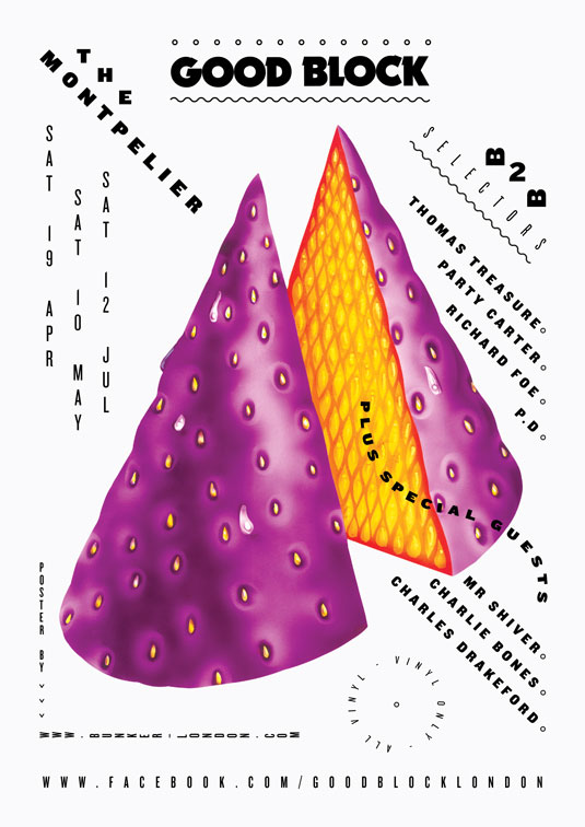
The illustration needed to be bold and colourful so that it would stand out either in shop windows or online. The heyday of airbrushing was the late '70s and early '80s so we really liked how the concept linked in with the night. The type needed to follow suit, so it had to be loud but not overboard. It was important to make the dates and venue clear as well as promoting the line-up, the free entry and the fact that the DJs only play vinyl.
Article continues belowProject evolution
Richard Grainger of Bunker London sets out the stages that led them to the final poster for Good Block club nights.
01. Gathering inspiration
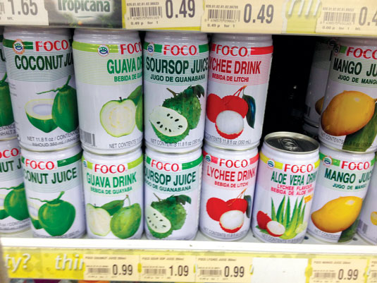
Paul spotted some juice cans in the corner shop with airbrushed illustrations. He liked how inviting and hyperreal they looked and that they worked well as a series. We wanted to make use of his airbrushing skills and reflect the area's exotic flavours, so we came up with the idea of inventing make-believe fruits.
02. Initial sketching
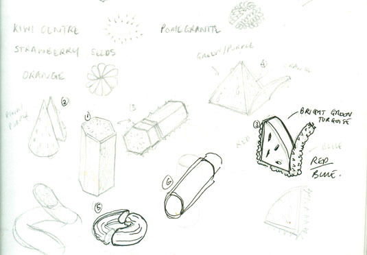
Good Block's name and vibe leant itself to mathematical shapes with an iconic '80s style like the prism and cylinder. Once we'd sketched several that we liked and worked well together, Paul and I figured out ways to divide up each shape so that we could reveal the inside of the fruit to add more texture and colour.
03. Airbrush approach
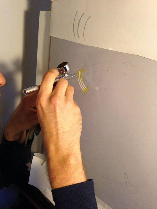
Paul wanted make-believe fruits to look edible so he referenced natural fruits but inverted the colours. After sketching the image on paper, he laid the frisket film over it and cut the shape out, masking off the rest of the page to stop overspray. He then built up shadows and texture using the airbrush and hand stencils.
Sign up to Creative Bloq's daily newsletter, which brings you the latest news and inspiration from the worlds of art, design and technology.
04. Touching up
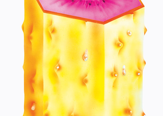
We took the artwork to a shop with an A3 scanner. Once we had the files, I tweaked the contrast and used Airbrush in Photoshop to touch them up. I got rid of dust from the scan and any overspray, and added detail, I increased the History States to 60 so I could go back far and placed the cut-out on a light-grey background.
05. Adding the type
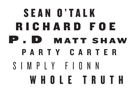
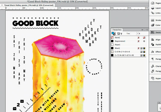
We wanted a font that wasn't over the top and had varying weights, so Knockout came to mind. I always use Fontbook and test out real text so you know it will work. In InDesign I played with how the type could sit, coming up with rules like how certain information was always in circles and the date was always vertical.
06. Final checks
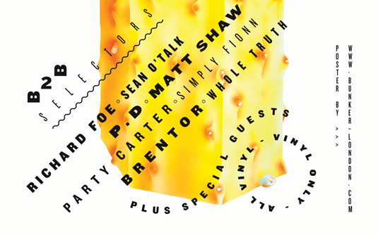
I made sure that the logo and all the type was in true black (C-75 M-68 Y-67 K-90) rather than 100% black as it can come out slightly grey. It was essential to check all the dates and information. We used a local printers and just asked for the cheapest paper, which was Xerox 170g gloss. It's actually pretty good print quality.
07. Making visuals
At the last minute, we decided to transform Paul's illustrations into live visuals for a charity night at Ace Hotel. Jim (English) imported the scans into Premier, rotating the fruits to make psychadelic geometric patterns. He then explored Premier's blend modes to merge and overlap different layers of the footage.
Words: Richard Grainger and Paul Kelly
This article originally appeared in Computer Arts issue 231.

The Creative Bloq team is made up of a group of art and design enthusiasts, and has changed and evolved since Creative Bloq began back in 2012. The current website team consists of eight full-time members of staff: Editor Georgia Coggan, Deputy Editor Rosie Hilder, Ecommerce Editor Beren Neale, Senior News Editor Daniel Piper, Editor, Digital Art and 3D Ian Dean, Tech Reviews Editor Erlingur Einarsson, Ecommerce Writer Beth Nicholls and Staff Writer Natalie Fear, as well as a roster of freelancers from around the world. The ImagineFX magazine team also pitch in, ensuring that content from leading digital art publication ImagineFX is represented on Creative Bloq.
