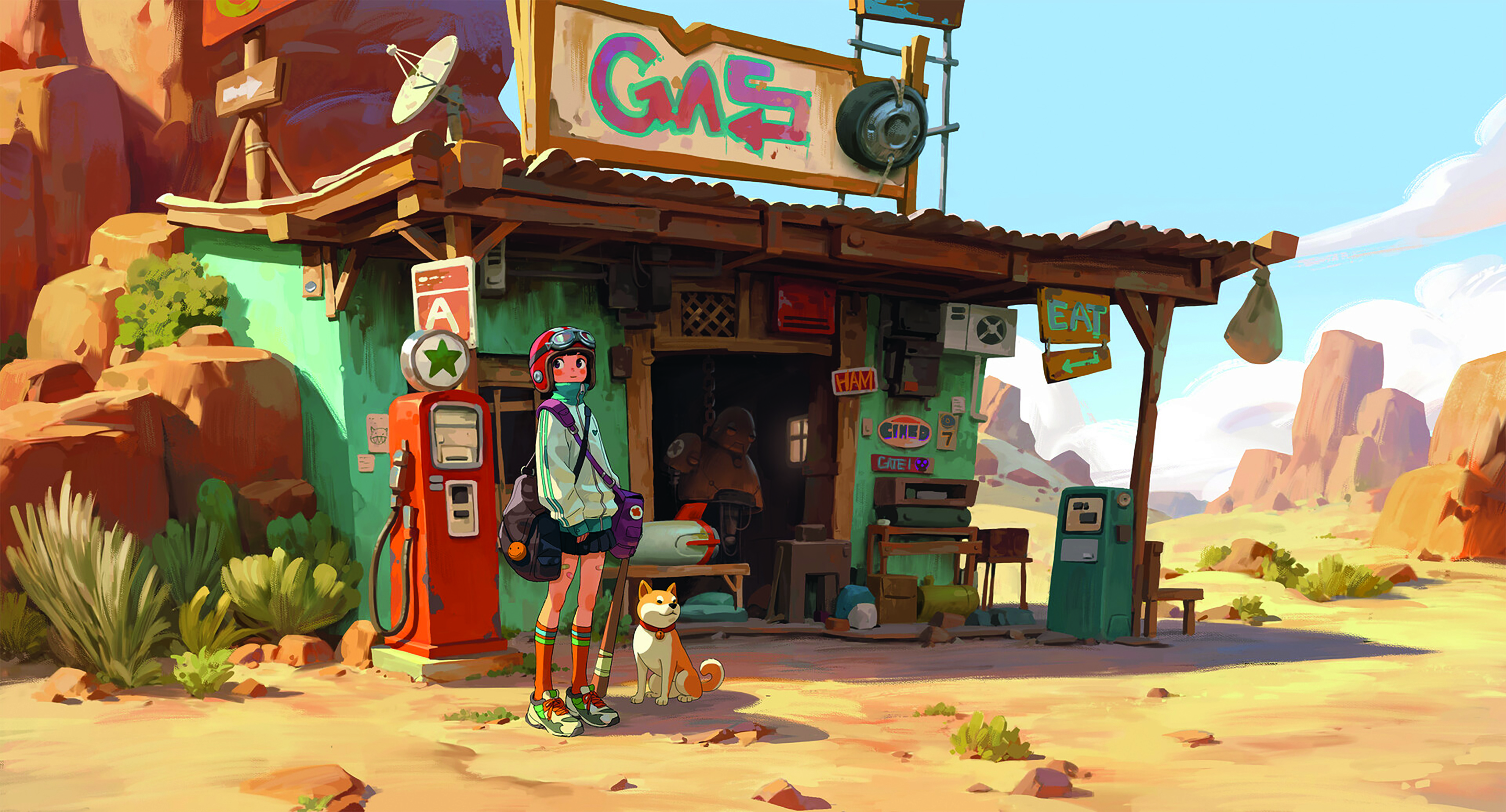
How to create positive emotion using colour and light
Mark Molnar's tips will ensure your digital painting has a bright and joyous feel to it.
Sign up to Creative Bloq's daily newsletter, which brings you the latest news and inspiration from the worlds of art, design and technology.
You are now subscribed
Your newsletter sign-up was successful
Want to add more newsletters?
One person's definition of happiness will differ from another, but generally speaking saturated colours are usually considered more cheerful in both Western and Eastern societies – just look at traditional cultural festivals where people dress up in colourful costumes.
Bright and saturated colours have always been the symbol of celebration – think about the carnivals in Rio or Venice, the Holi Festival of Colours in India and Nepal, or the celebration costumes worn by tribal societies, which differ greatly to their everyday clothing.
We can also apply modern theories of psychology to suitable colour schemes. Warm colours are usually considered more inviting, and within the warms the oranges and yellows are the most commonly positive colours.
This probably comes from the warm light of the sun and fire – an association that can be found on the subconscious of every human being. These colours are also associated with royalty, nobility and wealth in most cultures.
As well as choosing the right colour scheme we can also adjust the value range of the image. Although we can't apply this to every situation, creating a high-key image can help to achieve a brighter mood in the scene.
To explain, a high-key image is one in which the lighter values dominate the composition. The middle values and darks are only there to balance out the image and to give the viewer a point of comparison.
01. Pastel values
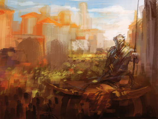
I block in the composition, in which I've already established the colour scheme. I want to depict a sunny day or morning scene, so I use various saturated yellows and oranges.
Sign up to Creative Bloq's daily newsletter, which brings you the latest news and inspiration from the worlds of art, design and technology.
I try to keep the image more high key, but also add some dark values in the foreground to balance them out and to enhance the perspective.
02. Aggressive reds
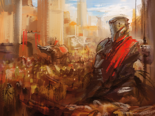
I change the composition slightly by adding taller buildings over on the left-hand side.
I also bring the main knight closer to the camera, which creates more depth to the image. I then introduce more aggressive-looking, bright reds to the image, to suggest that we're seeing a marching army.
03. Make it snap
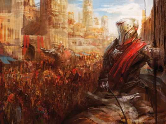
To achieve more visual noise I apply photo textures. I then further define the background and introduce more contrasting colours to the crowd and to some parts of the background.
Because I want to achieve a rougher finish, the final step is to define the major shapes and edges, and carry out some colour tweaks.
04. The old switcheroo
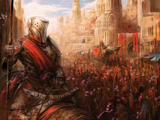
I want to convey the carnival atmosphere of a victorious army, so I place the whole image in an almost monochromatic yellow-orange tone with added patches of light blues for more contrast and some saturated reds to show a bit of aggression of the soldiers.
Flipping the can be a great way to make sure you've got your composition right, but sometimes it works to bring your painting alive towards the end of the process.
This article originally appeared in ImagineFX magazine.
Like this? Read these!
- Ray Harryhausen's sketchbook unearthed
- How to paint pinched flesh in 4 steps
- Top tips for creating convincing eyes

Mark is a concept artist / art director specialised on the visual development, pre-production design and project art direction of film, animation and game projects. His past clients include Lucasfilm, Time Warner, Weta Workshop, Eidos, Applibot and Fantasy Flight Games.
