15 concept art skills to power up your illustration
Discover how concept art techniques can be applied to a standalone illustration, for great-looking artwork.
Sign up to Creative Bloq's daily newsletter, which brings you the latest news and inspiration from the worlds of art, design and technology.
You are now subscribed
Your newsletter sign-up was successful
Want to add more newsletters?
My formal training was in illustration, but I’d already spent a decade as a kid scouring books like the Art of Star Wars series and various other ‘movie magic’ publications, which became my informal introduction to concept art. For me, the two skills have always been integrated and equally appealing.
After many years of working with companies like EA, Sony and Microsoft, concept art and visual development techniques have become part of my instinctive way to think about and tackle any design task. For me, the process is the best way to become immersed into the world of the project. It’s how I find it easiest to get my head around all of its complexities and details. It’s also the beginning of idea formulation and imagery that will eventually follow through to the finished product.
The process [of using concept art and visual development techniques] is the best way to become immersed into the world of the project
Ross Dearsley
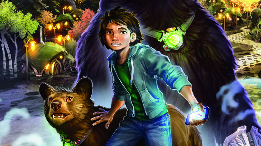
I’m currently illustrating a series of books called Secrets of Bearhaven, for Scholastic Press, where I’ve used a concept art approach to visualise the world and characters of the story in order to create covers and interior art. Scholastic’s response to my skills as a concept artist has been refreshingly encouraging and a wholly collaborative experience, which spotlights the growing transferable skills between these two domains.
Article continues below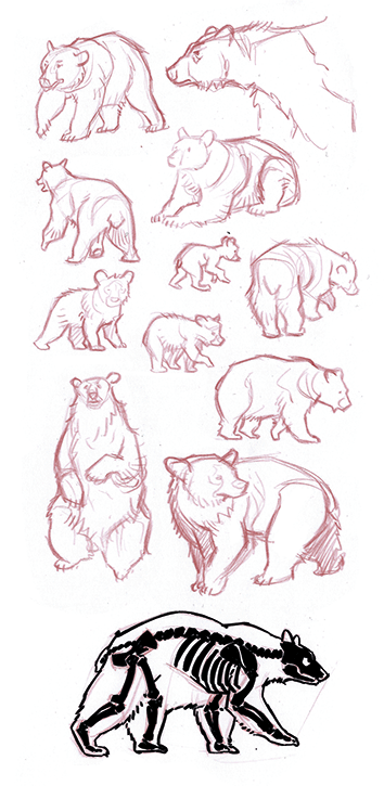
01. Sketch studies to build confidence
Often projects are under tough time constraints. It’s tempting to dive straight in and make stuff up as you go, but if possible, do preparatory sketches first. You’ll be amazed how much useful information becomes apparent through observation and sketching. For Bearhaven I became familiar with bear anatomy, and the architecture and gadgets of the world.
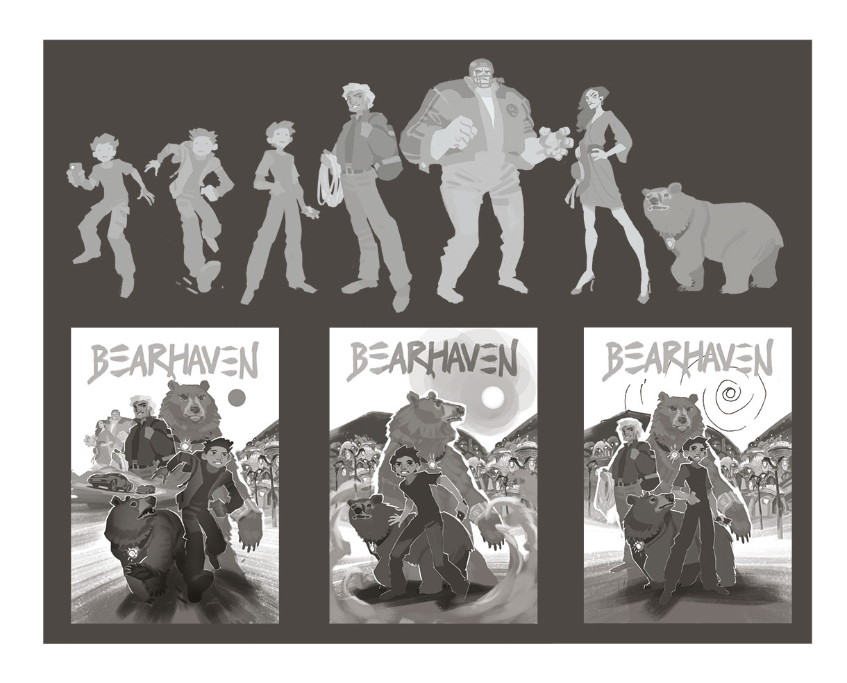
02. Use isolated layers for composition
To help make sense of complex composition tasks, create a mini-library of characters and poses on transparent layers based on your initial ideas for the piece of artwork. You can then use these like cut-outs and rearrange them into various alternate compositions. This enables you to quickly try a variety of ideas and combinations, which you can then work up into a more resolved sketch. You can create these character elements as Smart Objects in Photoshop, which retains the original resolution even if you enlarge and reduce multiple times.
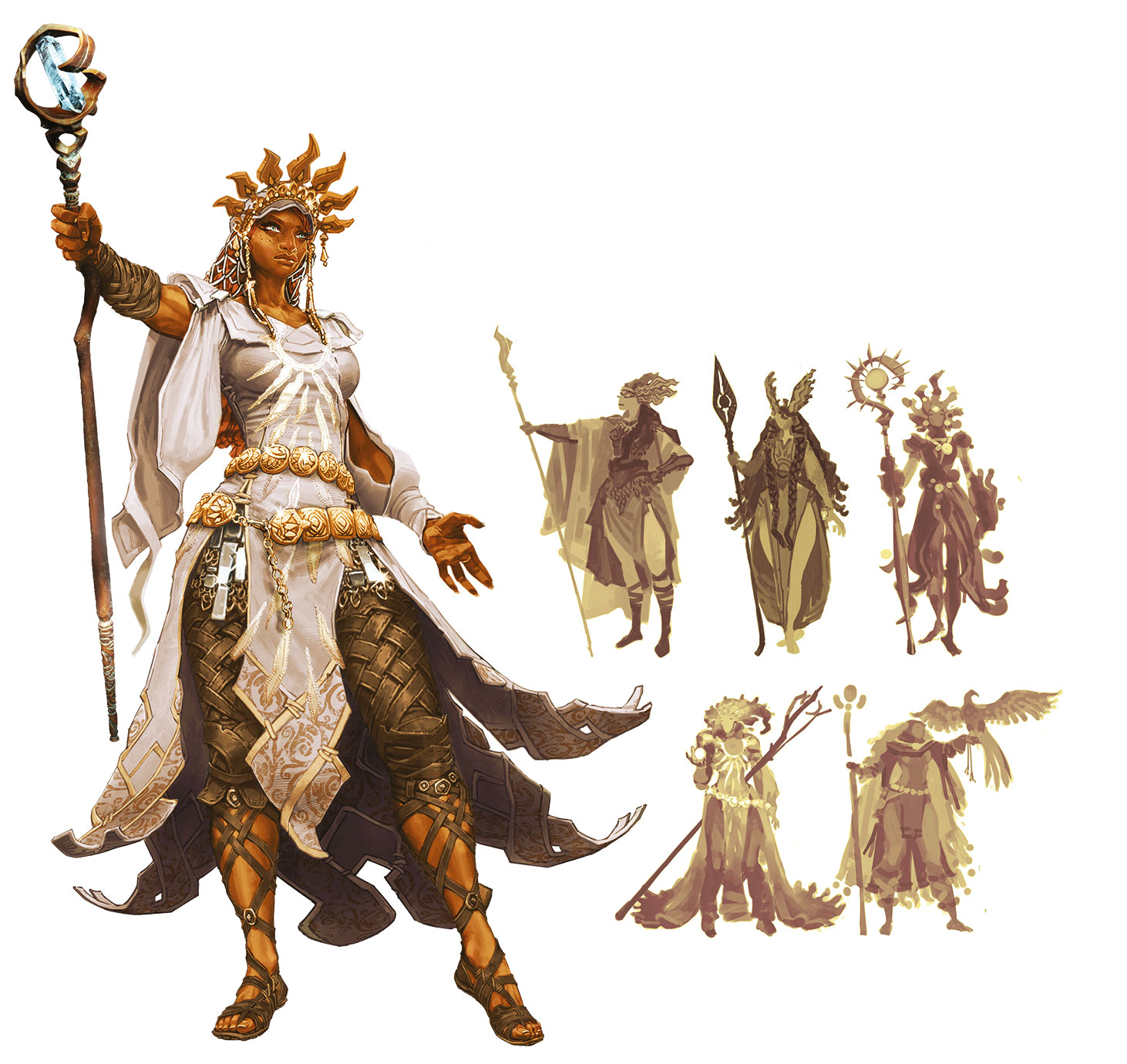
03. Begin broad, then refine
Use initial rough shape sketches to try a variety of different directions, rather than variations on the same direction. For the Fable Legends Celeste character shown here, I explored a variety of ideas to see what the team would respond to, including Valkyrie-styled characters, body type variations, staff variations, slightly more magical influence and eastern influences.
Essentially, you’re raising questions visually. Team feedback from sketches like these will hopefully create debate, and you’ll soon get a strong idea of the direction required for your next design stage. Remember that people don’t always know what they want until they see it, so it’s good to have a lot of scope in your visualisations.
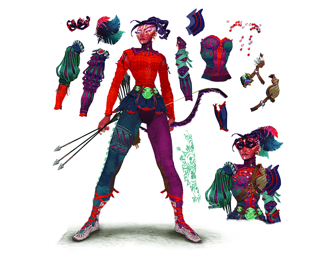
04. Generate costume variants and accessories
You could look at using different costume elements on individual layers as a way to develop an armour design. In Fable Legends we worked on multiple variant costume designs for each character, and the simplest form of this was a base costume, which would evolve into a ‘cool’ version. Simply turning your file layers on and off could generate some interesting combinations.
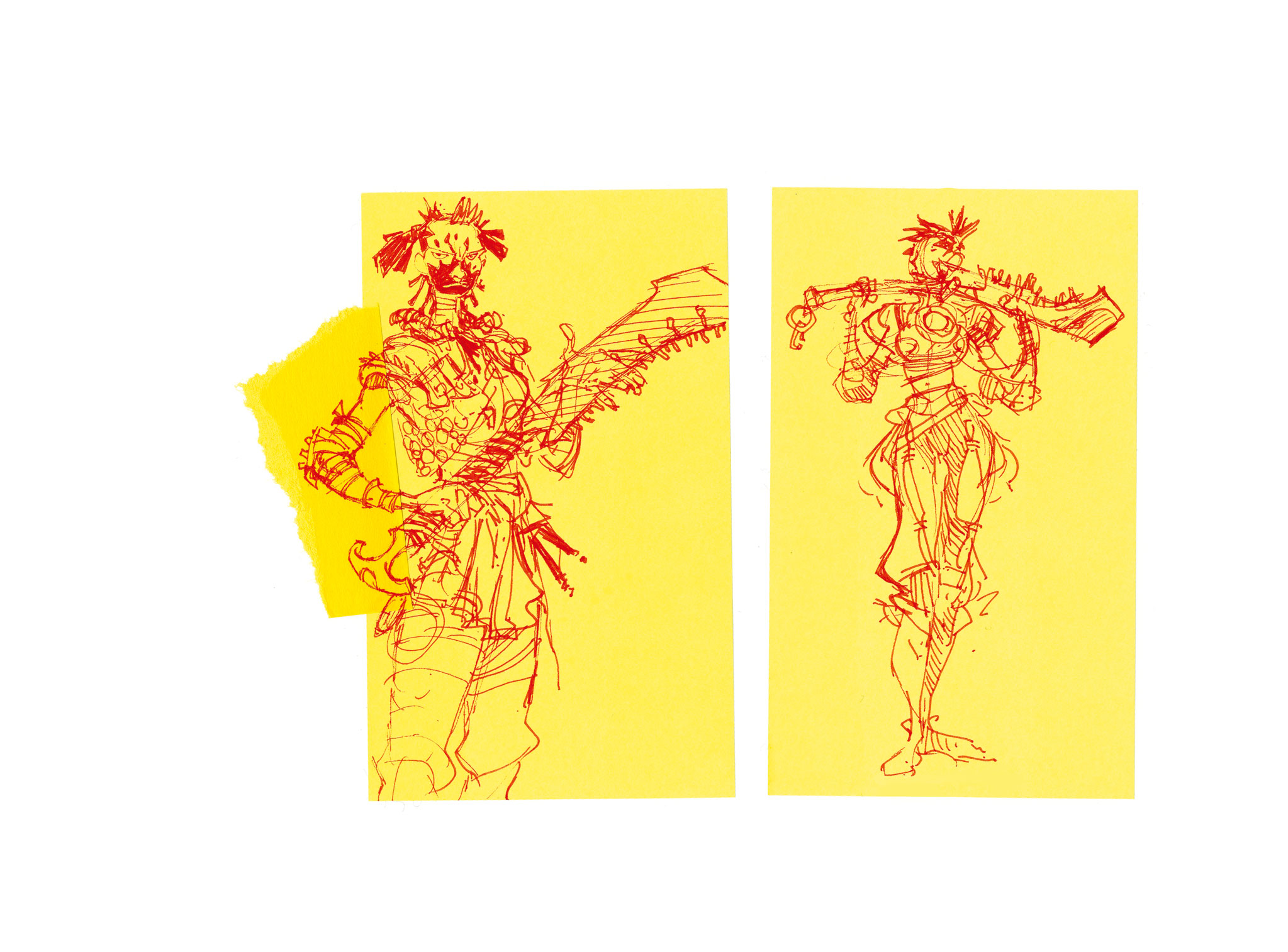
05. Sticky Notes: the new thumbnail?
Thumbnails are well established as a quick method to work out composition and the broader elements of your design, the idea being that the drawing is so small that it’s physically impossible to get hung-up on details. Sticky Notes are a great way to physically constrain your planning sketches.
They also have the added advantage that if you make a mistake, you can use the sticky edge of a clean note to add a new section for your amendments, and just tear off the excess. I often scan my Sticky Note sketches, and use them as the basis for a final digital image.
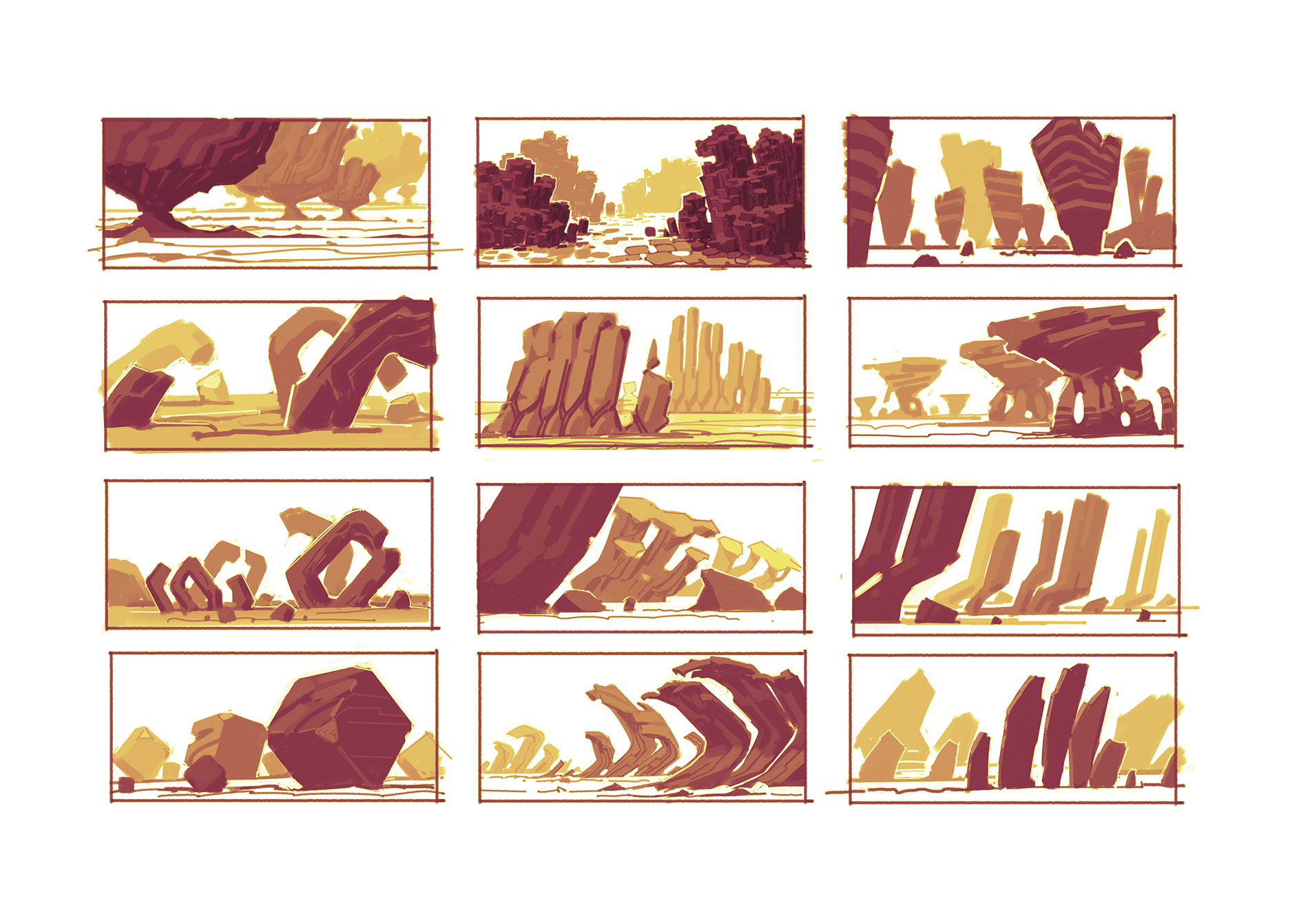
06. Reduced value range sketches
Whereas thumbnails and Sticky Note sketches constrain the size of your drawing, you can also create reduced value range sketches. These force you to visualise forms in a more simplistic way, but they also give you the ability to create tonal depth and basic lighting. These are various ideas for Martian landscape formations.
07. Recognise emerging ideas
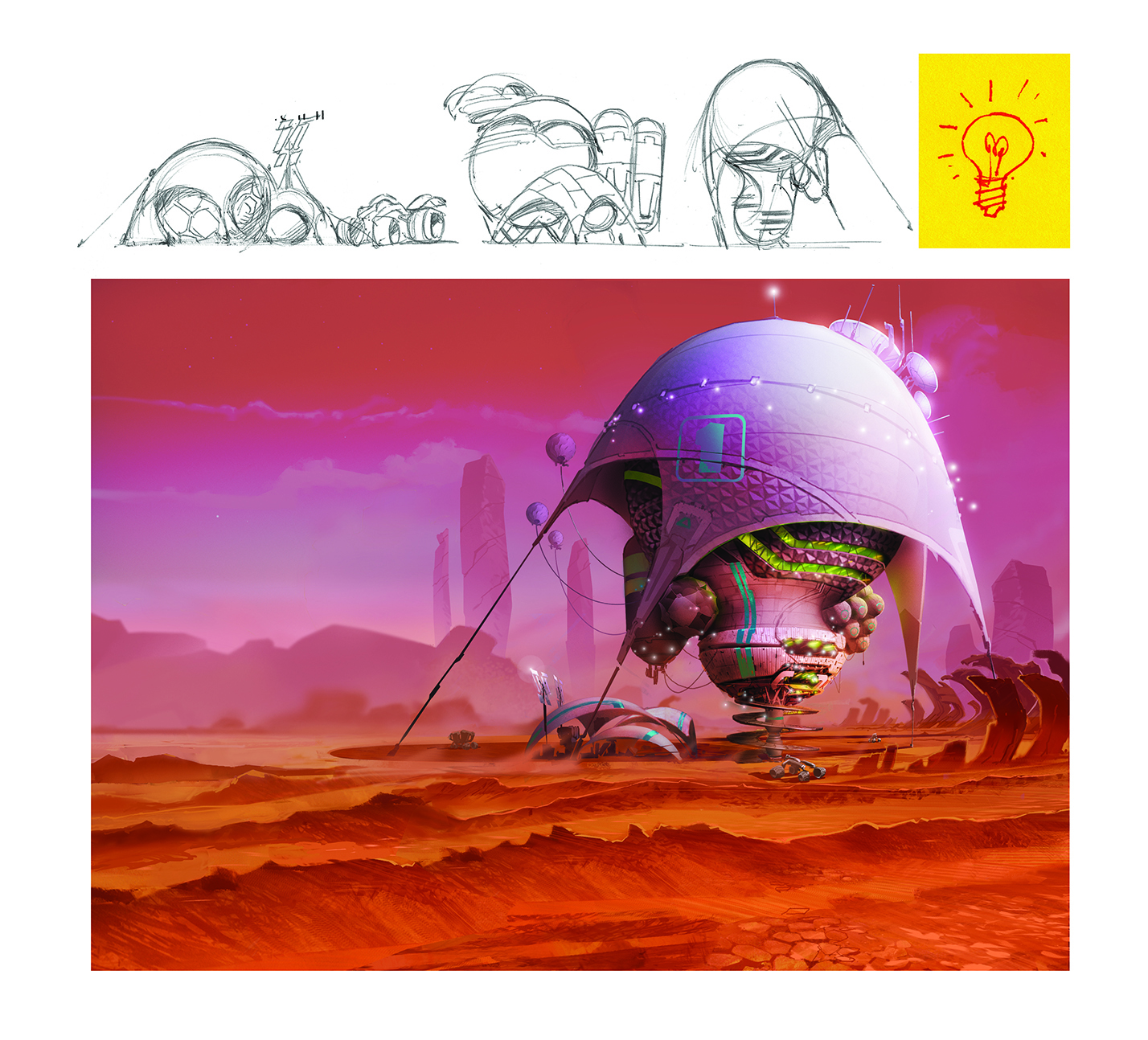
As you sketch you may have a strong idea in your head how the image should evolve. But it’s important to also be aware of ideas which might be revealed unexpectedly while sketching. This is part of the visual development design process that’s often used in the animation industry.
As I worked on the rough sketches for this surface structure I was aware that Mars only has about 38 per cent surface gravity compared to Earth, so this opens up the possibility of designing some unusual architectural ideas. I ended up with the balloon/tent idea which looked reminiscent of an Edison screw light-bulb shape, and it was this final detail that inspired the spiral access ramps at the base of the structure.
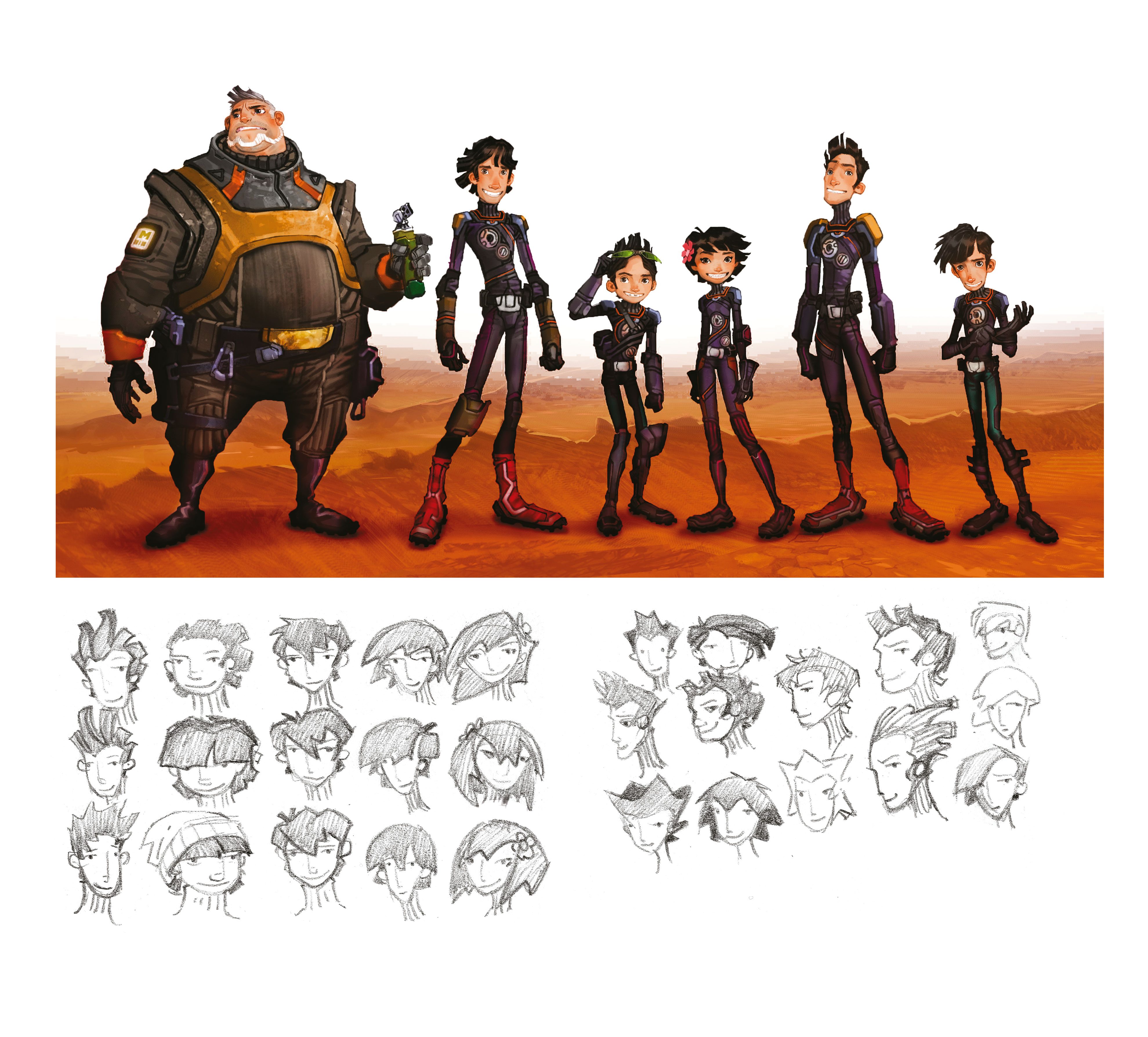
08. Contrast your cast of characters
It’s easy to get lost in the enjoyment of designing and painting a particular character, but remember to mentally step back from your project once in a while, and consider the bigger picture: how does this character compare with the others in the ‘cast’ of your project? Just like casting actors in a movie, multiple similar visual character designs will tend to dilute their impact, whereas contrasting character designs tend to enhance each other. Height, volume, pose, attitude, costume and colour are all useful tools to create contrast between characters.
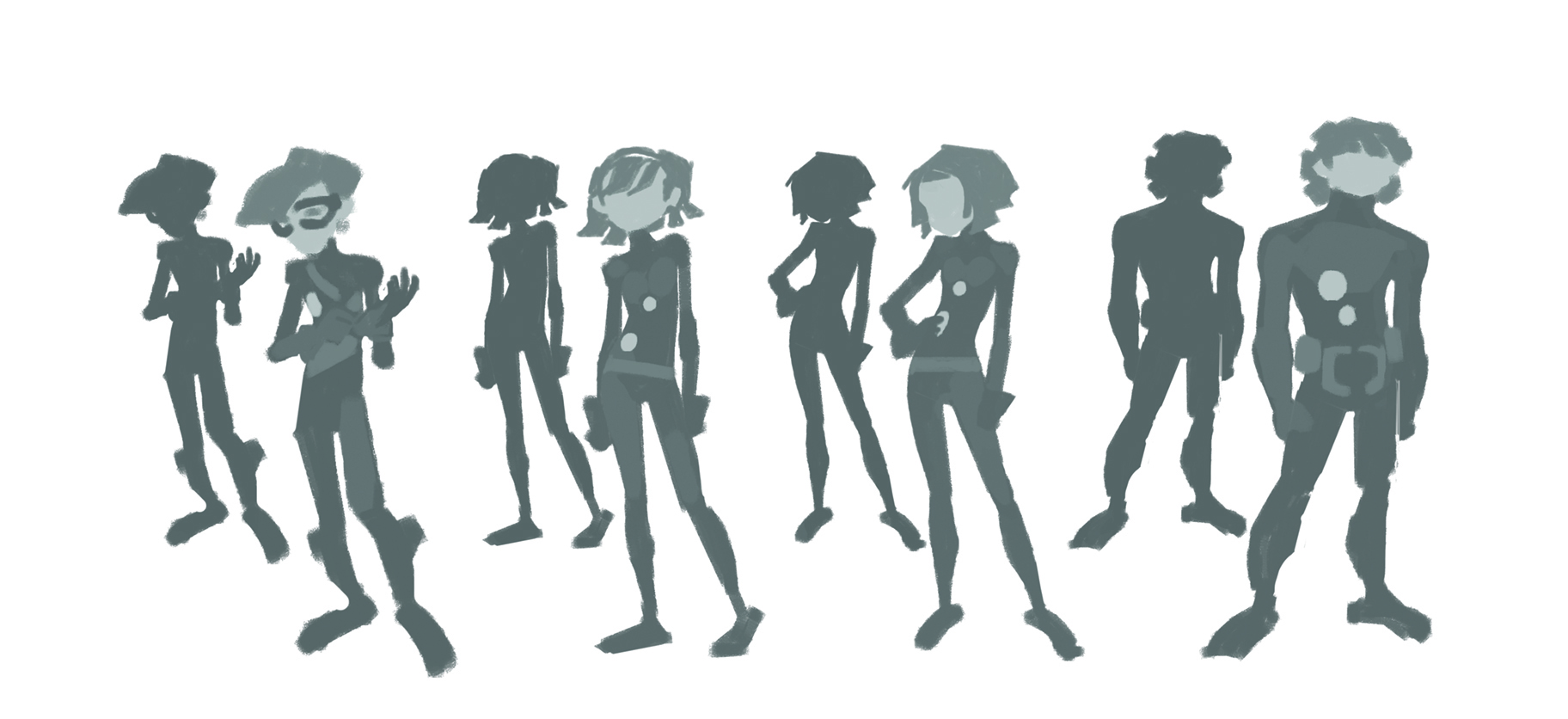
09. From silhouette to tonal details
When working on character silhouettes, orthographic views are relatively straightforward, but when it comes to a three-quarter angle or a more complex pose where limbs cross each other, it can be tempting to revert to a linear approach. However, it’s good practice in the early stages to force yourself to stay with the single silhouette colour and try hard to visualise the pose in your mind as you’re drawing. You’ll find that with practice you achieve a much greater understanding of these tricky poses.
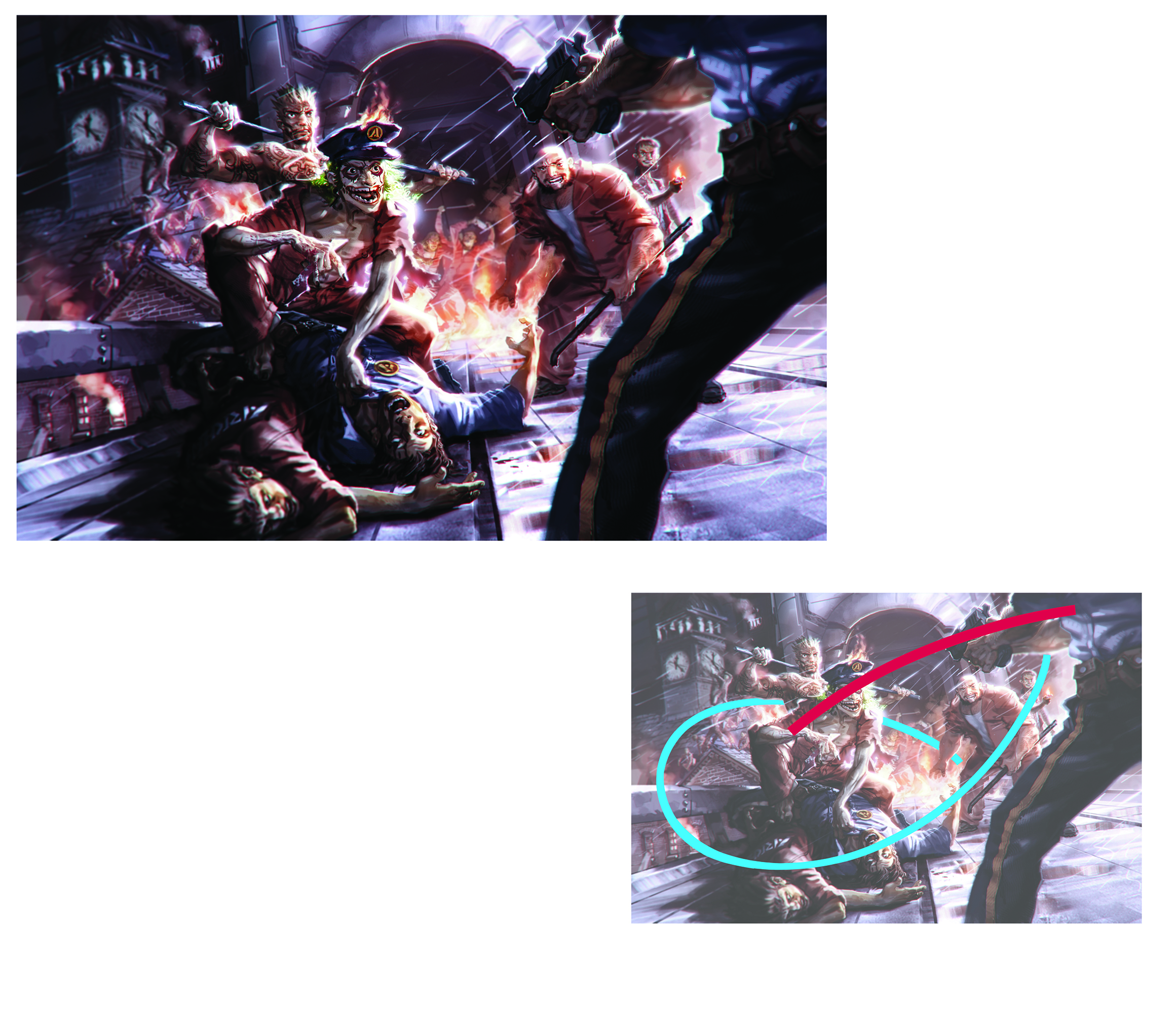
10. Guided composition
It’s your job to lead the viewer’s eye, and take them on a journey through your image. Rather than concentrating on details within the image, you should look for an overall visual impression of the movement and balance of the artwork.
Just like framing a scene using a camera, a useful technique is to create a frame – either digitally, or from card – and experiment moving it around your image. You can often be surprised by the varying effectiveness of the image depending on framing. In this example, the red area shows the primary area of dramatic focus, but you can see how the surrounding details are composed to lead the eye around the image and reinforce the primary area.
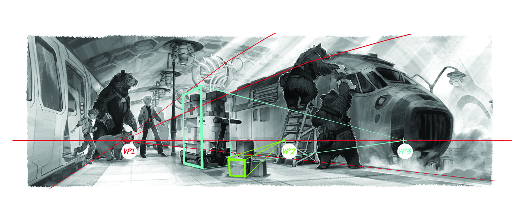
11. Perspective variation
In your environment designs, having everything set to a single vanishing point can produce a flat, uninteresting image, so it’s a good idea to vary your vanishing points for some elements to add visual interest and help bring the image to life.

12. Mix your media
Even though the real-world style brushes that software can simulate are so advanced now, there’s still no reason why you shouldn’t incorporate real-world elements. Here, the scanned paper rip across the image is a compositional device that represents this character’s conflict between home and career. This is a simple example, but my point is that it was quicker to use physical paper and scan it than to try and hand-paint the effect. Digital art software is just another tool, so why not mix it with other real-world media?

13. Tackle complicated architecture
Architectural structures can be fairly easily blocked-out using 3D software, which you can then use to create a variety of camera viewpoints that would form the basis of your 2D image. However, it’s a great idea to develop your knowledge of sketching structures in perspective, because it’s a much quicker way of conveying your initial ideas in sketch form. I do value the freedom of 3D imagery, though – especially when you’ve spent days painting an environment and an art director says, “Can we see that from a slightly different view?”
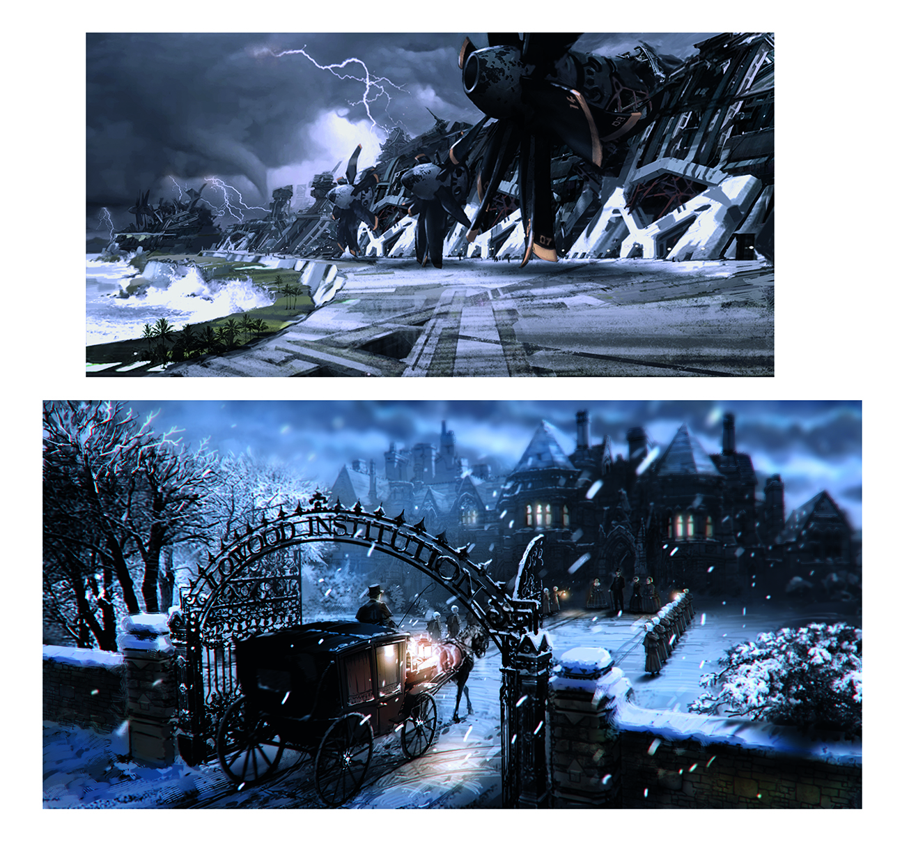
14. Environmental weather
Weather can become an addition character in your design and illustration work, influencing mood and perception. You can use to compositional advantage, such as ground-level atmospherics like rain or fog that can isolate depth planes within your images and creating focal areas.
It’s good to be aware of weather clichés that you might want to avoid though, such as the ‘rainy funeral scene’. In this Jayne Eyre image, the snowy setting creates a stark and oppressive atmosphere, which is offset by the warm lantern glow of the approaching horse-drawn carriage.
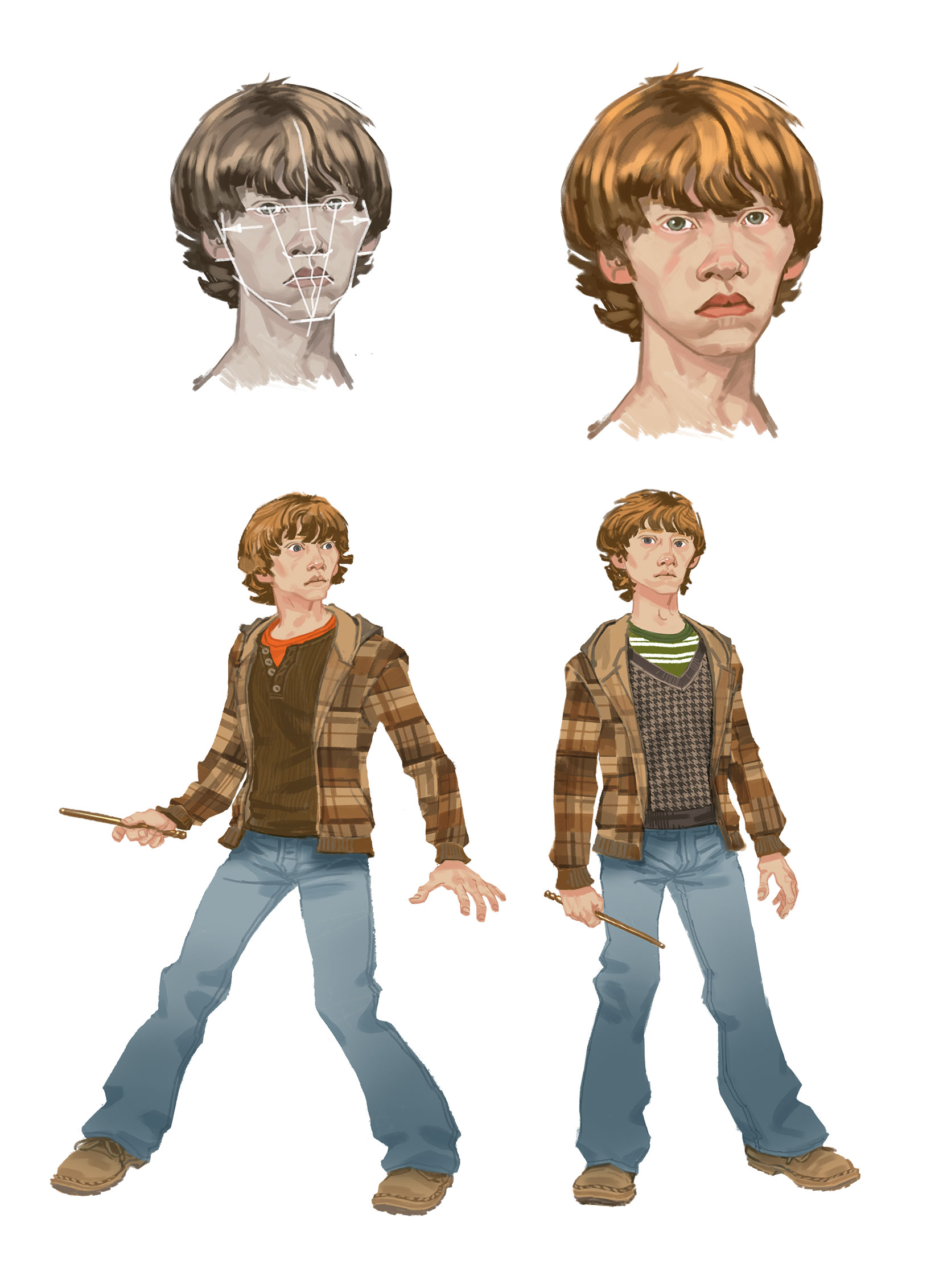
15. Develop stylised characters
Traditionally in stage and theatre productions, the actors would often apply bold makeup so that their faces, and more importantly their expressions, were clearly discernible from way back in the audience. Taking a simplified,
slightly caricatured approach to your characters’ faces will have a similar effect, making them easier to read. You’re effectively attempting to refine down to the simplest visual form, identifying the key features and idiosyncrasies that make up this character. Everything else is redundant detail that can be discarded.
Sign up to Creative Bloq's daily newsletter, which brings you the latest news and inspiration from the worlds of art, design and technology.
