3 ways tech is changing type
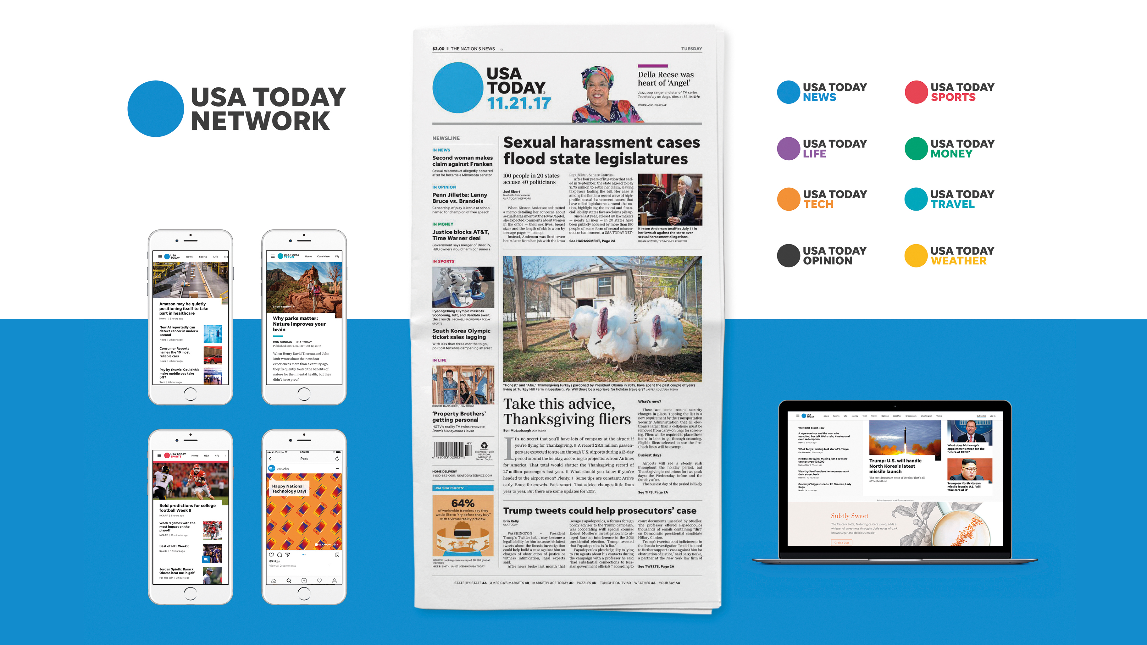
Launched back in 1991 by Swiss designer Bruno Maag, Dalton Maag has created type designs for the likes of Google, Amazon and Nokia. Priding itself on working with clients both large and small, local and global, to create a range of type-related services, the studio is perfectly placed to comment on how technology is set to revolutionise the industry.
To get a taste of what to expect from web fonts in the near future, we caught up with Dalton Maag's very own Bianca Berning and Jany Belluz to hear how advancements in type design will affect what we read.
01. Type consistency
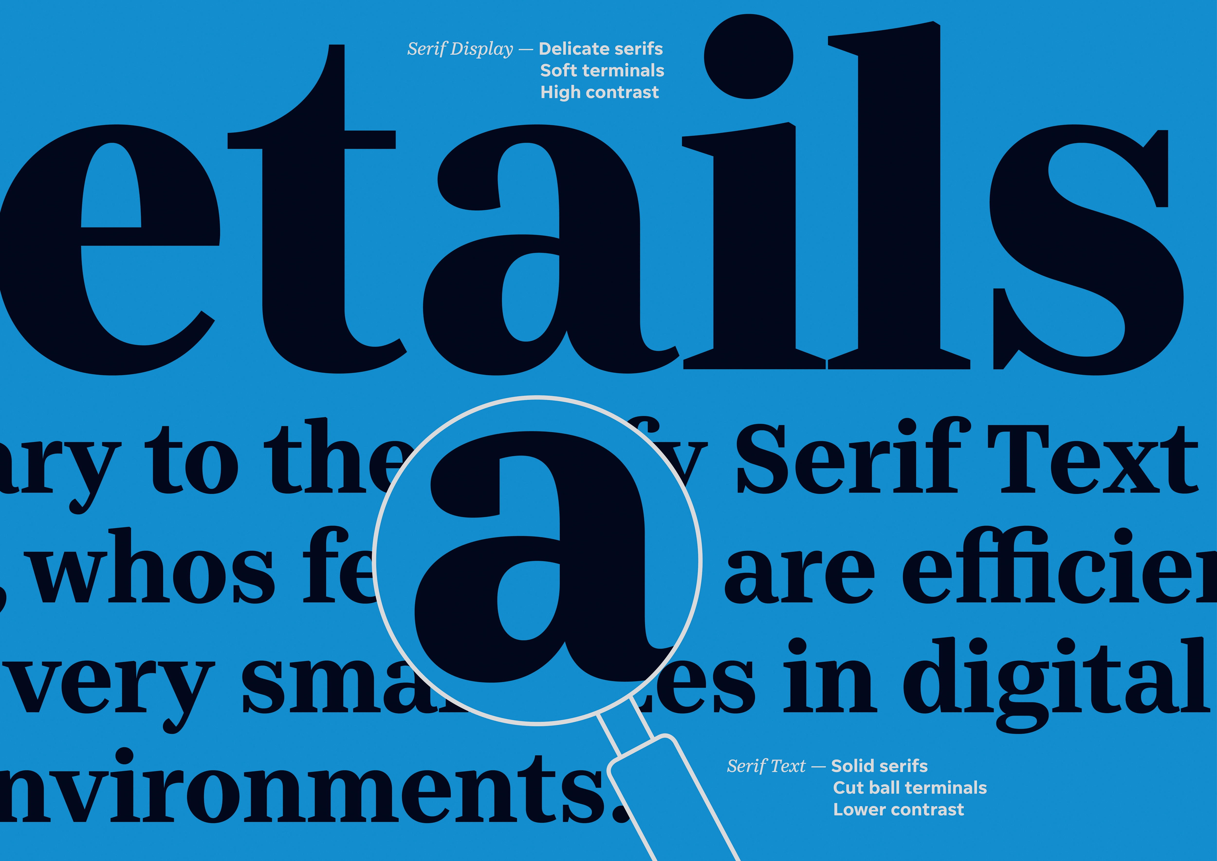
"As type design is such detailed work, we are always looking to develop systems and processes that streamline the design process and ensure total consistency," says Dalton Maag software developer Jany Belluz.
Article continues below"This could be focused around enhancing the precision of our designs across multiple scripts and thousands of characters, to streamlining the process for delivering font files to clients. The goal in the future is to ensure we’re as efficient as possible, to allow font developers to focus on the most interesting and valuable part of their job: designing."
02. The potential of variable fonts
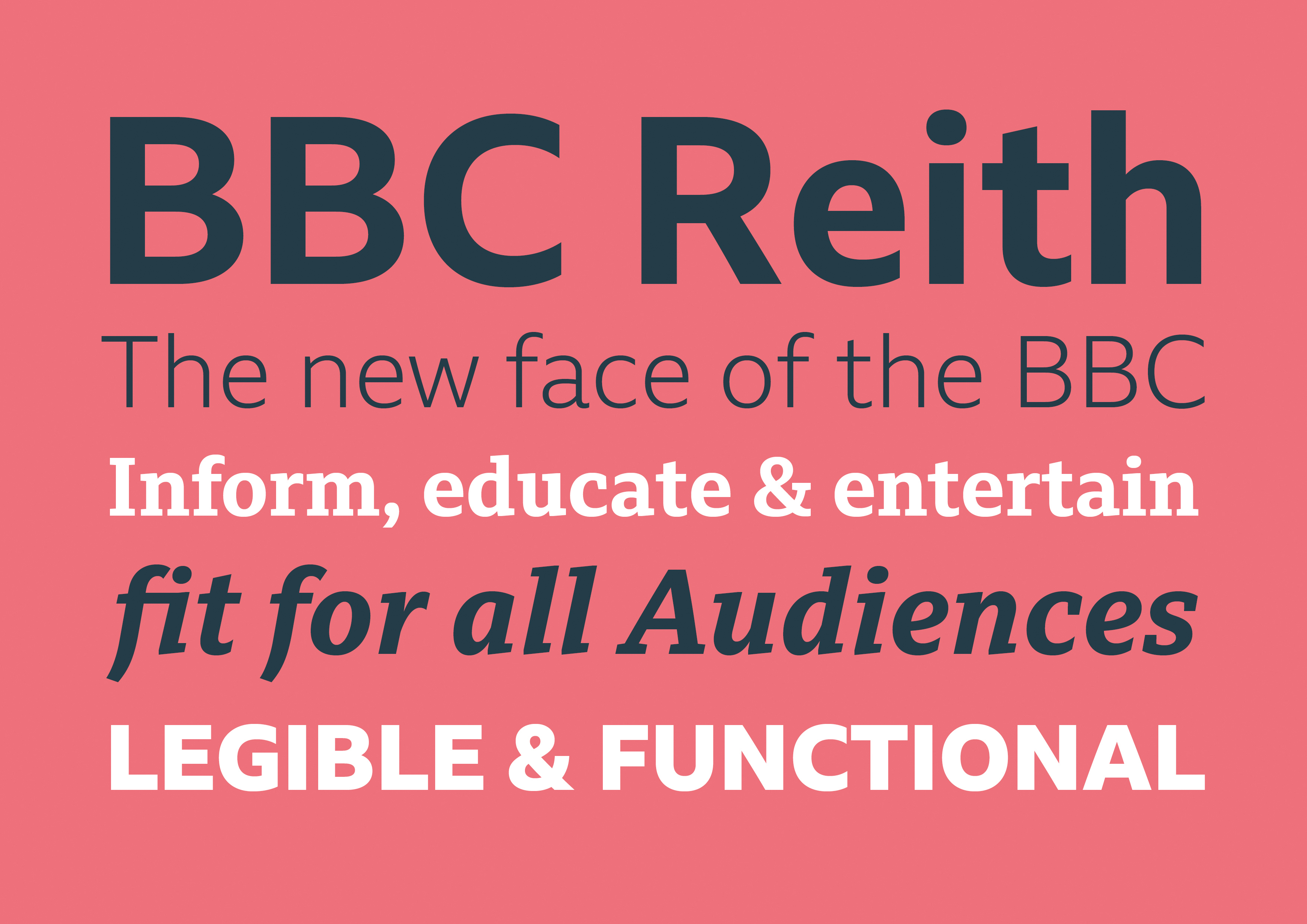
There's a lot of excitement around variable fonts right now, and while use cases are presently still sparse, it's a technology Dalton Maag is taking seriously. "As a typographer and type designer I am eager to see what users will create with variable fonts, especially when it comes to user-centred, responsive digital typography," reveals Bianca Berning.
"As variable fonts require a slightly different approach in terms of testing and QA , type foundries will have to improve their technical support once they become a standard deliverable alongside static desktop and web fonts."
03. Open source innovations
Open source collaborations are driving constant innovations in type design, and one long-term project Jany Belluz is proud of is called glyphsLib. "The goal was to allow our font developers to swap easily between two font design editors that they use: FontLab and Glyphs," he explains.
Sign up to Creative Bloq's daily newsletter, which brings you the latest news and inspiration from the worlds of art, design and technology.
"The file formats of those two programs are nonstandard and incompatible, so my goal with glyphsLib was to make sure that they could go back and forth between them without losing important information. My task was to get familiar with both file formats and write code to convert each tidbit of information from one to the other. This now means our designers have much more flexibility, so they can use the best-suited program for each task."
This article was originally published in issue 289 of Computer Arts, the world's best-selling design magazine. Buy issue 289 or subscribe to Computer Arts.
Related articles:

Tom May is an award-winning journalist specialising in art, design, photography and technology. He is the author of the books The 50 Greatest Designers (Arcturus) and Great TED Talks: Creativity (Pavilion). Tom was previously editor of Professional Photography magazine, associate editor at Creative Bloq, and deputy editor at net magazine.
