5 huge trends in app icon design
These five symbols have become a visual shorthand for a whole generation of apps.
App icons play a crucial role in helping a new app stand out: not just in the App Store, but on someone's screen amongst a sea of other similar app icons. Once installed, it still needs to be found easily, and stay front-of-mind for the user.
Just as with logo design, app icon design involves conveying meaning in the most simple, eye-catching way possible. But while logos have a multiple of brand touch-points to come alive and build awareness and recognition, app icons need to stand out in a grid of equal-sized icons, while making it immediately obvious what they do.
Two types of icon
There are two main approaches when it comes to icon design: symbolic and iconic. The latter are much more literal and representative; the former are more abstract and must acquire meaning by association.
Once such semiotic 'rules' are established, it can save a lot of time for all involved to follow them, giving you a visual shorthand for your app icon. Sometimes it does pay to do something strikingly different - but you need to know what you're railing against.
So read on to explore five major app design trends that have become visual shorthand for a whole generation of app users...
01. Envelopes for email
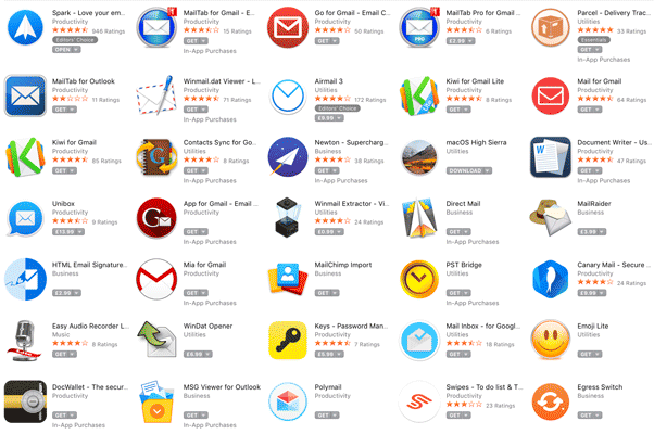
This is one of the longest-established visual shorthands in the app icon game, since email was one of the very first applications to be developed after the birth of the internet.
Although electronic mail bears no practical similarities to its postal counterpart, besides the fact that information is transferred from a sender to a recipient, the familiar association between a paper envelope and an email seems to be here to stay.
Sign up to Creative Bloq's daily newsletter, which brings you the latest news and inspiration from the worlds of art, design and technology.
Whether your provider of choice is Gmail, Outlook, Hotmail or Yahoo Mail, you'll find an envelope figuring prominently as part of the app icon. This makes it all the more interesting when this trend is bucked.
Spark , for instance, chose a paper aeroplane, giving it standout while making the visual shorthand of transmitting paper from one place to another a bit more playful and fun.
02. Triangular arrows for media
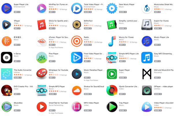
Theoretically, there's nothing to link a triangular arrow shape with the concept of 'playing' a piece of media content, besides decades of positive reinforcement of the association, through buttons on hardware as well as software.
As such, this is a symbolic icon design, compared to the iconic approach of the envelope. It's a symbol that has been all-but universally embraced by the entertainment industry as a visual shorthand for music and film-based media-playing apps.
While more iconic designs such as clapperboards and musical notes are a regular feature too, triangular arrows are everywhere - whether from large organisations such as YouTube or the BBC's iPlayer, or a broad selection of smaller dedicated media-playing apps.
Again, apps that swim against the current may stand out - but the universal significance of that simple triangular symbol means it features in the vast majority of music and video player icons in some capacity.
03. Ticks for productivity
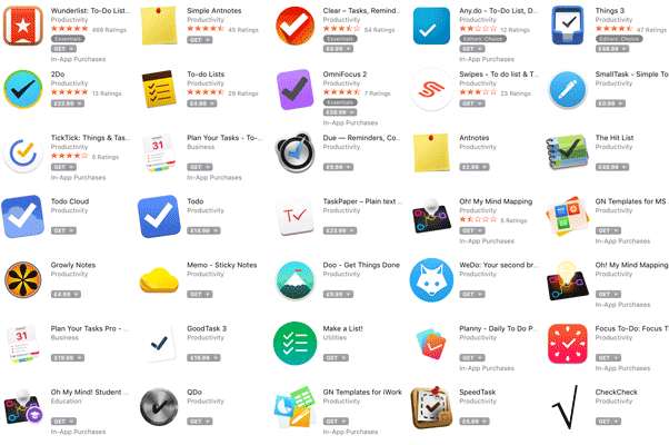
It's perhaps unsurprising that almost every app that bears some resemblance to a to-do list features a tick in its icon: it's all about accomplishment, and the satisfaction of checking the box that signifies a task is completed.
The tick has become synonymous with the Productivity category on the App Store, and it's used by many leading tools, including Clear, Things, Todo and OmniFocus.
Such a strong association is hard to shake off, and besides some crucial variations in shape, colour and pattern, many of the apps above do look strikingly similar when viewed alongside each other.
That's not to say that some productivity apps haven't found a new direction, however: Wunderlist, for instance, plays on the association of a starred bookmark to signify its approach to to-do lists, whereas Doo is more characterful, with a flag planted at the top of a mountain.
04. Locks and keys for security
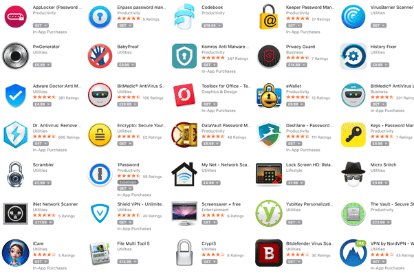
What images spring to mind when you think of security apps? Chances are, whether it's a virus scanner, a password manager or an encryption tool, there'll be a padlock, a key, or a safe of some description.
Just as with the above examples, there's a sound reason for this association. It's about making people feel reassured - a visual shorthand that implies that cybercriminals, hackers, viruses and other unmentionables can't get to you, because you're locked up tight.
As with the email envelope, of course, this association is relatively arbitrary: all the security in question is digital, with no physical locks or keys in sight, but the association remains strong - if a little cliched.
05. Pencils or paintbrushes for creativity
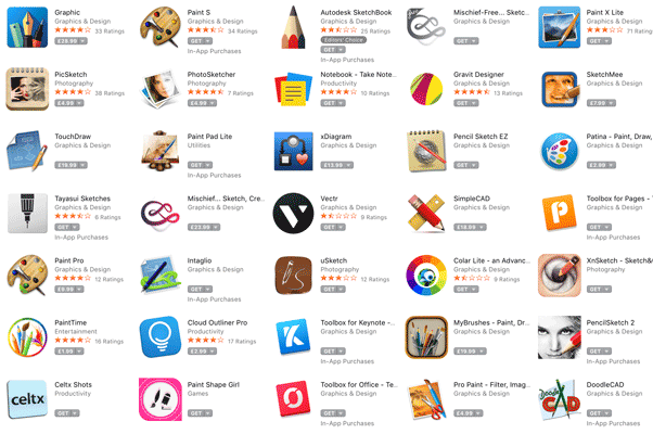
It doesn't take a genius to draw a line between the tools of a particular trade, craft or discipline and the icon to represent it. A stethoscope to represent a medical app, a hammer for a building app, a camera to symbolise photography - it all makes practical sense.
When it comes to sketching, painting and other creative apps, therefore, it's no surprise that pencils, paintbrushes and palettes tend to feature heavily amongst the app icons. These are all familiar visual references for the creative process, after all.
But just as security apps don't actually padlock your laptop, productivity tools don't need to physically tick a checkbox, digital media players aren't slaves to their 'play' button, and emails aren't actually stuffed in an envelope, there are ways to think outside the box.
Remember when Photoshop was represented by a feathered quill? Adobe has since moved on to represent its suite of software as an interconnected 'periodical table' of creative tools, with not a pencil or paintbrush in sight. Perhaps it's time for more app icon designers to stop taking things quite so literally.
Read more:

Nick has worked with world-class agencies including Wolff Olins, Taxi Studio and Vault49 on brand storytelling, tone of voice and verbal strategy for global brands such as Virgin, TikTok, and Bite Back 2030. Nick launched the Brand Impact Awards in 2013 while editor of Computer Arts, and remains chair of judges. He's written for Creative Bloq on design and branding matters since the site's launch.

