5 ways to create better brand imagery
Five brands that have mastered the art of creating powerful brand imagery, and what you can learn from them.
Sign up to Creative Bloq's daily newsletter, which brings you the latest news and inspiration from the worlds of art, design and technology.
You are now subscribed
Your newsletter sign-up was successful
Want to add more newsletters?
Clever and unique use of imagery can have a transformative effect on a brand's impact. The best logos can create a powerful visual association that goes far beyond the actual design itself.
It's worth pointing out that 'brand imagery' is different from 'brand image'. A brand's image is that intangible, emotional quality that brands constantly strive to improve in the minds of consumers, formed from a broad kit of parts, including the promises a brand makes and the actual experience it delivers.
Brand imagery, by contrast, is a more concrete, objective entity: how a brand presents itself to the world. It can evoke heritage or innovation, communicate quality, or imply good, honest, no-nonsense value. It helps shape brand image, but is never wholly responsible for it. It doesn't necessarily have to be visual, either – brand imagery can appeal to any of the five senses. Sounds, smells, tastes and physical sensations can all help define a brand.
Article continues belowRead on to discover five brands that have developed brand imagery that defines their attitude, and helps them stand out from the crowd...
01. First Direct
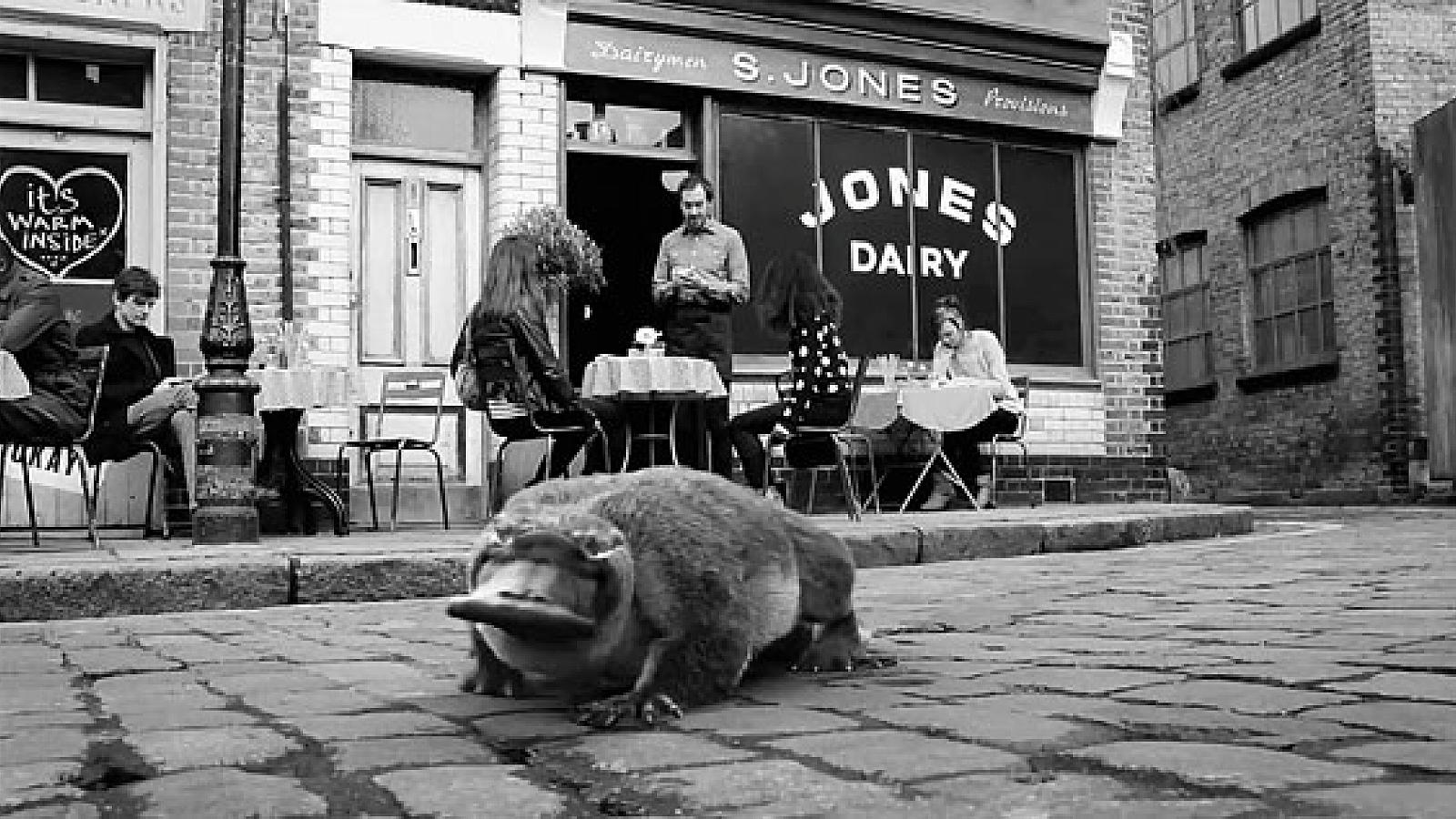
Banking and financial services have traditionally been one of the most conservative, 'safe' sectors for branding. It's all about trust, security and growth.
It's not a sector you'd usually associate with a platypus, a frilled lizard or an astronaut walking on water. But somehow, since its 2013 repositioning by JWT as 'the unexpected bank', First Direct has appropriated all three.
Part of HSBC, First Direct has built a compelling brand image on its famously high-quality, very 'human' service, and corresponding customer loyalty.
Sign up to Creative Bloq's daily newsletter, which brings you the latest news and inspiration from the worlds of art, design and technology.
Barry the talking platypus and his successor, Little Frill the lizard, both emphasised that award-winning service in their own delightfully surreal, hugely memorable black-and-white ads that also featured beatboxing songbirds and a pizza-guzzling bushbaby.
Fronted by the water-walking astronaut, First Direct's latest above-the-line campaign may reposition it again as a 'modern, digital bank', but that distinctive monochrome palette and unexpected visual associations are preserved in the brand imagery.
02. Aizone
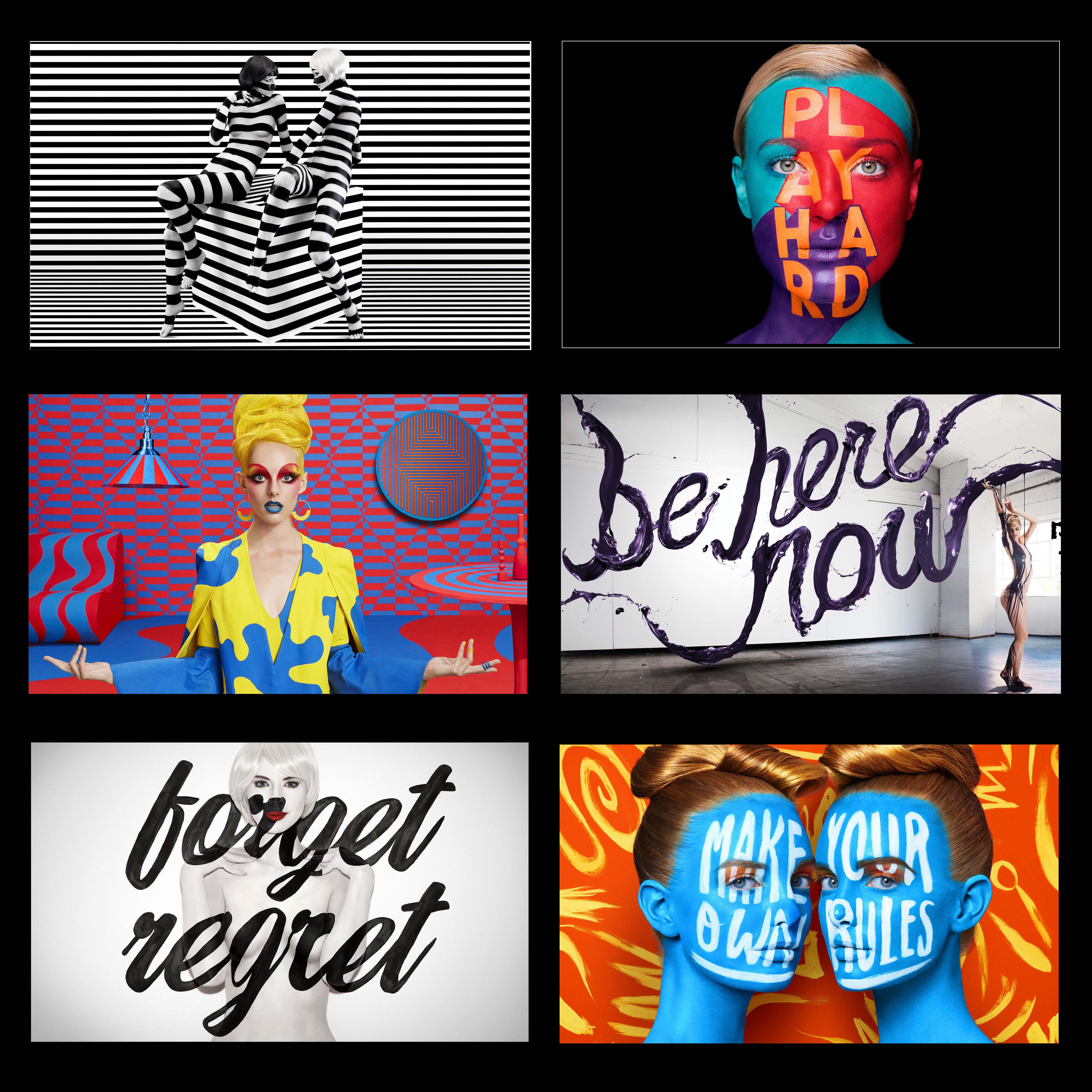
Luxury Middle Eastern department store Aizone enjoyed an annual visual extravaganza courtesy of Sagmeister & Walsh from 2009-2016, the result of which is a striking collection of brand imagery unlike any other. The initial constraint at the outset of the campaign – that the ads had to be black-and-white, and couldn't actually feature any of the department store's wares – drove the iconic New York agency to explore a stunning, and unmissable, combination of nude models and body paint.
Subsequent campaigns introduced splashes of increasingly vibrant colour, and experimental type – at first painted onto models, and later constructed out of everything from paint to hair to balloons. More recently, the agency took the concepts in new directions, setting their models inside 3D environments inspired by pop art, constructivism and psychedelia.
Splashed across newspapers, magazines, and billboards throughout Lebanon, all of these examples of brand imagery were the very definition of head-turning. But they also show how a powerful visual concept can be constantly reinvented to keep things fresh.
03. London Symphony Orchestra
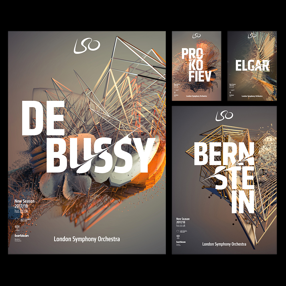
Winner of Best of Show at the 2017 Brand Impact Awards, the breathtaking rebrand of London Symphony Orchestra by The Partners (now Superunion) captures the essence of style, passion and movement effortlessly.
While Aizone demonstrates what can happen when a bold creative agency has fun with a relatively open brief, this is a superb example of brand imagery that's firmly rooted in the subject matter: it's generated dynamically based on motion-capture data from LSO conductor Simon Rattle.
The sweeping curves tear through the type with gusto, while the abstract, jagged metallic background imagery visualises the ethereal nature of the music. Each poster is unique, and yet unmistakably part of the whole. Brand imagery doesn't get much better, or more authentic, than this.
04. Apprenticeships
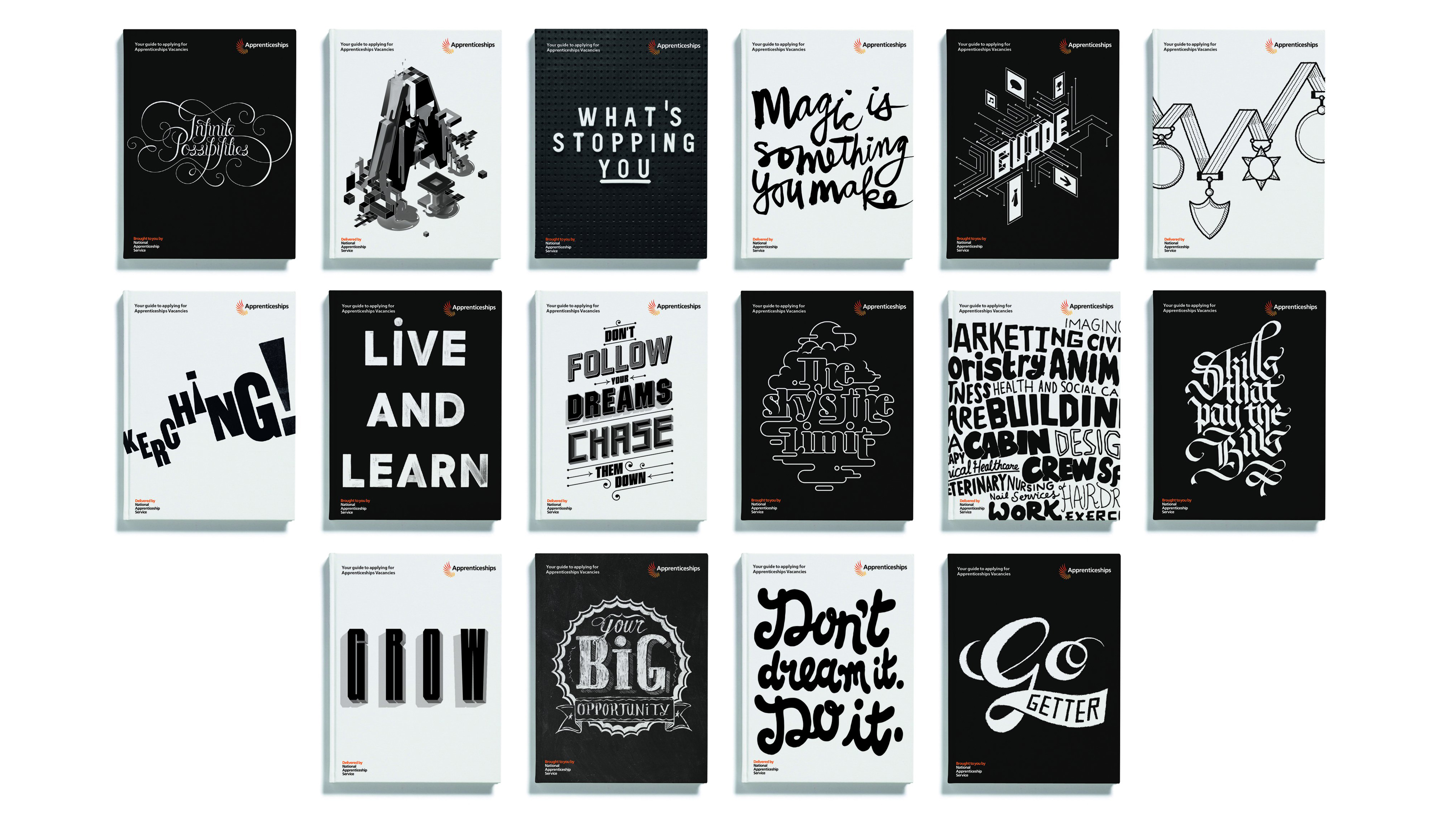
As First Direct demonstrates, sometimes the absence of colour can be every bit as striking as all the shades of the rainbow. Part of Purpose's rebrand of the UK government's Apprenticeships service – which had previously been totally unassuming with a palette of burgundy and orange – was an incredible batch of brand imagery, crafted entirely in stark black and white.
Based around the idea of 'Inspiring Transformation', the agency created a varied series of illustrated type treatments, all based around motivational phrases.
A Meccano-style modular typeface followed, which played on the equally integral ideas of construction and practical, useful skills that the initiative champion – again, all in the black-and-white palette that makes the Apprenticeships brand imagery so distinctive.
05. D&AD Festival
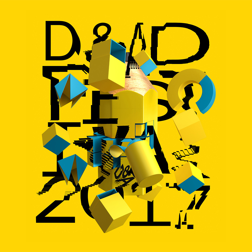
In a way, designing brand imagery for the D&AD Festival and Awards is both a dream brief, and a nightmare brief, as you know it'll be front and centre for a crowd of the world's very best, more discerning designers. The Beautiful Meme rose to the challenge in 2017, riffing on, distorting and deconstructing the familiar Pencil in all its famous colours: Wood, Graphite, Yellow, White and Black.
Blown up huge on the big screen during the Awards, the resulting series of stylised 3D animations were an explosive feast for the eyes. They don't have the conceptual cleverness of LSO, or wittily subvert expectations like First Direct, but they do one thing exceptionally well: elevate the central brand element, the Pencil, to hero status. And as a piece of brand imagery, you can't argue with that.
Read more:

Nick has worked with world-class agencies including Wolff Olins, Taxi Studio and Vault49 on brand storytelling, tone of voice and verbal strategy for global brands such as Virgin, TikTok, and Bite Back 2030. Nick launched the Brand Impact Awards in 2013 while editor of Computer Arts, and remains chair of judges. He's written for Creative Bloq on design and branding matters since the site's launch.
