How design can boost clients' profits
Creative excellence isn’t everything. We deconstruct four design projects that more than paid for themselves by boosting the client’s bottom line.
Sign up to Creative Bloq's daily newsletter, which brings you the latest news and inspiration from the worlds of art, design and technology.
You are now subscribed
Your newsletter sign-up was successful
Want to add more newsletters?
Challenge 2: Turning around poor performance
Golden Car rebrand by Taxi Studio

In 2012, Finland’s oldest cider brand was in dire straits. Having led its category for decades, Golden Cap was being undercut on price from one direction, and couldn’t compete with premium brands on the other. Parent company Sinebrychoff, wanted to reverse this slippage, fast.
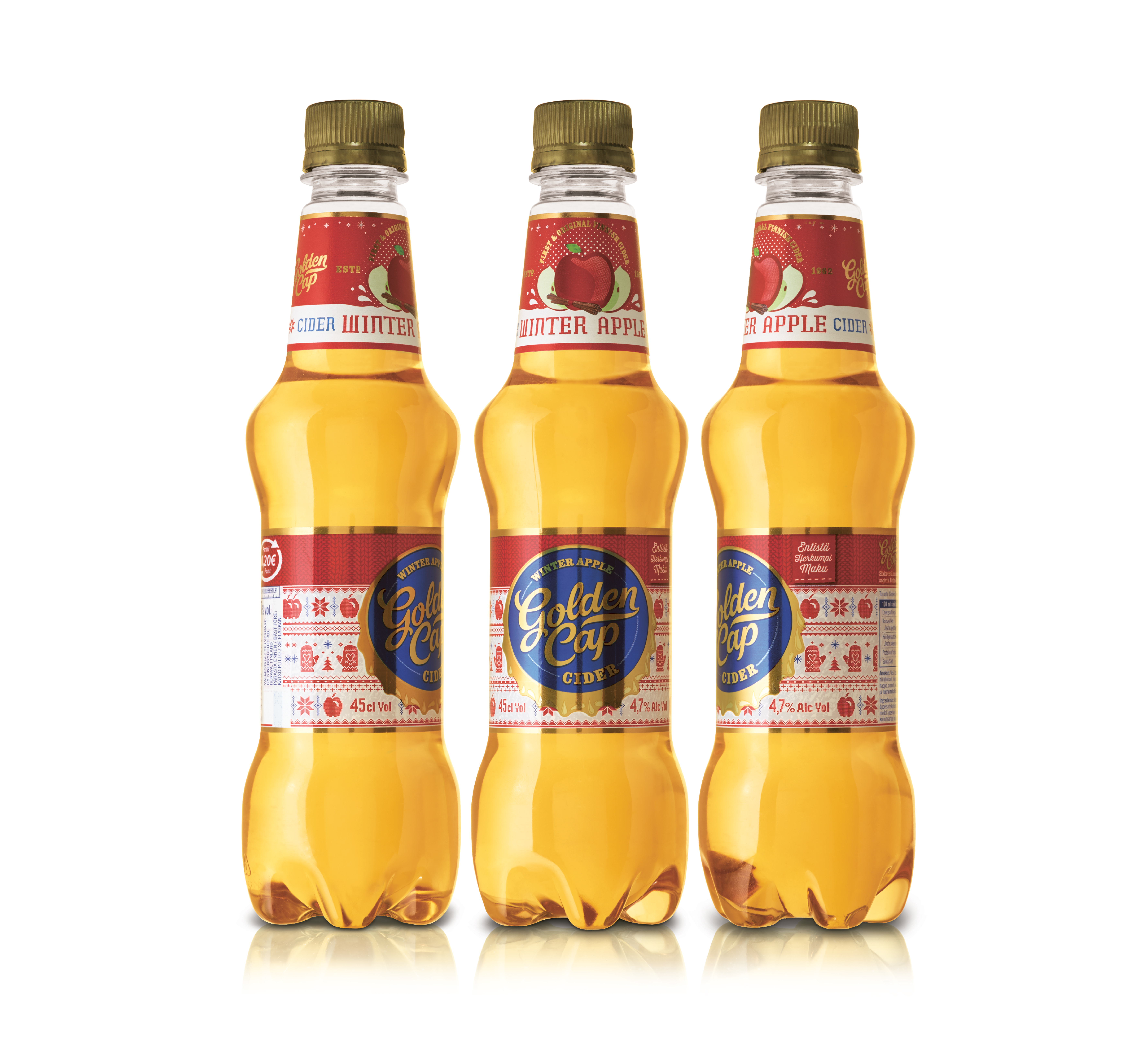
“Golden Cap had a typeface that was very recognisable,” explains Taxi Studio associate creative director Jonathan Turner-Rogers, “but the pack was very generic with swooshes, liquid splashes and some fruit. It was very photographic and didn’t have a lot of appetite appeal. It could have easily been an own-brand.”
Article continues belowWith the insight that Finnish consumers are very proud of their heritage, Taxi Studio dug through Sinebrychoff's archives to see whether there was something in there that could reawaken the brand. The team found that Golden Cap’s inaugural bottles featured a golden crown cap, and this became the key motif of the rebrand.
“The powerful, iconic nature of that cap gave us a really strong brand equity and also very simple portfolio navigation,” says Turner-Rogers. “It allowed us to produce something of visual quality across both can and bottle – using metallic foils on the bottle to bring the label to life.”

Turner-Rogers attributes the rebrand’s success to a “badge-brand mentality” – a strikingly simple and bold illustrative style that gave the brand the “cool factor”. The packaging’s simplicity created distinctive brand blocking on shelf, and the straightforward nature of the identity system also provided a functional brand architecture that allowed easy diversification for new flavours or limited editions, such as jumper-clad Winter Berry.
But the bold approach wasn’t loved by all. “When the new brand went into research with loyal consumers it bombed, but with new consumers it flew,” says Turner-Rogers. “However, the client was brave enough to take the decision that this rebrand was about the future.” It worked. Without promotions or an above-the-line campaign, overall sales went up 21 per cent three months after launch, and the £195,000 design budget was more than recovered in this period.
Sign up to Creative Bloq's daily newsletter, which brings you the latest news and inspiration from the worlds of art, design and technology.
Next page: discover pro tips for attracting sponsorship partners...
Current page: Golden Car rebrand by Taxi Studio
Prev Page Bluewolf rebrand by Moving Brands Next Page The Canadian Olympic Team rebrand by Hulse & Durrell