How design can boost clients' profits
Creative excellence isn’t everything. We deconstruct four design projects that more than paid for themselves by boosting the client’s bottom line.
Sign up to Creative Bloq's daily newsletter, which brings you the latest news and inspiration from the worlds of art, design and technology.
You are now subscribed
Your newsletter sign-up was successful
Want to add more newsletters?
Challenge 4: Launching a new product
Hippeas identity by Jones Knowles Ritchie

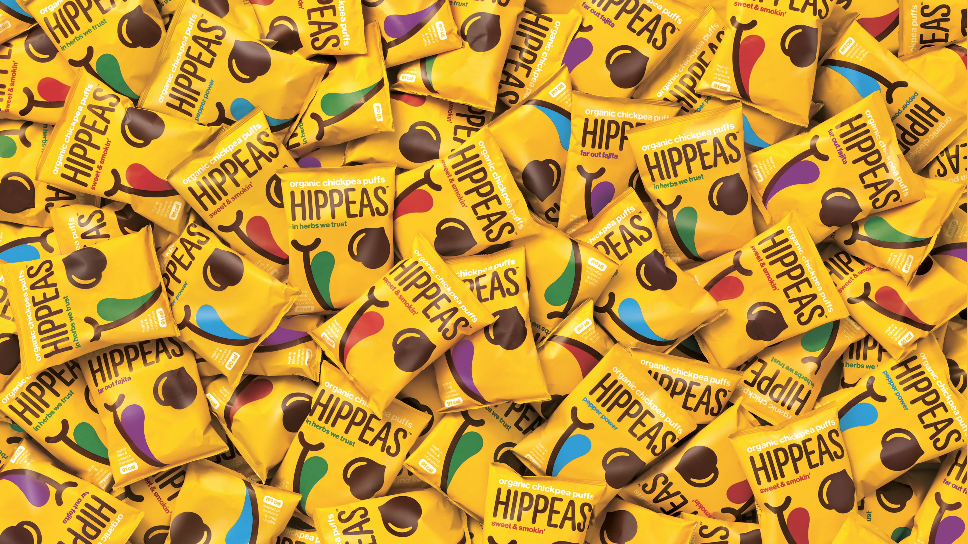
Launched in July 2016, Hippeas is one of the fastest growing health snacks on the market. Its identity by global design agency Jones Knowles Ritchie has led to the organic puffed chickpeas being stocked in 18,500 stores in the UK and USA (including Starbucks in the latter).
Its success, believes Green Park Brands founder Livio Bisterzo, is partly due to the company collaborating with jkr from very early in the brand’s life. “It wasn’t just a design process,” explains Bisterzo. “We went right from the beginning, creating a personality and story – an overarching brand world above and beyond packaging design.”
Article continues below 
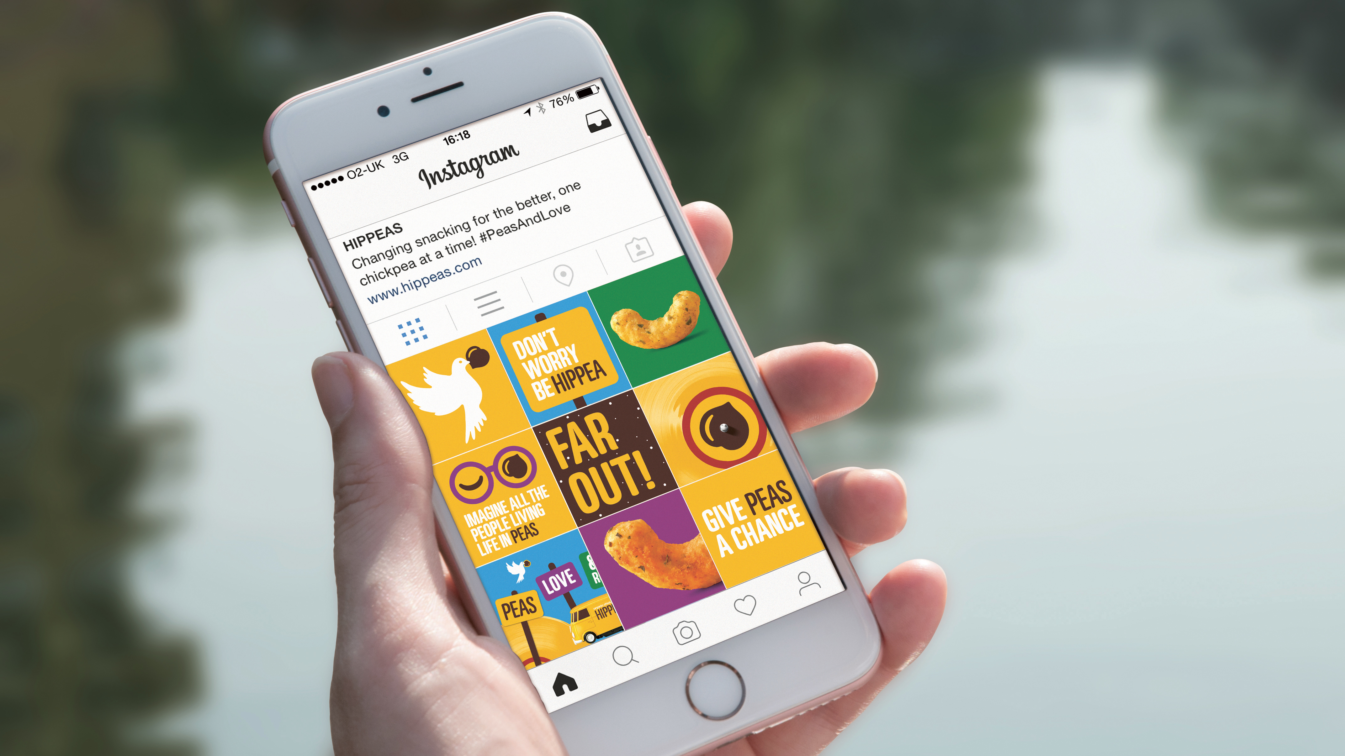
That story was shaped with an unashamedly pun-tastic tone of voice, riffing on hippy phrases (‘Give peas a chance’ and experiential ‘peas-ful protests’ with ‘snacktivists’) but with genuine messaging about Hippeas’ social and environmental credentials, such as its sustainable supply chain. These narratives successfully tapped into the rebel spirit of today’s millennials – a key market for Bisterzo – and their current passion for activism, health and the environment.
Featuring a smiley face with lip-smacking tongue and chickpea-shaped eye, the identity itself draws on the rich visual imagery and colour palette of the 1960s, explains jkr design director Stephen McDavid. McDavid attributes the brand’s success to its clear mindset: switching from being a “challenger brand” to an “iconic brand of the future”, with a clear, confident aesthetic that is instantly recognisable.
Cut-through was also a big part of Hippeas’ astonishing sales figures – and both Bisterzo and McDavid agree that this was achieved by thinking outside of the category. “Hippeas is a healthy alternative to snacking, but we didn’t want to appear worthy or niche,” says McDavid. “We were very keen to develop a brand language that was bold, and says that being good for you doesn’t need to be boring.”
This article was originally published in Computer Arts magazine issue 262; buy it here.
Sign up to Creative Bloq's daily newsletter, which brings you the latest news and inspiration from the worlds of art, design and technology.
Related articles:
Current page: Hippeas identity by Jones Knowles Ritchie
Prev Page The Canadian Olympic Team rebrand by Hulse & Durrell