How to make your designs responsive

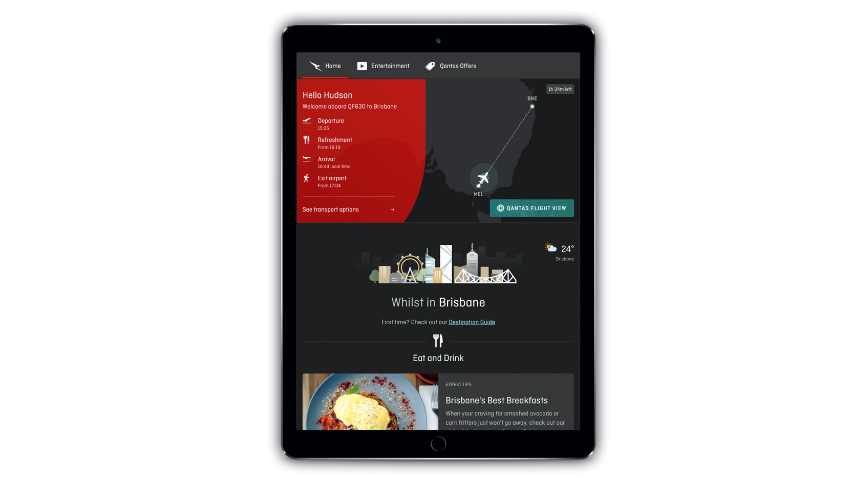
Back in the ‘olden days’ (before 2010), most web design involved the creation of two separate websites: one for desktop, one for mobile. Then Apple introduced the iPad, and everything changed. Before long, the number of different devices hitting the market was increasing exponentially, and it was becoming impossible to design a bespoke website for every single one. To meet this challenge, a new discipline emerged, which its creator Ethan Marcotte dubbed responsive web design (or RWD for short).
The basic principle of responsive web design is that, rather than create a separate website for every device, you write one lot of code that will seamlessly adapt your site to whichever device it’s being consumed on.
This explains why any quality website created in 2018 will have a totally different look when viewed on a widescreen laptop than when viewed on smaller smartphone screen. Indeed, even if you just resize your browser window on the former, you’ll doubtless see the layout morph and adapt to it in a delightful, ‘automagic’ fashion.
Article continues below 
But responsive web design is not just about making a site look different; increasingly it’s about making it act differently too.
“Essentially, responsive web design is about creating the right experience, exactly when and where the user needs it,” explains Bill Kingston, partner at London design consultancy Elixirr Creative.
“The information users seek varies depending on the device – so we need to take this into account when designing. Having insight into user behaviour and context is key.”
Joel Maynard, digital designer at Hampshire agency Superrb, provides a practical example. “How you handle navigations on some sites, for instance, needs to be carefully thought through,” he explains.
Sign up to Creative Bloq's daily newsletter, which brings you the latest news and inspiration from the worlds of art, design and technology.
“Things like rollovers and hover effects were really fashionable at one point – but if you’re relying on the use of a cursor to unlock these features, that isn’t practical for touch devices, so you need to think about things like that upfront. Especially because, as well as smartphones and tablets, touch desktops are becoming more popular now too.”
Subtle tweaks
The main point is that a user’s needs, and often the kind of information they’re looking for, may change based on device. These differences may often be only slight, notes Chris Robinson, a design lead at digital studio ustwo London, but that doesn’t mean they’re not important.
“For example, attention spans may differ. A change in navigation hierarchy might be required. You may want to prioritise certain features or make subtle changes to the interaction principles.”
Thankfully, new technologies are making it ever-easier to bake these complex needs into responsive web design. “Previously, certain layouts may have been difficult or hacky to make responsive,” says Robinson.
“But new tools such as CSS Grid and Flexbox are starting to allow for more intricate layouts. Interaction on the web is vastly improving and we’ll see a range of complex apps now being built into the browser.”

Luckily for most designers, you don’t have to be a coder to get on board with all of this. “Graphic design tools are finally starting to adapt to digital workflows, with features that help designers test responsive layouts,” says Robinson.
“Sketch’s smart resizing and pinning tools, for example, allow you to create responsive rules on a component level. Framer helps you go a little further, enabling you to change the visibility of components at various dimensions.”
Maynard uses Sketch for the majority of his web design projects. “It comes with templates for device sizes, so you can dive straight into designing responsively,” he explains.
“I’d also recommend keeping your eye on InVision Studio, as it really does look like a game-changer for prototyping, animation and design, all in one app. Another tool I tend to use is Skala Preview in order to help check all my designs are in line when browsing on smaller devices.”
Look around you
But even if you steer clear of creating websites or prototypes yourself, understanding the core elements of responsive design can still help your career as a designer. And that can be as simple as paying attention to what’s going on around you.
“When working on websites day in day out, you naturally start picking up how a website operates,” Maynard points out. “To delve more deeply, sites like Awwwards and siteInspire are great for finding cool sites that have been pushed to the max in terms of cutting-edge design. You can also use sites like Tympanus and CodePen to find nice interactive elements that work well across multiple devices and various screen sizes.
RWD is in constant evolution. There is no wrong or right way, experiment!
Bill Kingston
“More broadly, practice makes perfect when it comes designing responsively,” he adds. “Something I once did to practise was to find a website that I thought could be improved upon, and then put together a responsive concept.”
Kingston takes a similar view. “Keep your eyes on the web, look at sites on different devices, analyse them,” he recommends. “Keep a list of pain points as well as an inspiration folder of successful experiences when you come across them. Stay alert, RWD is in constant evolution. There is no wrong or right way, experiment!”
This article was originally published in issue 279 of Computer Arts, the world's leading magazine for graphic designers. Buy issue 279 or subscribe here.
Related articles:

Tom May is an award-winning journalist specialising in art, design, photography and technology. He is the author of the books The 50 Greatest Designers (Arcturus) and Great TED Talks: Creativity (Pavilion). Tom was previously editor of Professional Photography magazine, associate editor at Creative Bloq, and deputy editor at net magazine.
