The problem with period product branding
Period branding is pants. Is it time for a bloody revolution?
This article was originally published in 2017.
Branding for sanitary products has always been, well, a bit pants. The packaging is usually garishly bright and the ads show young, attractive women rollerskating, climbing mountains and gallivanting around in white trousers.
And then there’s the unnatural-looking blue liquid that is poured onto pads, as if menstruating were some sort of strange science experiment instead of a bodily function that roughly half the world’s population experience monthly for an average of 40 years of their lives.
Article continues belowMost women I know don't want to rollerskate or wear white trousers on a normal day, let alone when they are leaking blood.
I don’t know who came up with the idea of equating having your period with a magical burst of energy, but given that most women I know don’t want to rollerskate or wear white trousers on a normal day, let alone when they are leaking blood, I seriously doubt it was a woman.
And as anyone who’s grown up with these products can attest, using them doesn’t make you feel any better. They don’t make cramps go away or stop you feeling moody or tired.
In recent years, some of the shame and embarrassment around menstruation has lifted as women have opened up about the subject in the public domain. In 2015, Rupi Kaur caused a viral sensation by Instagramming a ‘shocking’ picture of her, fully clothed but sporting a period stain; Olympic medalist Fu Yuanhui confessed that her period may have affected her performance in 2016; and the classification of sanitary products as ‘luxury goods’ has been debated in UK Parliament.
Some brands have listened; some are even leading the conversation.
Sign up to Creative Bloq's daily newsletter, which brings you the latest news and inspiration from the worlds of art, design and technology.
Always
Both big players in the UK sanitary towel market, Bodyform and Always, have taken steps to bring their campaigns in line with modern attitudes. Always claims it is ‘on a mission to boost girls’ confidence’. Its Black Pencil-winning Like a Girl campaign showed how girls’ perceptions of their abilities nosedive once they hit adolescence; another (nauseating) ad is about embracing failure.
While the points Always is trying to make may be valid, equating confidence with sanitary towels is questionable. And the brand’s past and persistent message that no one should know you’re menstruating has also arguably played a part in girls’ negative self-image.
Bodyform
In 2016, Bodyform ran a campaign with the strapline ‘no blood should hold us back,’ which showed actual women bleeding, albeit because they were doing sport. The significance of showing quite graphic images of blood in an ad about menstruation should not be underestimated.
Another Bodyform ad saw a woman putting a sanitary towel in her pants, in a toilet, for the first time ever. In line with old-school period ads, she was also a trapeze artist in a white leotard. But the ad suggests this was her job, and not something she just felt like doing because her uterus was shedding its lining.
Next came the Blood Normal advert, which finally showed a blood-like liquid in a sanitary towel for the first time (a corn syrup and dye mixture rather than blood, for 'health and safety reasons', but still better than blue water), as well as blood running down a woman's leg in the shower.
The message in this campaign – 'Periods are normal. Showing them should be too' – was apparently gleaned from the company's research that found 74 per cent of people wanted to see more honest representation of periods in adverts. It's stating the obvious, and these things shouldn't need to be said, but they clearly do.
Mooncup
One company that has never been shy about what it’s offering is Mooncup, whose marketing for its reusable menstrual cups has typically (and sensibly) focused on the environmental and economical benefits of using its product.
An ad from 2017 took a different approach. A humorous and a clever play on traditional stories of men rescuing women, it has a killer strapline: ‘periods, without the drama’. But the ad’s message and story is not very clear if you don’t know what a Mooncup is, which many don’t. (Look it up!)
Thinx
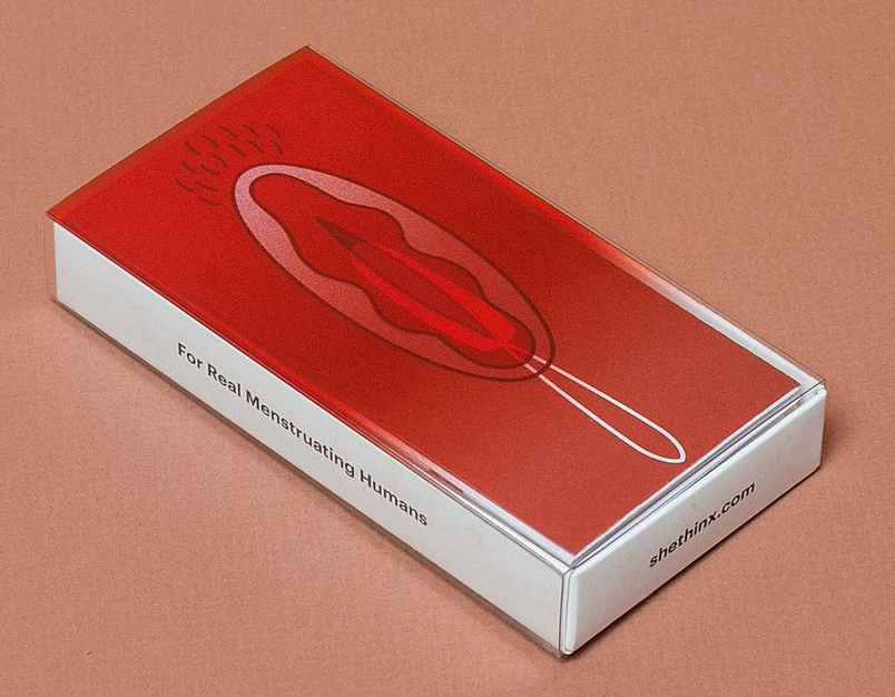
In the US, innovative alternatives developed by and aimed at millennial women are disrupting the market. Thinx sells ‘period panties’ – a revolutionary idea in itself – plus tampons that come in blood red boxes depicting an image of a vagina, with the slide off outer layer revealing a picture of a tampon underneath.
Its adverts describe the realities of periods in a clear and engaging way, and have been praised for breaking taboos left right and centre.
FLEX
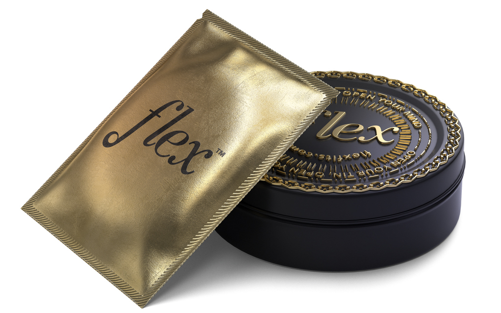
The owners of FLEX, which sells a menstrual disc that can be worn for ‘mess-free period sex’ also deserve kudos for daring to mention ‘sex’ and ‘period’ in the same sentence.
FLEX’s sleek black, gold and white packaging is more akin to expensive sex toys or make-up than ‘feminine care’. But that mess-free period sex isn't exactly cheap, although FLEX does offer regular discounts on its products.
Period Equity
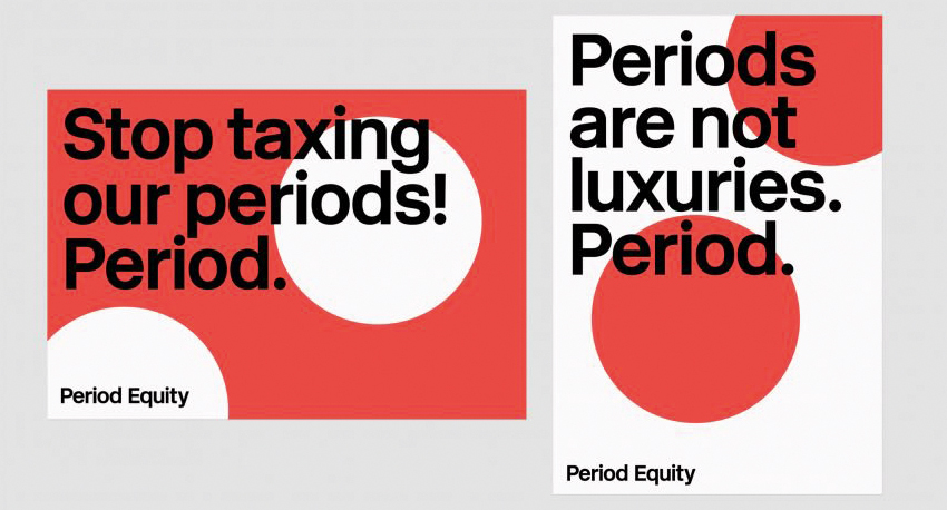
And as Paula Scher eloquently reminds us with her simple yet effective branding for US charity Period Equity, periods are not luxuries.
LOLA
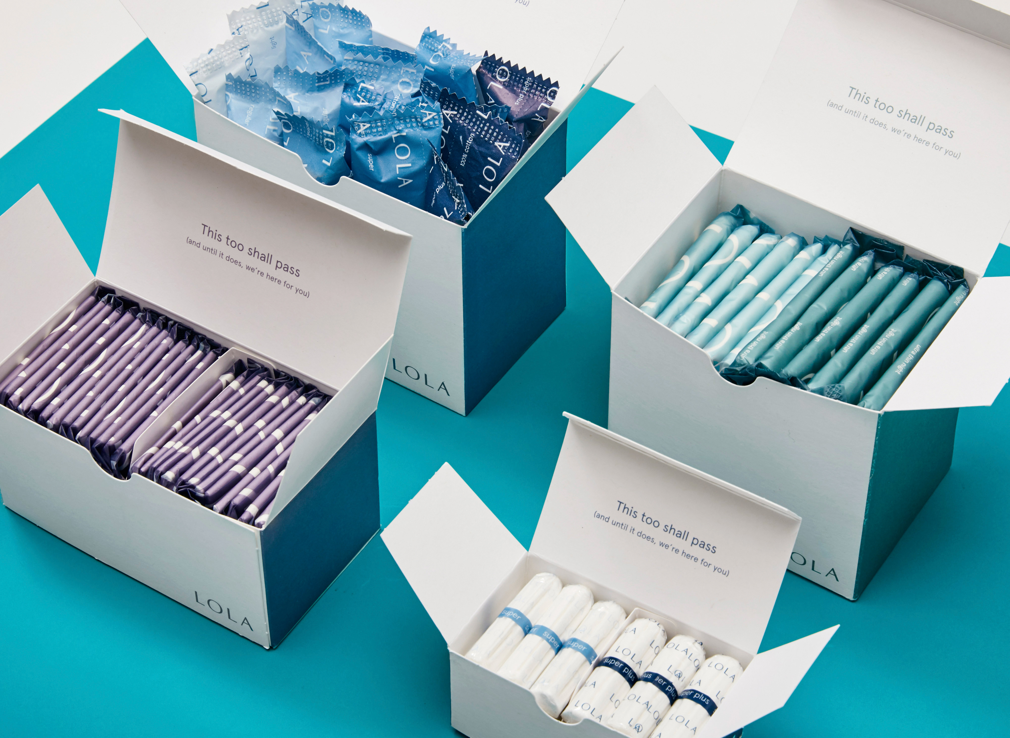
Reflecting that its products are necessary basics, without making them look unattractive, LOLA’s organic tampons and pads have a simple and chic feel. In the US, they also come delivered to your door in customisable boxes, taking into account that not every period day requires the same product.
Fémme
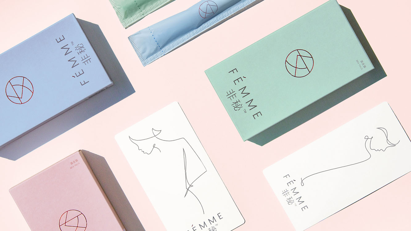
With similar muted colours to LOLA, Pearlfisher’s branding for Chinese tampon company Fémme is feminine, delicate and discreet, and was developed after extensive research of taboos around using tampons in China. The differences between Fémme and products in the West highlight the fact that different approaches are needed in different cultures.
These are all steps in the right direction, but we need to go further. We need more branding that educates everyone about periods – not just cis women. We need more different types of menstruating humans represented in period ads that contain words such as ‘vagina’, ‘bleeding’ or ‘stain’.
We need campaigns showing that this natural process, which sustains human life, is not something to be ashamed of, but that not being ashamed doesn’t necessarily mean we want to go on zipwires or climb mountains. And we also need to clear up once and for all, that there is absolutely nothing blue about menstrual blood.
This article originally featured in Computer Arts, the world's leading graphic design magazine. Subscribe here.
Read more:

Rosie Hilder is Creative Bloq's Deputy Editor. After beginning her career in journalism in Argentina – where she worked as Deputy Editor of Time Out Buenos Aires – she moved back to the UK and joined Future Plc in 2016. Since then, she's worked as Operations Editor on magazines including Computer Arts, 3D World and Paint & Draw and Mac|Life. In 2018, she joined Creative Bloq, where she now assists with the daily management of the site, including growing the site's reach, getting involved in events, such as judging the Brand Impact Awards, and helping make sure our content serves the reader as best it can.

