National Rail ticket redesigned
Fed up with the traditional design of the National Rail ticket, designer David Rutter took it upon himself to give it an upgrade.
Sign up to Creative Bloq's daily newsletter, which brings you the latest news and inspiration from the worlds of art, design and technology.
You are now subscribed
Your newsletter sign-up was successful
Want to add more newsletters?
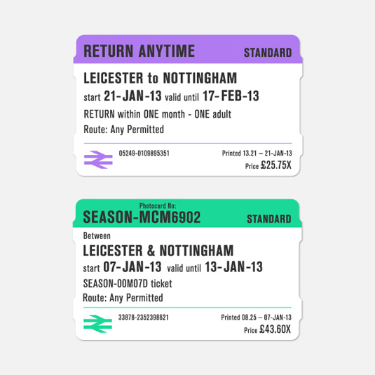
Londoners and those of us who are faced with a daily commute will be all too familiar with the traditional design of the National Rail ticket. It's not the most inspiring - boring typography and garish colours have ensured that many are unfazed when it comes to chucking it away.
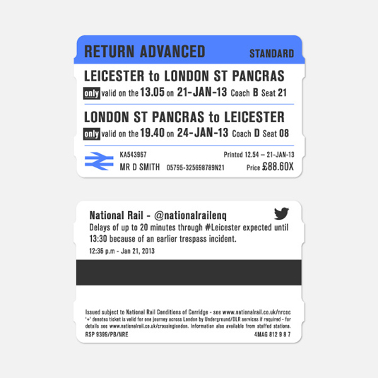
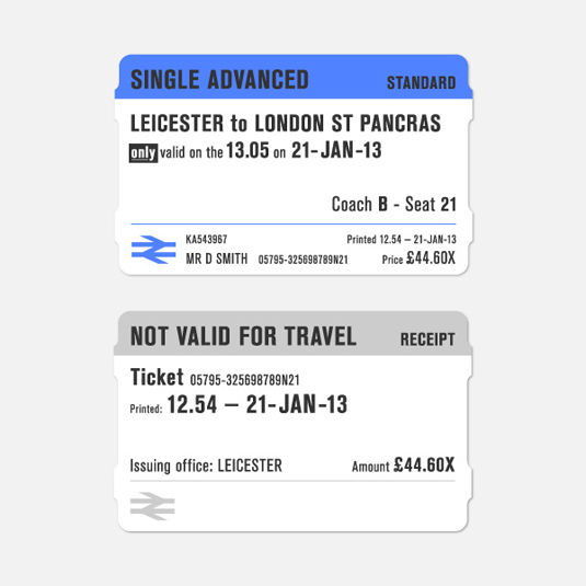
Fed up with the design, independent graphic designer David Rutter took it upon himself to give the ticket a much-needed facelift. He wanted to ensure that the ticket was easy to use; remove any irrelevant information to include more useful items and to distinguish each ticket type for ticket inspector. He also included live information taken from @nationalrailenqutilizing local hash-tags (#leicester etc) to show updates to services.
The ticket dimensions have remained the same but David has given the design a much-needed new lease of life with colour coding, better typography and social aspects. We'd love to see this making it into the mainstream travel services!
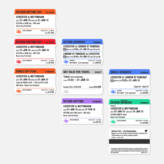
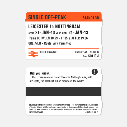
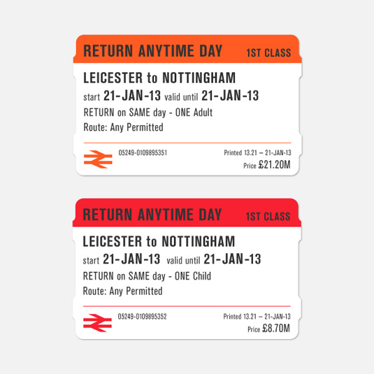
See more of David's work over on his website.
Like this? Read these!
- The best free web fonts for designers
- Useful and inspiring flyer templates
- The best 3D movies of 2013
What do you think of the redesign? Let us know in the comments box below!
Sign up to Creative Bloq's daily newsletter, which brings you the latest news and inspiration from the worlds of art, design and technology.

The Creative Bloq team is made up of a group of art and design enthusiasts, and has changed and evolved since Creative Bloq began back in 2012. The current website team consists of eight full-time members of staff: Editor Georgia Coggan, Deputy Editor Rosie Hilder, Ecommerce Editor Beren Neale, Senior News Editor Daniel Piper, Editor, Digital Art and 3D Ian Dean, Tech Reviews Editor Erlingur Einarsson, Ecommerce Writer Beth Nicholls and Staff Writer Natalie Fear, as well as a roster of freelancers from around the world. The ImagineFX magazine team also pitch in, ensuring that content from leading digital art publication ImagineFX is represented on Creative Bloq.
