New talent: Central Saint Martins 2015 show
This year's graphic design graduates offer up a light-hearted approach to design.
Sign up to Creative Bloq's daily newsletter, which brings you the latest news and inspiration from the worlds of art, design and technology.
You are now subscribed
Your newsletter sign-up was successful
Want to add more newsletters?
If you're looking for the best new graduates for your studio or agency, don't miss Computer Arts' New Talent special, issue 243, featuring the team's handpicked selection of the UK's best graduates – on sale 24 July 2015
Graduate show season is always an exciting time to spot new talent, with everything from apps to illustration foraging a new path in graphic design. We visited London's Central Saint Martins to take a look at the work of the Graphic Communication Design graduates.
Programme director Rebecca Wright was keen to stress the humour showcased throughout the projects, "It seems like this year, the students were more daring," she explained. "They just wanted to have fun; to ensure the viewers had a great time looking at their projects."
Here, we've picked 10 incredible projects from the show, which included D&AD winners, foam sculptures, rebrands and interactive animations.
Can't make it to the show? Be sure to check out the CSM stand at D&AD New Blood next week, and come and say hi to us on the Computer Arts stand too.
01. Ben Silvertown & Sidney Lim
- Course: Graphic Communication Design
- Project: Surge
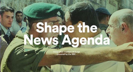
"Surge was actually a project that we decided to take on, on top of our university projects," explains Creative Director Ben Silvertown, who along with fellow graduate Sidney Lim, created 'Surge' – a social-voting-fuelled multi-device, multi-media platform, connecting young people to BBC content using a hybrid of tailored, live & popular feeds.
Giving themselves just 3 weeks – from conception to execution – the pair went on to win the D&AD Newblood award. "As designers we come from quite different backgrounds; Sidney's usually focused more on Systematic Design and Branding where as I’m more of a Digital Media/Advertising hybrid," Silvertown continues. "It allowed us to showcase our key skills and create something that neither of us could have done on our own."
Sign up to Creative Bloq's daily newsletter, which brings you the latest news and inspiration from the worlds of art, design and technology.
02. Stefan Iyapah
- Course: Graphic Communication Design
- Project: In the Blink of an Eye
The feel throughout the show this year had a sense of humour to it and graduate Stefan Iyapah's 'In the Blink of an Eye' project certainly had an air of fun to it, with an underlining message. "I wanted to show that when you're on the tube, you can miss something really important or funny in the blink of an eye," he told us. Using interactive technology, the hand-drawn animations change as soon as the viewer blinks their eyes.
"I think the piece has been very successful, and watching people's reactions, everyone connects with that feeling of being on a tube and looking up to find something different or missing stops without realising!" he says. "I love the fact that it is has been so universally understood no matter people's backgrounds." Using ink with a nib for each illustration, it's a seamless cross-over of creative talents.
03. Jonny Drewek
- Course: Graphic Communication Design
- Project: Pop
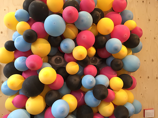
Performing stand-up comedy and spoken word throughout his degree, Jonny Drewek is keen to stress the influence of this upon his work. A brilliant example of the cross-over of humour into graphic design, Drewek collected the balloons from the Rio Cinema in Dalston. "The biggest challenge I faced was finding ways of fixing balloons together in the most reliable yet non-instrusive manner," he says.
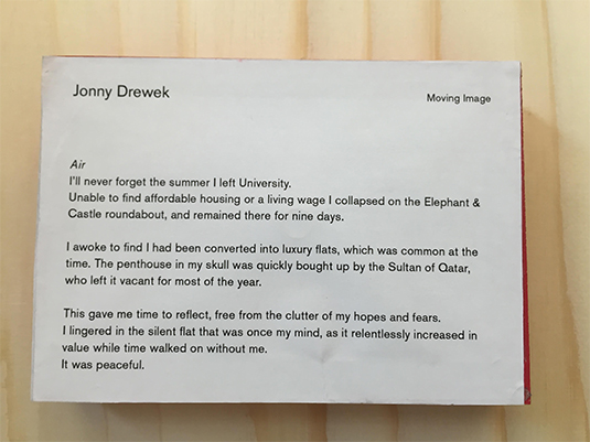
"As soon as I'd finished my piece I felt a sense of gloom as I realised that even now, my balloons were slowly deflating. Their collapse is really just an accelerated symbol of the relentless decay of all beauty. Choked up, I explained this to my gallery neighbour Nikki, who said she really had a lot of work still to do, and that I was getting tears on her Arduino."
04. Rebecca Thomson, Rachita Saraogi & Marina Viktorsson
- Course: Graphic Communication Design
- Project: Sisterhood
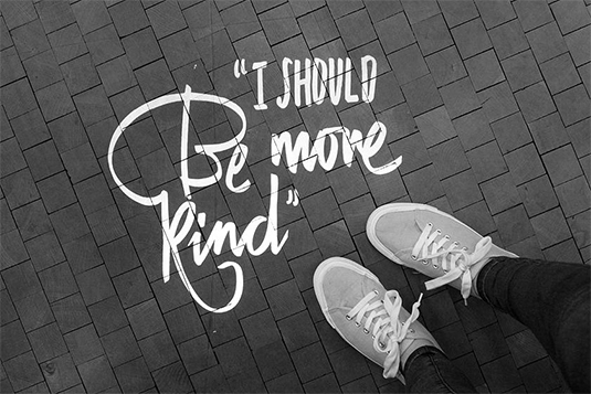
Collaboration can often bring out the best in your work, as three students found out with their final project, 'Sisterhood.' Striving to convince people of the lack of sisterhood between women today, Thomson, Saraogi and Viktorsson say the idea came from a very personal perspective.
"We have needed to constantly remind ourselves that it's always about the audience, in order to create something that will help people both physically and mentally," they explain. "We didn't tackle this as a branding project; the handwritten element of the design stems from our teenage memories of note passing in class and the graffiti in the girls' toilets."
05. Madeline Lim
- Course: Graphic Communication Design
- Project: bl'nk
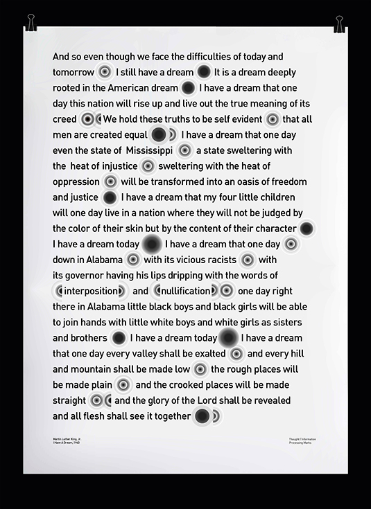
"bl'nk is a result of various experiments done in Blink documentation booklet,"explains Madeline Lim, a Singapore-born graduate. "It's a set of abstract punctuation marks, mainly inspired by Walter Murch's theory of human blink as an 'emotional punctuation'. Each punctuation mark in bl'nk behaves as a 'blink', a 'black-out' point for cognitive processing."
"I was constantly questioning myself: "How can I change the perception of blinking – something so natural, subconscious yet important and relevant to everyone?" she continues. I'm happy that it managed to visually interpret the idea of cognitive processing behind human blinks – something visually abstract, yet practical enough to be applied to different things/sources."
06. Wei Shao
- Course: Graphic Communication Design
- Project: Blank City
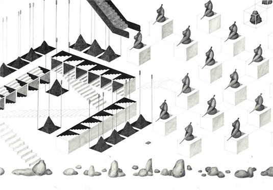
"The work is for people who feel sad, worried, scared, angry about the nightmare city we will have in the future," explains Wei Shao, who's 'Blank City' project was created through a series of pencil sketches. "The biggest challenge was how to position myself during the whole work, which is not only a piece of drawing, but also the way of thinking from research to the final outcome."
"I owned so many different roles through my project, as researcher, architect, writer and illustrator but I feel excited about what I achieved. The project was like a baby I had to feed, which accumulated all of my energy and emotions. Now is the time for the work to speak for itself."
07. Louis Grosperrin
- Course: Graphic Communication Design
- Project: Ündertåker
As shoppers across the world fill their homes with various IKEA purchases, Louis Grosperrin decided to poke fun at the obsession with his project 'Ündertåker'. Creating an animation and a physical frame, the project showcases an IKEA-like purchase for planning your own death. "The toughest part of the project was creating this environment around the screen, not necessarily enhancing the central piece, but adding a second dimension of playfulness and interaction with the viewer," he explains.
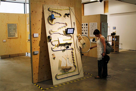
"Some people seemed to appreciate more the irony of the video and the absurdity of the whole, but a lot kept on playing with the ball channel and the wheel elevator, falling momentarily into memories of their childhood and tracking these falling balls with wide eyes, although where they were heading was quite obvious."
08. Persiis Hajiyanni
- Course: Graphic Communication Design
- Project: TERI DANCER
Continuing with the physical interaction theme, Persiis Hajiyanni created 'Teri'; keen to stress this dancing partner was not a 'puppet,' users were able to connect themselves to the foam made sculpture, with Teri becoming a partner of dance with every movement. "It was difficult when people started calling Teri a puppet because I could see what they meant, but I knew very well that it wasn't a puppet but I still didn't have the words to express how he was different to a puppet!" Hajiyanni explains.
"That was a tough point for me because I started doubting my work a lot and almost not seeing the point. Teri will become an extension of your body. He is more like a responsive sculpture, one that is willing and happy to get into a mutual dance, where both sides are influencing each other."
09. Sidney Lim
- Course: Graphic Communication Design
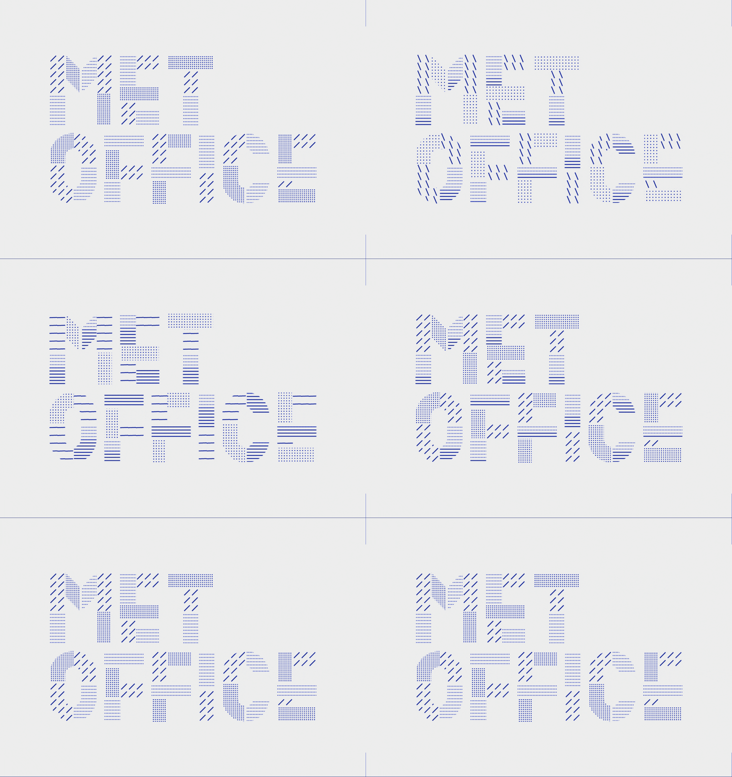
- Project: The Met office rebrand
"The project brief set for us is about designing a dynamic visual identity for a non-profit organisation of our choice, and when tackling this brief, a big challenge was really in establishing a good purpose and reason for the organisation to even have a dynamic brand identity," explains Lim. "The usage of a dynamic brand and logo needed to feel purposeful, appropriate and natural to the operations of the organisation, as the new brand would feel gimmicky should it not be rooted in reason and logic."
"I'm pretty happy with the final outcome, as I feel that it strikes a good balance between being futuristic and modern, while still retaining an air of authority that a huge organisation like the Met Office should have." See more images for the rebrand over on Lim's website.
10. Stefan Iyapah & Nikita Loknath Rao
- Course: Graphic Communication Design
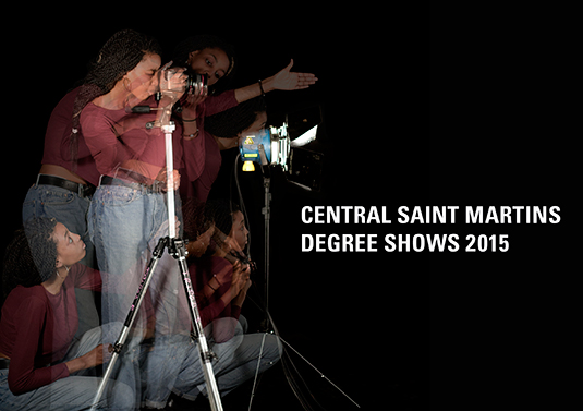
- Project: Central Saint Martins grad show branding
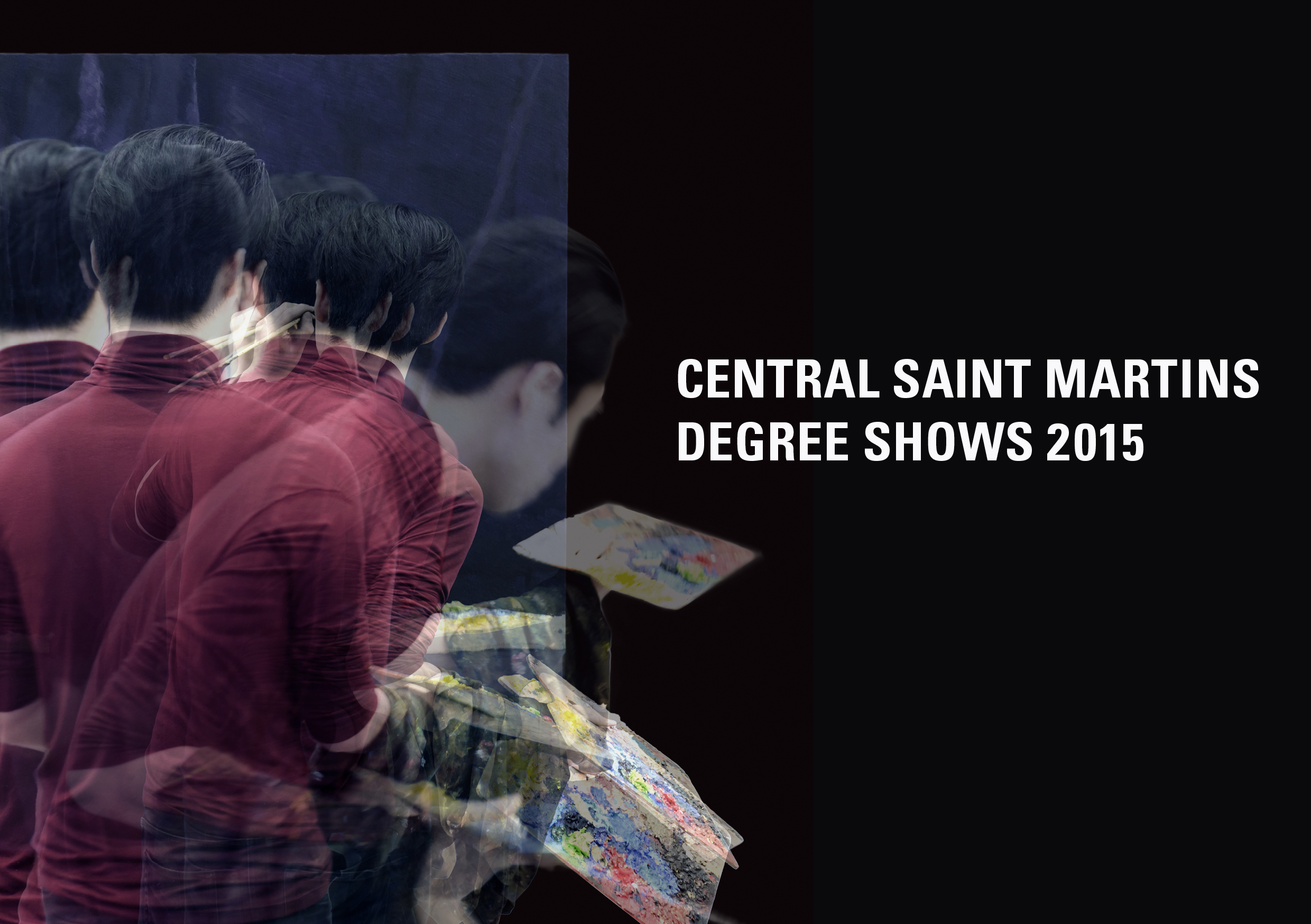
Tasked with creating the branding for the entire graduate show at Central Saint Martins, Iyapah and Rao were keen to showcase the wide array of creativity that happens throughout the school. "We had to have enough creative scope whilst uniting the wide range of different disciplines practised at Central Saint Martins," explains Iyapah.
Using long exposure shots, the pair were able to alter the transpiracy of each image to their liking. "The end piece is very satisfying as it seems to have communicated our core idea which was to represent the energy that goes behind all the work created at CSM," adds Rao.
Half-price Computer Arts subs offer!

To celebrate 2015 degree show season, you can get an incredible 50 per cent off an annual subscription to Computer Arts magazine. For £39 you'll receive 12 months of industry insight, opinion and inspiration, delivered to your door.
Plus: sign up by 7 July 2015 and you'll receive Computer Arts' New Talent issue, featuring an extensive guide to 2015's most outstanding design graduates.
Liked this? Try these…
- How create the perfect exhibition in a week
- 5 pro techniques for post production in Adobe Photoshop
- Free Photoshop brushes every creative must have

The Creative Bloq team is made up of a group of art and design enthusiasts, and has changed and evolved since Creative Bloq began back in 2012. The current website team consists of eight full-time members of staff: Editor Georgia Coggan, Deputy Editor Rosie Hilder, Ecommerce Editor Beren Neale, Senior News Editor Daniel Piper, Editor, Digital Art and 3D Ian Dean, Tech Reviews Editor Erlingur Einarsson, Ecommerce Writer Beth Nicholls and Staff Writer Natalie Fear, as well as a roster of freelancers from around the world. The ImagineFX magazine team also pitch in, ensuring that content from leading digital art publication ImagineFX is represented on Creative Bloq.
