A great way to grab attention – and keep hold of it – is to create a website layout that showcases your talents from the off (a decent website builder can help with the build). Ukraine web agency Vintage's site is a great example of this, drawing you into its VR design portfolio with an eye-catching combination of a pulsating logo built from glass particles and a lovely bit of glitch that activates on hover.
A simple glitch effect used sparingly can give your site a vital little extra bit of visual interest, and it's surprisingly easy to implement. Here's how to do it.
Got a complex website in mind? Make sure your web hosting is up to the task. And keep your design files safe in cloud storage.
Download the files for this tutorial.
01. Add code to the body tag of your page

Creating a simple glitch effect can be done in so many different ways. Here we are going to do it by having an animated GIF over the top of the text, which will be turned on and off in the display. First up, add this code to the body tag of your page.
<div id="holder" onmouseover="glitch()">
<div id="glitch"></div>
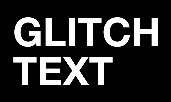
WEB
<br> PRODUCT-
<br> ION
</div>02. Styling the display
The content will use a specific typeface from Google Fonts called Work Sans. Grab the link from there and place it in your head section; then add the CSS to either style tags or a separate CSS file. The page is made black with white text and the holder is styled up for the text.
body {
  background: #000;
  font-family: 'Work Sans', sans-serif;
  color: #fff;
}
#holder {
  font-size: 6em;
  width: 500px;
  height: 300px;
  margin: 0 auto;
  position: relative;
}
03. Displaying the glitch
The glitch effect is going to be a background image that is placed directly over the top of the text. The important part here is that it is made invisible by reducing the opacity to zero so that it doesn't show up until the user interacts with the text.
#glitch {
  position: absolute;
  top: 0;
  left: 0;
  z-index: 10;
  width: 100%;
  height: 100%;
  background: url(glitch.gif);
  opacity: 0;
}
04. Hold everything
Add script tags to the end of the body section and create a cached reference to the 'glitch' div in the document. Then a variable named 'over' is set to false. This will be turned on and off when the user moves over the text.
var gl = document.getElementById("glitch");
var over = false;
05. Running the glitch
The glitch function is called when the mouse moves over the text. If the glitch is not running then the glitch visibility is turned on and it is turned off after one and a half seconds. You can experiment with this and use a random number to make it more unpredictable.
function glitch() {
  if (over == false) {
  gl.style.opacity = "1";
  setTimeout(function() {
  normal();
  }, 1500);
  }
}
06. Back to normality
The glitch effect should not stay on as it would be too annoying to the user, but as an interactive element it works well. Here, the code resets the opacity back to zero so that it isn't visible over the top of the text.
function normal() {
  gl.style.opacity = "0";
}
Get your ticket for Generate New York now

Three-day web design event Generate New York is back. Taking place between 25-27 April 2018, headline speakers include SuperFriendly’s Dan Mall, web animation consultant Val Head, full-stack JavaScript developer Wes Bos and more. There’s also a full day of workshops and valuable networking opportunities – don’t miss it. Get your Generate ticket now.
This article was originally published in issue 270 of creative web design magazine Web Designer. Buy issue 270 here or subscribe to Web Designer here.
Related articles:

