Create a mouse-controlled parallax background effect
Add an interactive background element to your website to create a perception of extra depth.
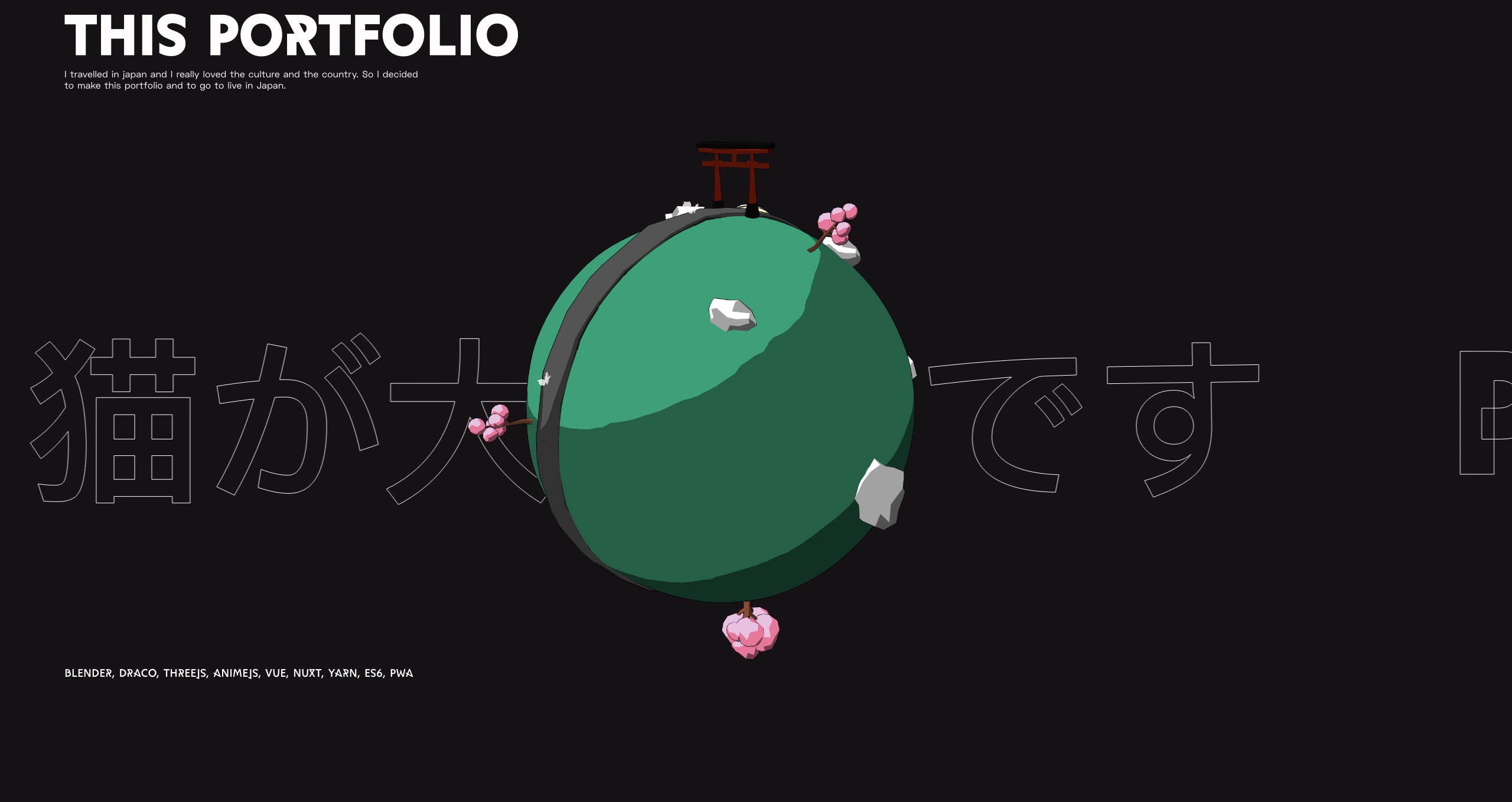
Sites with parallax scrolling continue to be popular for a reason: they create a pleasant and engaging browsing experience for the user. We've already looked at the best stunning parallax scrolling websites to inspire you, but what do you do if you want to make one of your own?
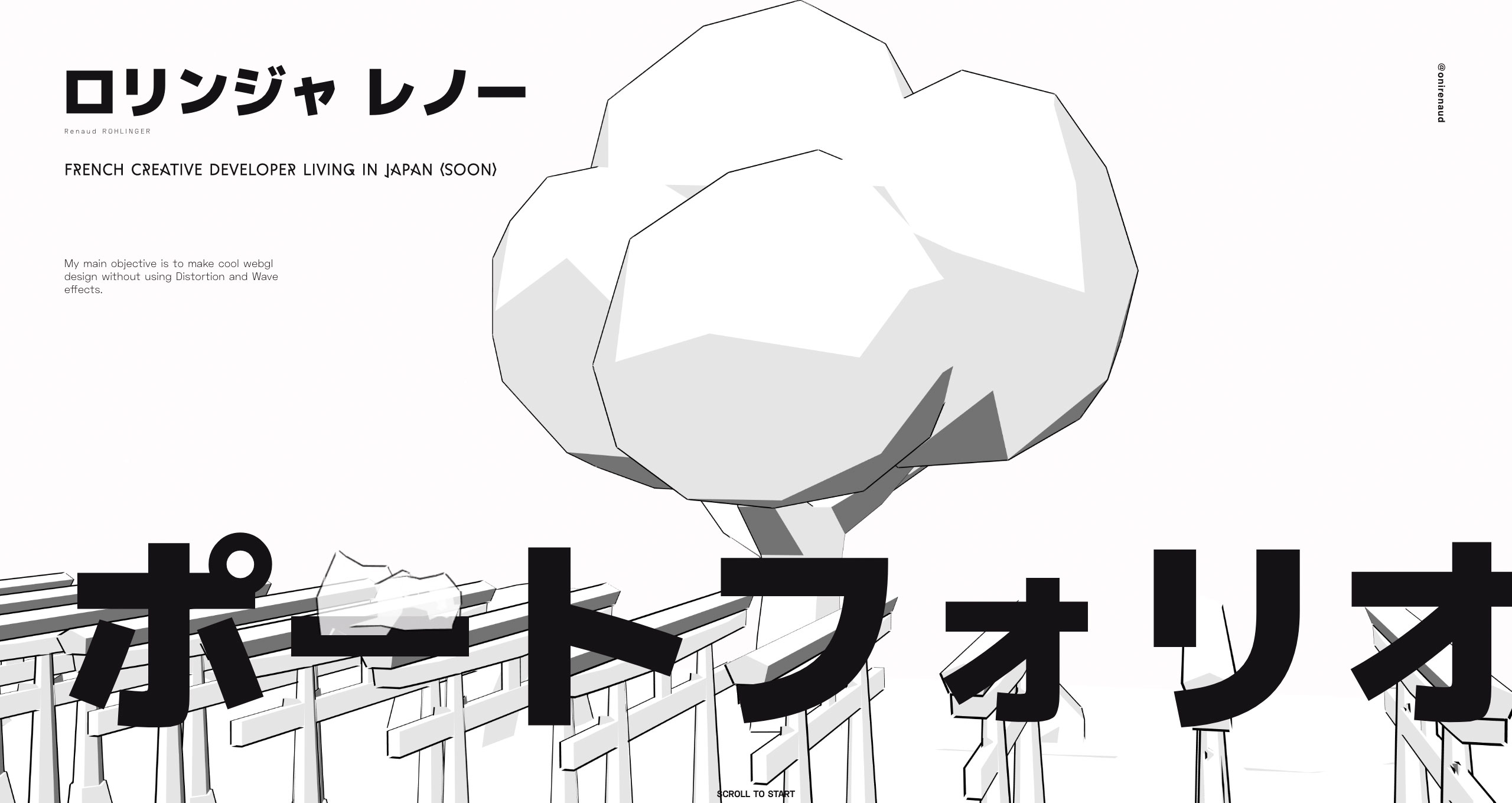
Luckily, French creative developer Renaud Rohlinger is here to show you the ropes for how to create a parallax scrolling background that you can control with your mouse. Check out the amazing results on his site, and then learn from Rohlinger himself below on how you can replicate the effect in your next project.
You could also try one of these website builders, and while you're considering your site performance, check your web hosting service is working for you. Got a media heavy site? Back up with reliable cloud storage.
Article continues below01. Define the HTML document framework
The first step is to define the framework of the HTML document. This consists of the HTML container that describes the document as having sections for head and body. While the head section links the external JavaScript and CSS files, the body section is used to define the page content elements in step 2.
<!DOCTYPE html>
<html>
<head>
<title>Parallax Background</title>
<link rel="stylesheet" type="text/css"
href="styles.css" />
<script src="code.js"></script>
</head>
<body>
   *** STEP 2 HERE
</body>
</html>
02. Identify the HTML content
The body content consists of display text and a div container using the data-parallax attribute. It is this container element that will be used for the parallax background, with each of its child elements to be styled with the required background images. In this example, the container has three image layers to be created from the child div elements.
<h1>Hello!</h1>
<div data-parallax>
   <div></div>
   <div></div>
   <div></div>
</div>
03. Create a CSS parallax container
Create a new file called styles.css. The first step in this file sets the default content colour to be white, and the settings for the parallax background container. Fixed positioning is applied to the parallax container to allow it remain in the same position as content scrolls over it. A default colour is applied as the page colour, while a negative z-index allows the container to appear under the page content.
html, body{
   color: #fff;
}
[data-parallax]{
   position: fixed;
   width: 100vw;
   height: 100vh;
   top: 0;
   left: 0;
   z-index: -1;
   background-color: #000;
}
04. Set up CSS parallax layers
Each of the image layers is set to use absolute positioning with a size to match the browser window. The parallax image in this example will be be based on a specific sized pattern that is set to repeat. You may choose to only repeat the image vertically using repeat-y, or horizontally using repeat-x.
Sign up to Creative Bloq's daily newsletter, which brings you the latest news and inspiration from the worlds of art, design and technology.
[data-parallax] > *{
   position: absolute;
   width: 100vw;
   height: 100vh;
   background-repeat: repeat;
   background-size: 20vw 20vw;
}
05. Use CSS background layers
While each of the image layers share the position and size settings defined in step 4, each layer uses a unique image. The nth-child selector is used to reference each individual element within the parallax container. The background-image attribute is used to draw two lines which creates a grid effect when tiled. Lower layers use darker colours to help provide a perception of depth.
[data-parallax] > *:nth-child(1){
   background-image:
      linear-gradient(to right, #333 1px,
  transparent 1px),
      linear-gradient(to bottom, #333 1px,
  transparent 1px);
}
[data-parallax] > *:nth-child(2){
   background-image:
      linear-gradient(to right, #777 1px,
transparent 1px),
      linear-gradient(to bottom, #777 1px,
transparent 1px);
}
[data-parallax] > *:nth-child(3){
   background-image
      linear-gradient(to right, #fff,
transparent 1px),
      linear-gradient(to bottom, #fff 1px,
 transparent 1px);
}
06. Perform JavaScript layer initiation
Create a new file called code.js. This step finds the parallax container and initiates each of its image layers with the data-index attribute that will be used in step 7. This must be performed from a function attached to the browser window’s load event, so that the code is only executed when the page’s body content is ready.
window.addEventListener("load", function(){
   var container = document.
querySelector("[data-parallax]");
   var childNodes = container.children;
   for(var n=0; n<childNodes.length; n++){
      childNodes[n].setAttribute("data-index", n+1);
   }
   **** STEP 7 HERE
});
07. Calculate JavaScript mouse movement
The effect relies on moving the images associated with each parallax layer in response to mouse movement. The parallax container identified in step 6 has a mousemove event listener attached, which triggers a function to reposition background images of the parallax layers whenever there is mouse movement. Each layer has a motion calculation based on the index number applied in step 6.
container.addEventListener("mousemove",
 function(e){
   var elms = this.children;
   for(var c=0; c<elms.length; c++){
      var motion = parseInt(elms[c].
getAttribute("data-index"))/10;
      var x = ((e.clientX)*motion)+"px";
      var y = ((e.clientY)*motion)+"px"; elms[c].style.backgroundPosition = x +
" " + y;
   }
});
This article was originally published in creative web design magazine Web Designer. Buy issue 290 now.
Related articles:
