Create collage effects in the browser with CSS
Make collage-style effects without messing about in graphics software.

Sign up to Creative Bloq's daily newsletter, which brings you the latest news and inspiration from the worlds of art, design and technology.
You are now subscribed
Your newsletter sign-up was successful
Want to add more newsletters?
If you've ever wished you could replicate the effects of a traditional collage maker in your website layouts, this is the tutorial for you.
The web design tutorial will look at three CSS properties: mask-image, clip-path and shape-outside. Even if you have used them, don’t worry. I’ll show examples that will help you create effects you probably haven’t seen on many websites.
Looking for a different type of tutorial? See how to make a photo collage in Photoshop. And for handy guides, see our pick of the top website builder and web hosting service.
Article continues belowMy biggest inspiration in terms of using the mentioned properties is traditional collages. I was wondering if was possible to create them in a web browser, without using any graphics editors or software. With the magic of CSS, it’s totally doable! Another bonus of creating them with code is having them scalable, animated and interactive. Before you start, make sure you have the following:
You will need:
- Your favourite web browser and developer tools – I recommend using Google Chrome since it supports all the features I use in this tutorial
- A code editor
- Assets such as images or SVG files – you can download the ones that’s we’re using in this tutorial here
Mask images that overlap text

Masking is the first feature I’d like to show you. It helps to build more creative shapes and layouts on the web by telling your browser which asset elements should be visible. Masking can be done in three different ways: using a raster image (that is in PNG format with transparent parts); CSS gradients; or SVG elements. Note that unlike a typical raster image, SVG can be scaled or transformed without a significant loss in quality.
What I especially like about masking is its ability to apply the same properties as for background – we can define a mask’s position, size and repetition, for instance, using: mask-repeat: no-repeat and mask-size: cover.
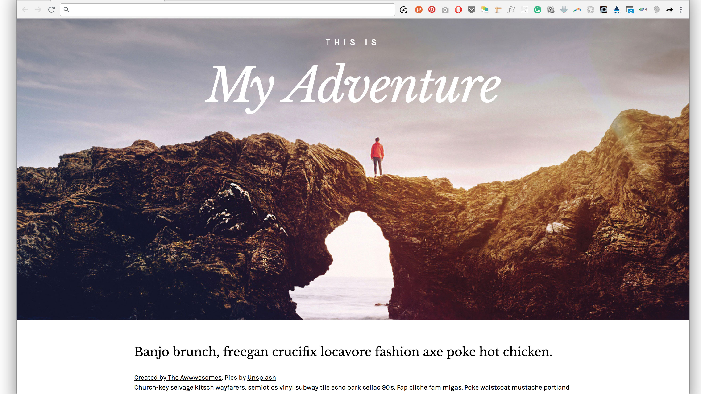
Thanks to CSS masking we can create more sophisticated effects on the web. One of them can be found in our example, where parts of an image cover some text; when a user scrolls up and down the page some portions of the text are shown/hidden. This gives the impression that the page title is located behind the mountains. To create this effect, some tricks are needed and the clever application of CSS masks will help us to achieve that.
Sign up to Creative Bloq's daily newsletter, which brings you the latest news and inspiration from the worlds of art, design and technology.
Let’s create a header with a selected background image and two headers inside. One of them will be the primary one (first level of heading).
<header>
        <h3>This is</h3>
        <h1><span>My Adventure</span></h1>
</header>
The text of the heading will be kept in the <span> tag. It’s not a common thing but, in this case, we’re applying masking to heading, not to the container.
header {
    width: 100vw;
    height: 80vh;
    top: 0;
    left: auto;
    background: url(../images/landscape.jpg) center top no-repeat;
    background-size: cover;
}
h1 {
    mask: url(../images/mask.svg#maskid);
    -webkit-mask: url(../images/landscape-mask.png)
center top no-repeat;
    mask-size: cover;
    -webkit-mask-size: cover;
    width: 100vw;
    height: 80vh;
    color: #fff;
    font-size: 100px;
    position: relative;
}
h1 span {
    position: fixed;
    display: inline-block;
    text-align: center;
    font-family: ‘Libre Baskerville’, serif;
    width: 100vw;
    top: 80px;
    font-style: italic;
}
Cut out images using CSS clipping

Let’s explore another example and find out more about CSS clipping. In short, clipping defines which image area should be visible. Clipping is similar to chopping pieces of paper. The shape’s boundary is called the clip path: anything outside the path will be hidden, while anything inside the path will be visible. With a clip path you can remove background from your image, instead of using heavy PNG files. For this we need to already have prepared the shape for the cut out.
The goal in this exercise is to clip the plant out of the image, removing the background. We can copy SVG code from our file and paste it to an HTML document. The clip path has to be placed within <defs> </defs> tags.
<svg>
  <defs>
      <clipPath id=”clip-plant”>
     <path d=”M293.2,524.8c0,3.3,0… [and more numbers]”>
     </clipPath>
  </defs>
</svg>
<div class=”plant”></div>
Later we can easily reference the path defined in the SVG code by adding a URL function.
.plant {
    height: 700px;
    background-image: url(../images/plant.jpg);
    background-size: cover;
    position: relative;
    background-repeat: no-repeat;
    -webkit-clip-path: url(“#clip-plant”);
    clip-path: url(“#clip-plant”);}
Think outside the box

Who said that text containers always need to be rectangular? Content can be cut into all sorts of different shapes by applying shape-outside and shape-inside properties that enable you to wrap your content around custom paths in CSS.
So, how does it work? Simply apply shape-outside to the given floated image or container. It is important to note that the float property and the dimensions of the element – either height or width – have to be defined otherwise it doesn’t work. You can use the url() function, which enables the shape-outside property to define an element shape based on the path from an SVG file.
.a-letter {
    background-image: url(‘../images/gold-bg.jpg’);
    background-size: 1000px;
    -webkit-mask-image: url(‘../images/a-letter2.svg’);
    -webkit-mask-composite: source-out;
    -webkit-mask-repeat: no-repeat;
    -webkit-mask-size: 300px;
    width: 100%;
    height: 60vh;
    position: relative;
    top: 0px;
    background-attachment: fixed;
    float: left;
    display: inline-block;
    width: 310px;
    shape-margin: 23px;
    shape-outside: url(‘../images/mask.svg’);
}
The shape-outside property doesn’t change anything about an element other than its float area. This means that any borders and background images will not adapt to the shape created on the element. This is the reason why we also need to apply the mask-image property – to cut out the background of the element to match the defined shape.
One important thing to note is that the shape-outside feature works only with CORS-enabled files. CORS stands for Cross Origin Resource Sharing.
In this particular case the best way to view it is to use localhost, otherwise it won’t work if you just open it in your browser.

When experimenting, please do bear in mind that not all of the mentioned features are supported by all browsers, so it’s worth checking them out here. The latest example doesn’t work in Firefox, Opera and IE but hopefully it will be available soon for all the browsers. And if you've got a lot of documents to store for your project, keep them safe in secure cloud storage.
Read more:
