Discover underpainting and how to make best use of it
Follow these steps to start using acrylics and oils to create an underpainting.

Underpainting is a painting technique made popular in the Renaissance in which you create a monochrome tonal rendering of a work before applying the full range of colours. Underpaintings are most often executed using browns, such as umbers and siennas (known as Imprimatura), or black-and-white (known as Grisaille).
The underpainting is a fairly complete tonal rendering of the final painting. This allows you to concentrate entirely on the tonal relationships of your composition, without having to worry about colour. It can be overwhelming trying to figure out both the tonal and colour relationships in a painting at the same time.
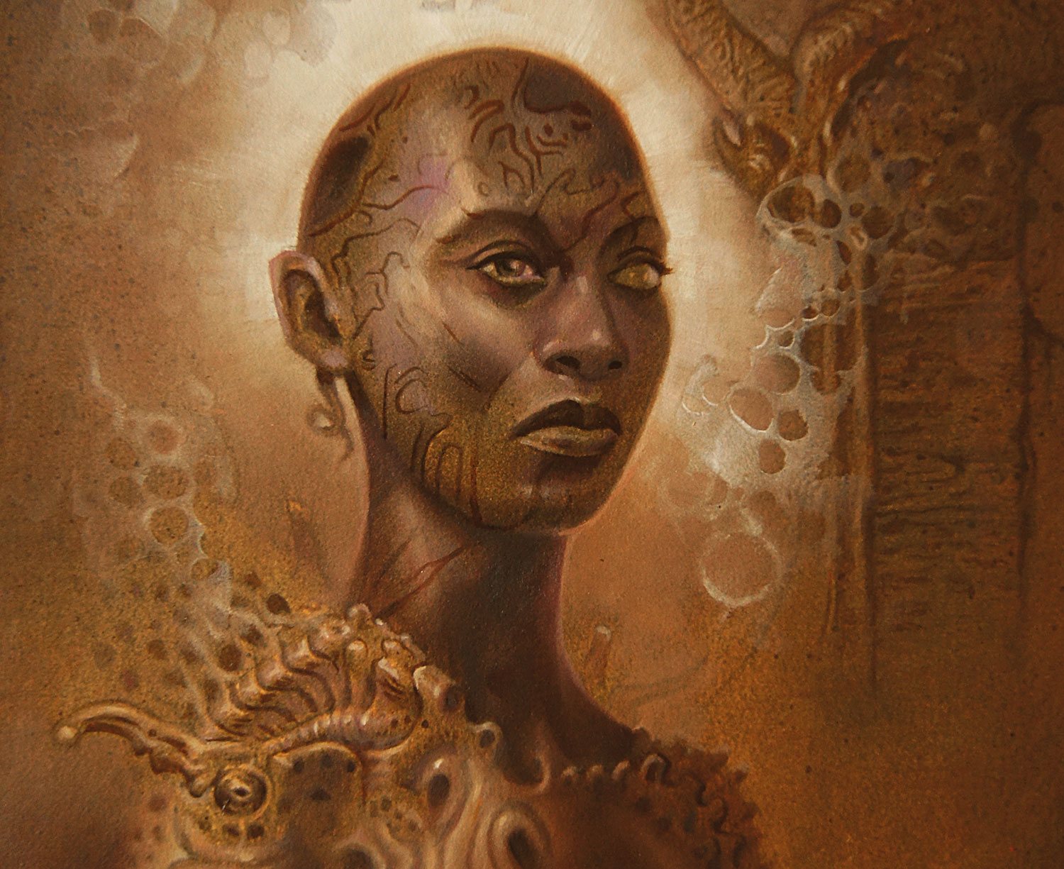
Once the underpainting is complete, you can apply thin layers of transparent colour (glazes) over it to complete the work. The build-up of layers of glazes allows light to penetrate the paint layers and bounce back. This creates a luminosity of colour that is not possible with opaque painting in which the ground is completely covered with thick paint. Dutch masters during the Renaissance, it was said, used dozens of layers of glazes to achieve their rich, lustrous colours.
Article continues belowWhen creating an underpainting, keep in mind that oil glazes can be applied over water-based media such as acrylic or watercolour, but the reverse is not true. Water-based paints are unstable on top of oil paints.
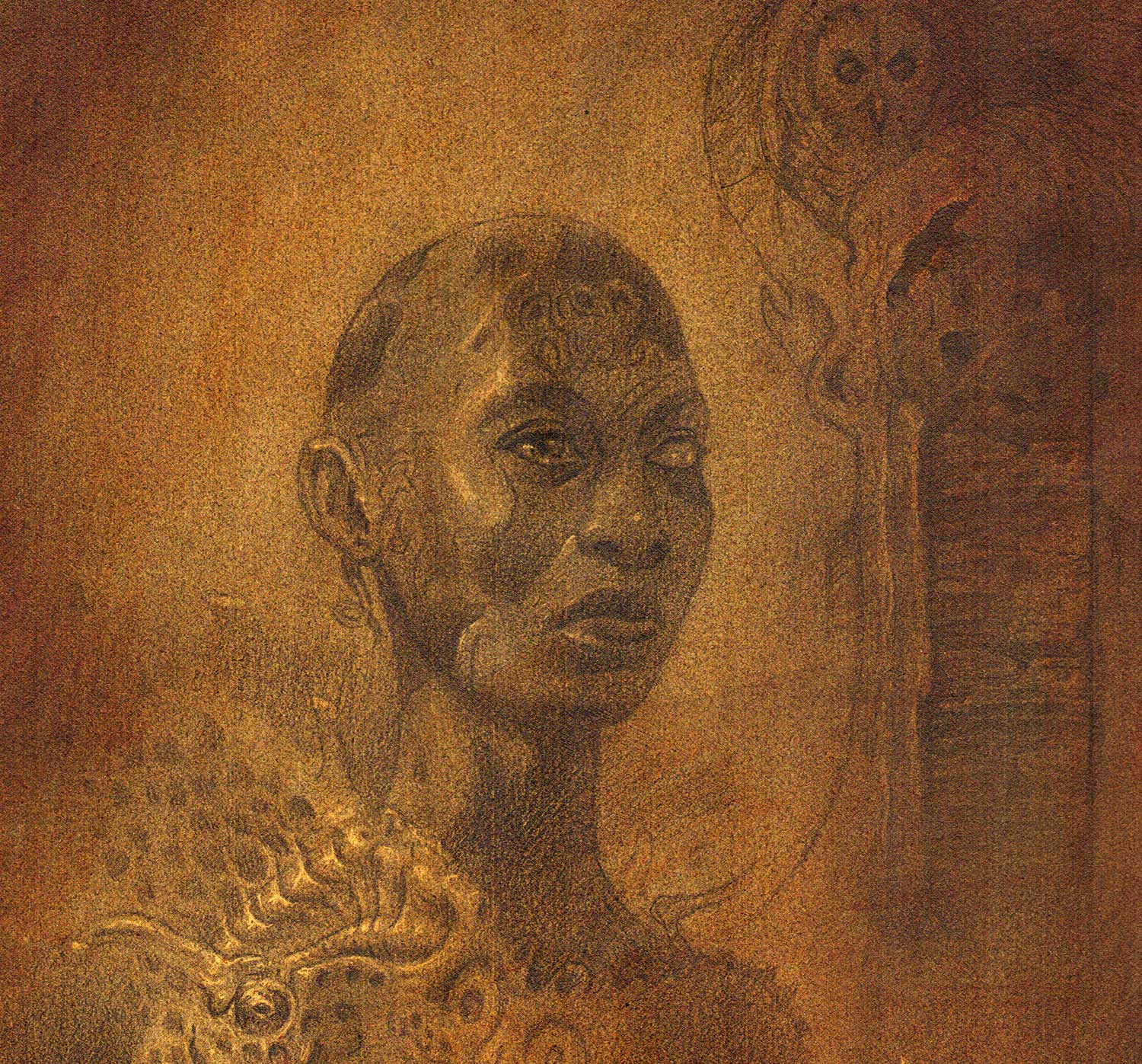
01. Middle tones

I begin by applying a thin layer of the best acrylic paint (in this case a mixture of Burnt Umber and Raw Sienna) over the entire surface. This creates a middle tone for the painting. The general rule to bear in mind is to keep the shadows transparent and the highlights opaque. This will enhance the 3D appearance of forms when colour is applied.
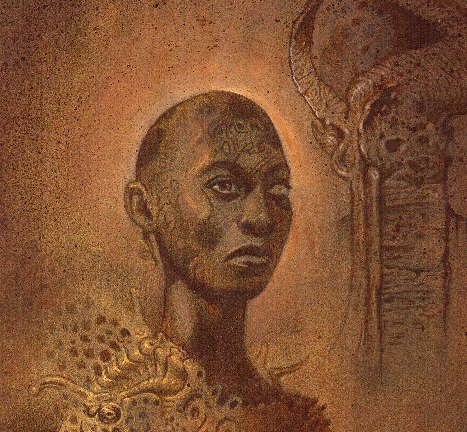
02. Build up the darks

Staying with acrylics, I build up my darks with thin washes of Burnt Umber. This allows me to figure out which area of the painting will have the darkest values. Then I can add lighter values to the piece by introducing white into my Burnt Umber. The white will make the paint more opaque.
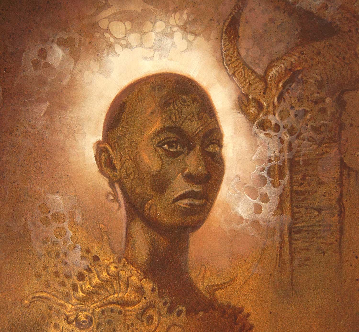
03. Bring in some contrast

Switching to oils (remember, oils over acrylics is good), I make the area around the head intensely bright. By leaving the head relatively dark, I create a high-contrast relationship that will draw the viewer’s eye to the head. With this tonal relationship decided, I adjust the tones throughout the rest of the painting to establish a pleasing tonal hierarchy.
Sign up to Creative Bloq's daily newsletter, which brings you the latest news and inspiration from the worlds of art, design and technology.
This article originally appeared in issue 1 of Paint & Draw; buy it here!
Related articles:

Jim Pavelec was a freelance fantasy illustrator for more than 15 years. Over the past few years he’s transitioned into creating dark surreal fine art, and spends much of his time working on illustrating his interpretation of the Ars Goetia grimoire.
