
ArtRage is a popular digital art tool (for more, see our ArtRage introduction) In this tutorial, I'll take you through each step of creating a portrait in ArtRage 5, from making a new file and loading up a reference image, sketching out initial shapes and forms, through to blocking in and adding thicker textured paint using ArtRage's Palette knife, and utilising custom brushes to create more texture and movement. I'll also show you how to add some final flourishes, such as grunge backgrounds and paper textures, as we export the ArtRage painting into Photoshop.
I like to echo my approach to traditional art techniques in my digital process, so the process shouldn't feel too alien or unusual if you come from a fine art background. The workshop below and accompanying video (above) show how the screen really does become a canvas before you. The portrait I'll be working on is of an old man in an abstract colourful setting, so I'll keep my paint loose and choppy to create vibrancy and interest in a modern manner.
Download Paolo Limoncelli's custom ArtRage brushes.
01. Choose your subject matter

Unless you've been commissioned to paint someone's picture, it can be a bit of a struggle for artists to source royalty free images as references. No need to worry: there are a range of websites that have stock art ready for you to use. This workshop uses high-resolution photo references of an elderly man, origami and tree blossom from the fantastic free image website Pixabay.
02. Create a new file in ArtRage

In ArtRage 5, I click File in the top-left corner. A drop-down box will appear with various options. I press New Painting and a box appears. This is where you set your dimensions and what surface you'll be working on. I select the Print Size tab and set the dimensions for my painting, which are 232x310mm. I make sure to change the default 72 pixels/inch setting up to 300, which will ensure a high-resolution image for our end painting.
03. Select the canvas texture

The next stage when creating a new file is to click the box showing the brushstroke across a texture surface. This will open up a new window in which the canvas colour, texture, roughness and lighting can all be tweaked. This will alter how the paint flows and adheres to the surface, so investigate which could suit your style. For this workshop I'll be using a lightly textured paper, which adds a nice, light grain to the paint flow.
04. Import a reference photo

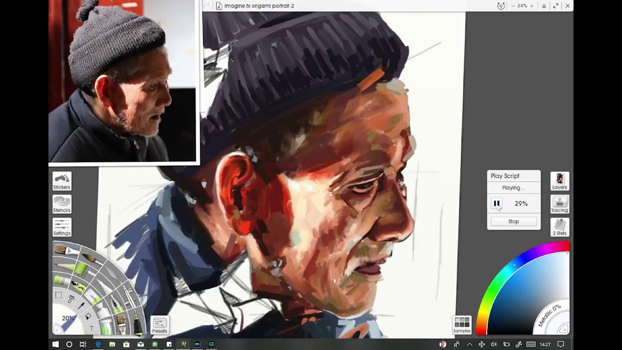
ArtRage enables you to import your reference image to sit on top of your workspace and be moved around, as if you were copying from a photo on your desk. Simply select Refs on the right-hand side of the screen and, in the new box that appears, either click the file image or the Post-it note. A new window will open where the downloaded/saved image of the old man and origami reference can be found and placed. Double-click the image and it now opens in ArtRage.
05. Draw the pencil sketch

I select the custom brush in the Tool picker and go to the Daub brushes. Here, I pick the Simple 2B Pencil brush because this works well for quick and rough drawings. I don't worry too much about shading and texture during this sketching stage. I draw in guidelines for where the top and sides of the head will be, along with the neckline, shoulders and main features. There's no need for masses of detail because this will be painted over in the next stage, but defining the areas of light and dark and values helps the painting process.
06. Duplicate the pencil layer

A helpful way of keeping track of your painting and not losing sight of your shapes and lighting lines is to duplicate your initial sketch layer and to place it on top of your work. In the Layers tab on the right, click the small file image on your pencil layer to open a menu, select Duplicate Layer and your pencil sketch will be duplicated on top in a new layer. Tap the black dot in the duplicated layer and set the Transparency to 50 per cent so that the lines don't interfere too much with your painting, but still act as a guide. Remember to delete or hide this layer at the end or when your painting is fleshed out enough to work without it.
07. Add layers

Before moving on to blocking in colour, I need to create a new layer for the paint. This is the main difference between fine art and digital art as usually paint would be directly applied over these lines on a canvas. However, painting digitally gives you the freedom to choose to keep these lines on a separate layer, in case they need tweaking at a later stage. Much like in Photoshop CC, I select the Layers box on the right-hand side of the screen and click the plus button. The new layer is now created and can be dragged in between the two pencil layers, ready to work on. I call this layer base something suitable: 'paint' or 'blocking in'.
08. Block in your colours

I don't want to add too much paint on the canvas during this blocking-in stage, so I select the Oil Brush tool from the Tool picker. Using this tool stops the painting from becoming muddy and hard to manage, and puts into the practice the 'fat over lean' rule that traditional artists follow. Next, I click the brush's Settings box and pull the slider labelled Loading right down to between four and nine per cent. This now gives me a dry brush with which to roughly paint in the tones, highlights and shaded areas, adding definition and structure to the portrait. The Palette Knife tool can be used to further blend the paint to fill in any gaps.
09. Develop an abstract background

I place a new layer underneath the blocking-in paint layer. Then I select the Normal Brush tool, enlarge it to over 300 per cent and build up a loose covering, using bold strokes and varying shades. Next, I select the Palette Knife tool with no Loading on it and push the malleable paint around. For the abstract blossom, I create a new layer and loosely paint in bright pinks and reds before selecting the Daub Impressionist 01 custom brush to fracture the paint across the canvas. The harder you press, the bigger the paint splinters. This creates some wonderful effects.
10. Make use of some custom brushes

ArtRage has a tool that enables you to create any kind of texture or brush. These textures can flesh out a portrait or scene and add vibrancy and movement. Either experiment with the custom brush designer, use the stock ArtRage brushes and textures, or download a set like the Daub Brushes by Paolo Limoncelli, who's kindly allowed us to include them with this workshop's resources. I use the Expressive Bristle Gouache brush for the skin, which enhances the nature of the wrinkles and builds up the chiaroscuro across the face.
11. Create a raised brushstroke texture

Unless you've loaded your brush with paint in the previous stages, your work could be a little lacking in 3D textures. Here, I create a new layer and drag it down to the bottom of the layers, where it's underneath everything else. Any thick paint or texture put on this layer will now cause the paint on top to rise and bobble. This quickly adds depth and chunkiness to the brushstrokes above.
I select the Normal Oil brush and raise the Loading to between 20 and 30. I follow the strokes that are above it and paint in these areas, causing them to raise as if painted by a real oiled brush. This can bring the work alive under close scrutiny and when it's printed out for display.
12. Save and export

It's always good practice to save the artwork throughout the painting process, just in case the app crashes! To do this is easy: simply click the File button at the top of the screen and click Save Painting as. Then name the file as you would a file on a computer. Once named, click the Save button as you work.
When I'm finished in ArtRage, I can choose to export my image as a JPG, PNG or PSD. Because more work needs to be done on the painting in Photoshop, I select the Export Image File option and in the open window drop-down I click PSD. The painting is now saved as a Photoshop file, ready to be manipulated and tweaked.
13. Apply a base texture in Photoshop

Although the ArtRage painting is already on a paper texture, it can be further enhanced using stock textures and grunge elements in Photoshop. I head to Pixabay and search through its selection of textures and surfaces, choosing a wall texture with white and black paint on it to fill in the lower areas of white in the painting. I open my saved Photoshop file and drop the wall texture on top of it, stretching it to fit. I drag this layer to the first layer above the paper layer at the bottom of the layers and adjust it to suit, deleting any unwanted areas that are visible.
14. Final paper texture overlay

To keep the image from looking too stark and lurid, as well as to enhance the realism of the piece, I place a paper texture on the top layer. Again sourcing from Pixabay, I drop the Ivory Off White paper image on to the painting in a new layer. I stretch it to fill the canvas and click Multiply in the layers tab. Then I adjust the Transparency to around 50 per cent, so as to subtly show the paper texture and warm the colours a little. The painting is now complete and can be saved and shared with the world.
This article was originally published in issue 168 of ImagineFX, the world's best-selling magazine for digital artists. Buy issue 168 here or subscribe to ImagineFX here.
Related articles:

