Recreate a manga classic
Use colour, contrast and composition to create a striking Akira-inspired image.

Sign up to Creative Bloq's daily newsletter, which brings you the latest news and inspiration from the worlds of art, design and technology.
You are now subscribed
Your newsletter sign-up was successful
Want to add more newsletters?
I've been a huge manga fan since childhood and it's impossible to hide the influence that passion has on my art. In my quest to paint powerful and dynamic images, I've learned a lot about how to draw manga from my favourite artists, through observation, and trial and error.
Yet as illustrators we can also make use of a range of visual techniques – composition, colour, lighting, perspective – to help us achieve such goals. People rarely spend more than a few seconds looking at something before moving on. So in the case of art that also serves a commercial purpose – such as a magazine cover – it's even more important to ensure those techniques are all working to create an eye-catching composition. It may feel overwhelming at times, but the trick is divide up the workflow, focus on one step at a time and solve any problems as they arise.
Because it's a static medium, I always try to create dynamism by playing with and exaggerating these techniques. Use of complementary colours, diagonal shapes and forced perspectives are some of the elements I repeatedly use in my work and I'll talk about these and more in this workshop on creating a manga-inspired cover image for ImagineFX.
Article continues belowFrom the initial rough sketches, creating more detailed line art, adding colour and final touches, I'll dive into this neon world to explain you my choices during the process and pass on some tips or observations that hopefully will help you in your own work. Watch my video above and follow the steps below to discover my tips.
Download brushes to use in this tutorial.
01. Look for inspiration
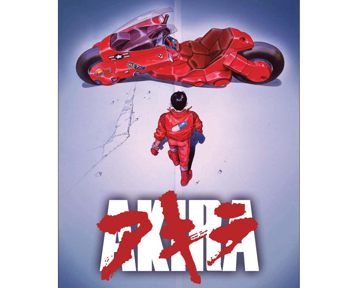
Before I begin sketching I always look around for some reference material. Films, photographs or any other media can help me to generate a raft of original ideas. I'm always trying to make something fresh and different in my art. Having said that, this piece is meant to be a tribute to the manga classic Akira, but I'll also include references to some of my other favourite manga series.
02. Produce quick thumbnails
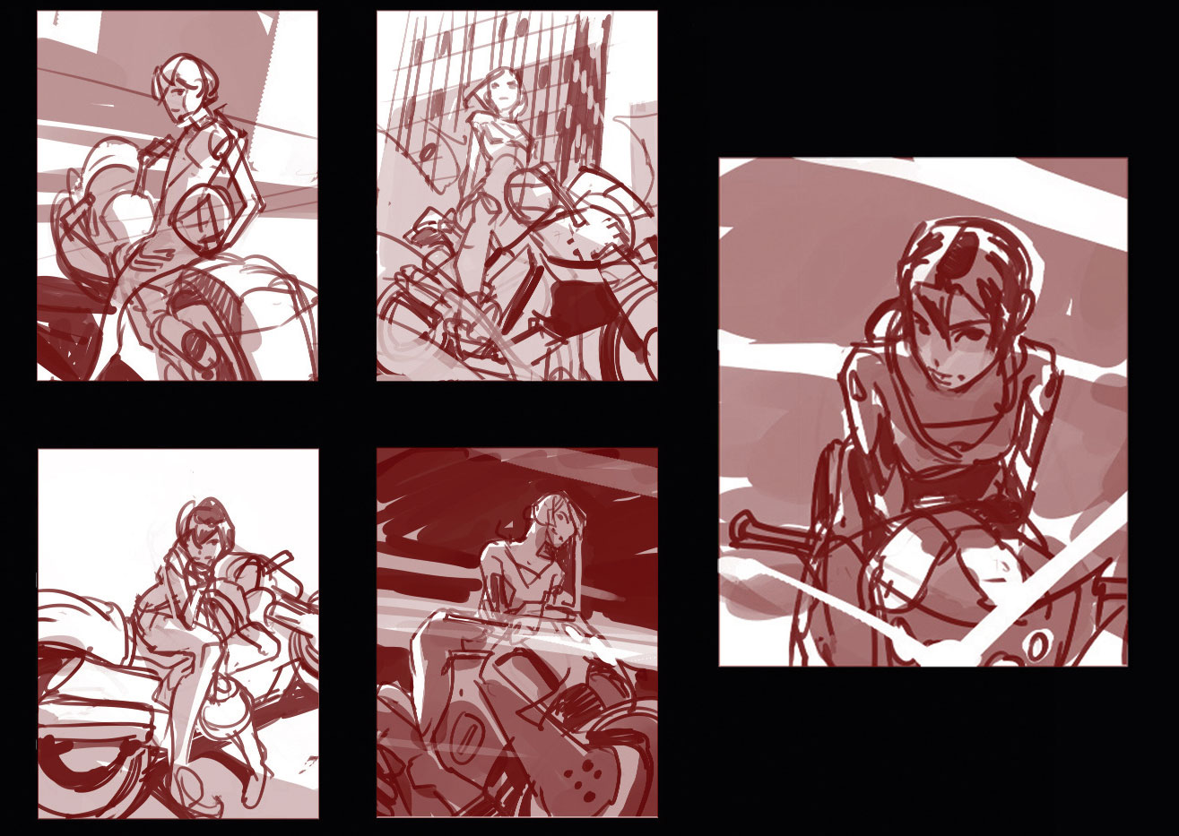
While the premise is simple – a woman on a motorbike – there's plenty of potential for introducing different points of view. Those sketches work as a brainstorming session, and as well as arranging elements differently, I try to work with different emotions on each one, too. Black, white and a mid-tone are all the colours I need at this point, which make things simple yet readable. Those sketches are like the skeleton of the image, and the composition must work even at this early stage. I place my lighting and cast shadows with the narrative in mind, and if I'm lucky I'll start having some ideas for how to colour the scene later on.
Sign up to Creative Bloq's daily newsletter, which brings you the latest news and inspiration from the worlds of art, design and technology.
03. Refine the sketch
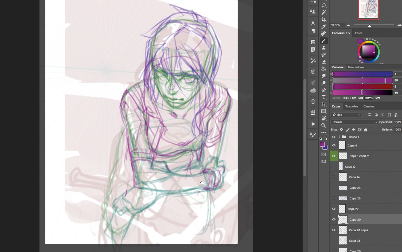
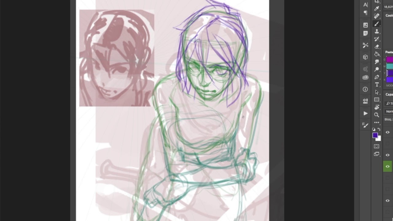
It's time to draw over the sketch and place details, just as if I were using a lightbox. I focus on anatomy and perspective, using a one-point perspective grid that I rotate slightly to add some dynamism to the scene. Then I define muscles and the main lines of the character. I draw her clothes, hair and other details in a different colour, so as not to lose sight of the character's anatomy.
04. Work on background and balance
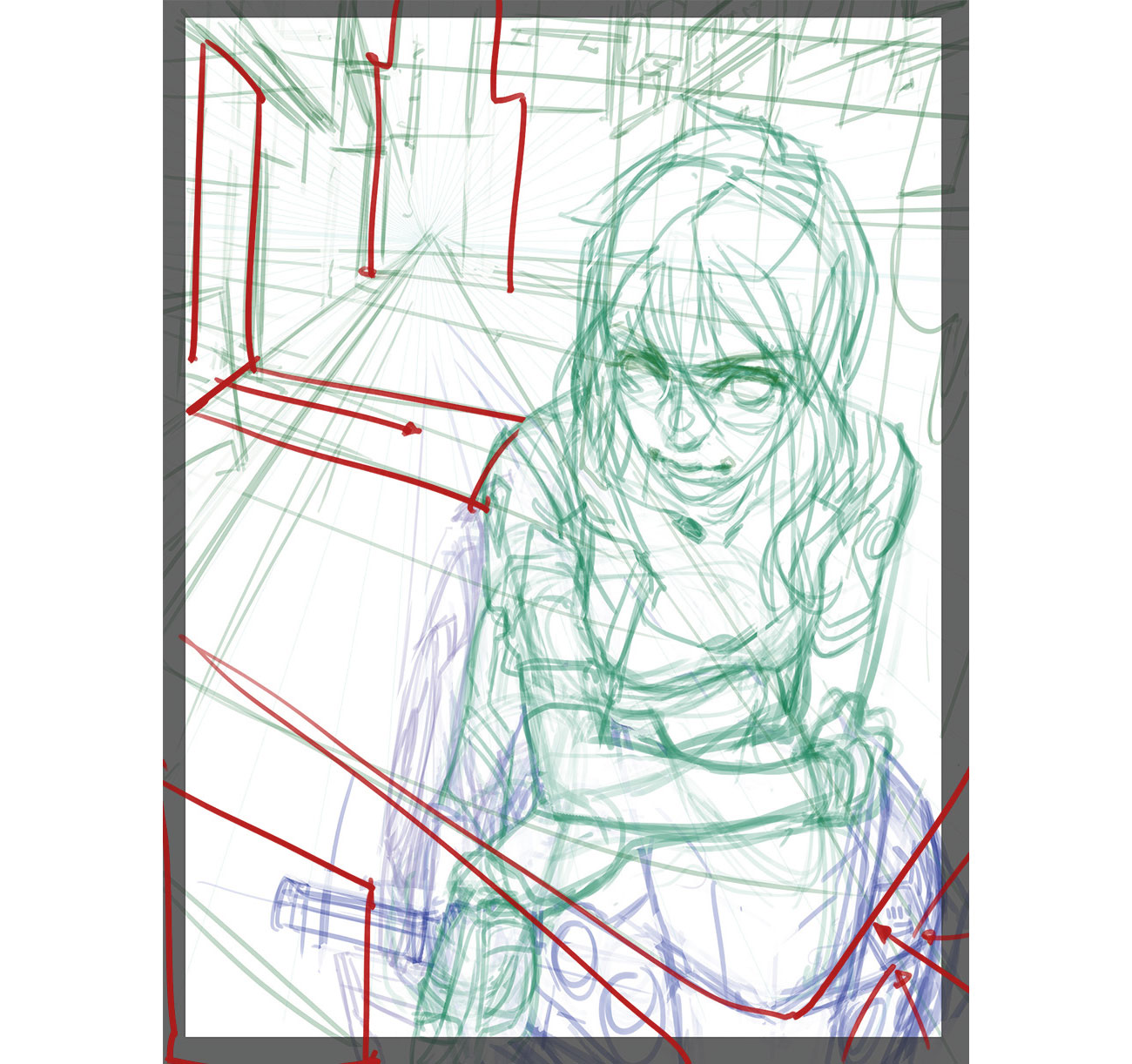
Placing the character on the right can make the image look unbalanced. To fix this I place details in the street behind using some night Japanese street images as reference. I place a huge light source on the store at the left, which creates a key diagonal line going towards the character. The vertical street lines and the motorbike headlight help to balance out the overall composition.
05. Final line art
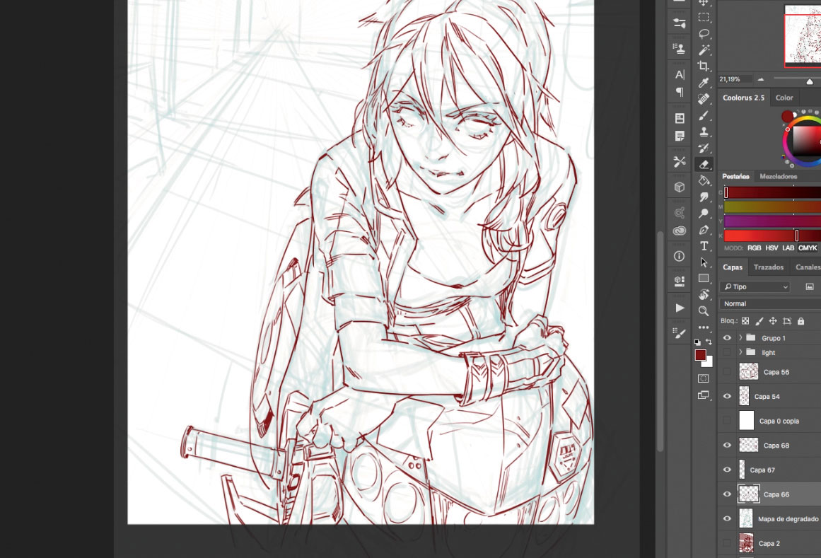
When everything's set in place, I draw over the rough sketches lines from before and detail the character and other elements. The background will be detailed using only colour, but line art will remain visible on the character and foreground, so I keep them clean on different layers. This line art will play a huge role in depicting the classic manga look.
06. Don't overwork, simplify
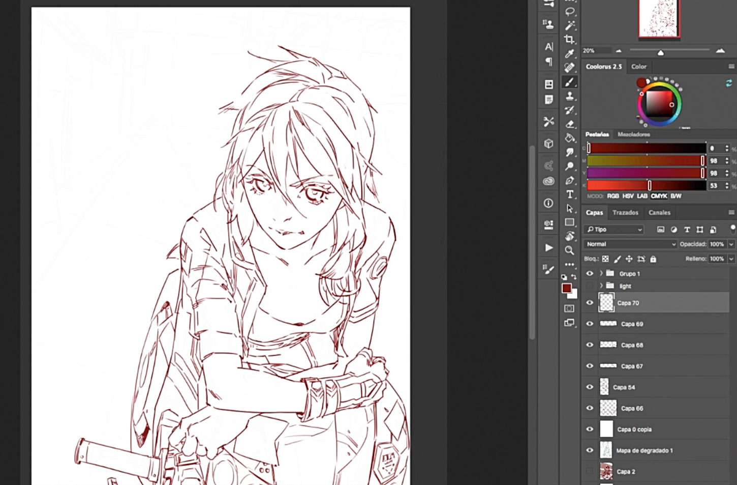
Sometimes it's tempting to start detailing early on in the process. The results are often messy. Instead, try to be straightforward and simplify. Here, the basic structure and anatomy are in place, but it doesn't mean they need to be visible on the line art. The structure lines have done their job and now it's time to build on them. I simplify objects like her nose and hands into just a few lines.
07. Use clothing and colour to define your character
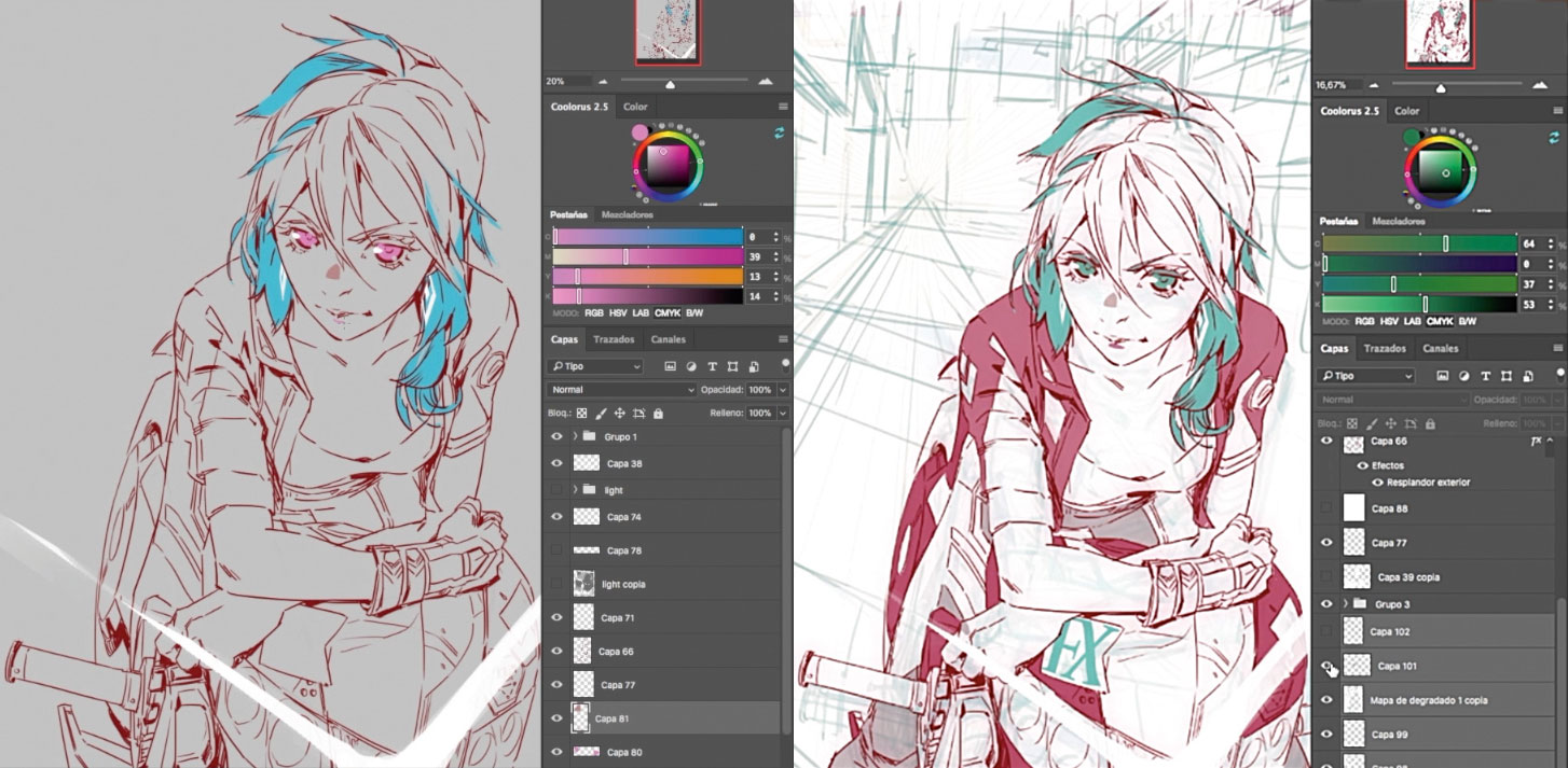
On a portrait piece like this it's important to define the character. The clothing design, colour scheme and eyes all help to add depth to our young biker. I decide to portray her wearing a leather jacket and trousers with plenty of triangles motifs and diagonals. You can also see these shapes in her hair. Red-coloured elements on her clothes and face convey the impression of strength, despite her friendly expression.
08. Think about lighting
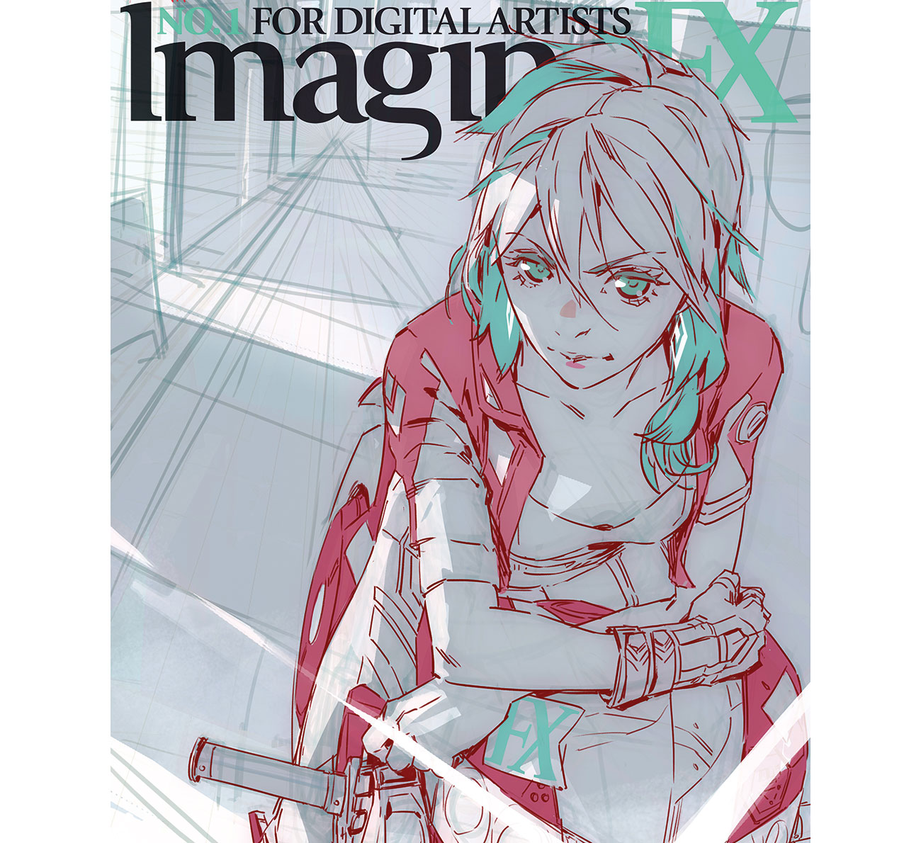
The idea of setting the scene on a neon-lit street at night was decided early on, but now it's necessary to detail the concept and place highlights and shadows more precisely. I pay attention to the position of the ImagineFX logo, too – it's important to keep it readable. I decide to leave that area in dark tones and free from neon lights, enabling the logo to pop out in white.
09. Establish general colour schemes
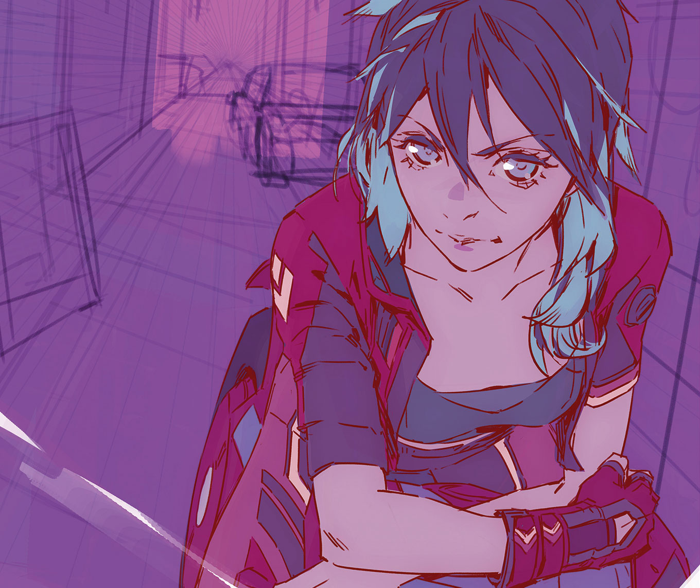
I now make my first colour decisions. Depending on the complexity of the illustration, I usually create a full colour key in a smaller duplicate of the file. However, because there's just one big character and I've got a clear idea of the image I don't need more than my previous light and tone study. Filters like Image > Adjustment > Color balance help me to keep all the tones as a purple hue.
10. Bring life to the world
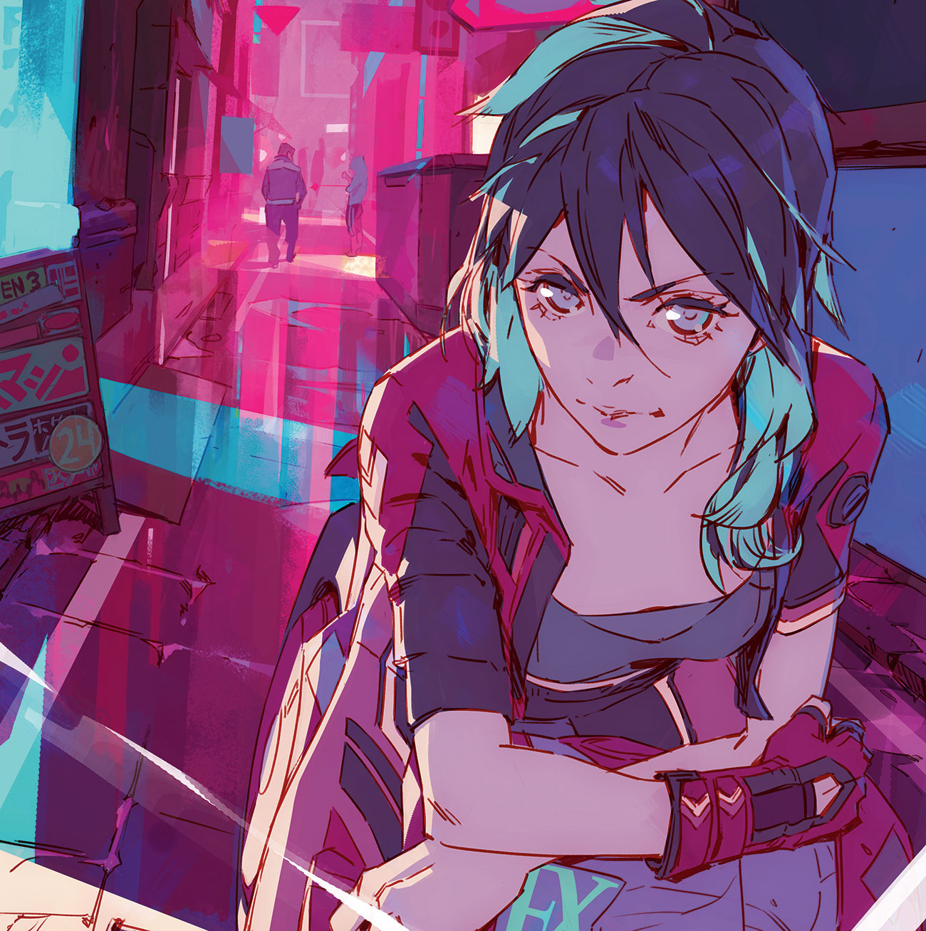
To add realism and life I bring plenty of details into the background: store signs, damp pavements, people… I imagine myself in the scene and try to express on the canvas what I would feel as I walk through that environment. Exaggerated lighting or a sense of weather are always good tools to employ when creating visual interest.
11. Work on volume and rendering
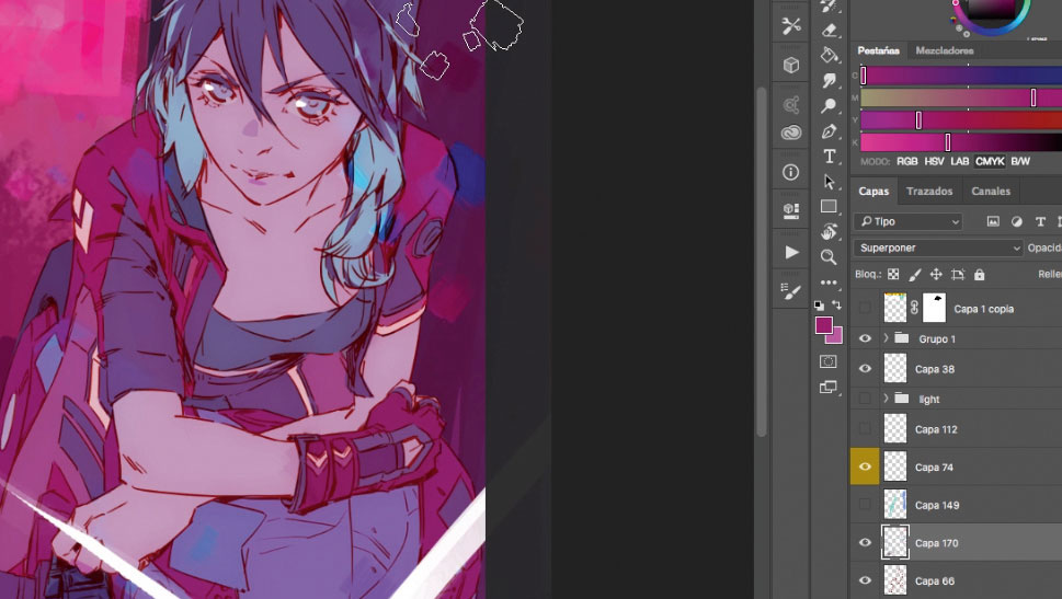
Using my custom Colour Generator brush in Overlay mode I add some randomness to my colours. This helps to enrich the entire image. Then I start on the character. First I put highlight over on the left that will make her stand out, and then I dive into the details. My shading is full of hard edges and flat colours, because I want the image to echo the anime or manga style.
12. Consider materials
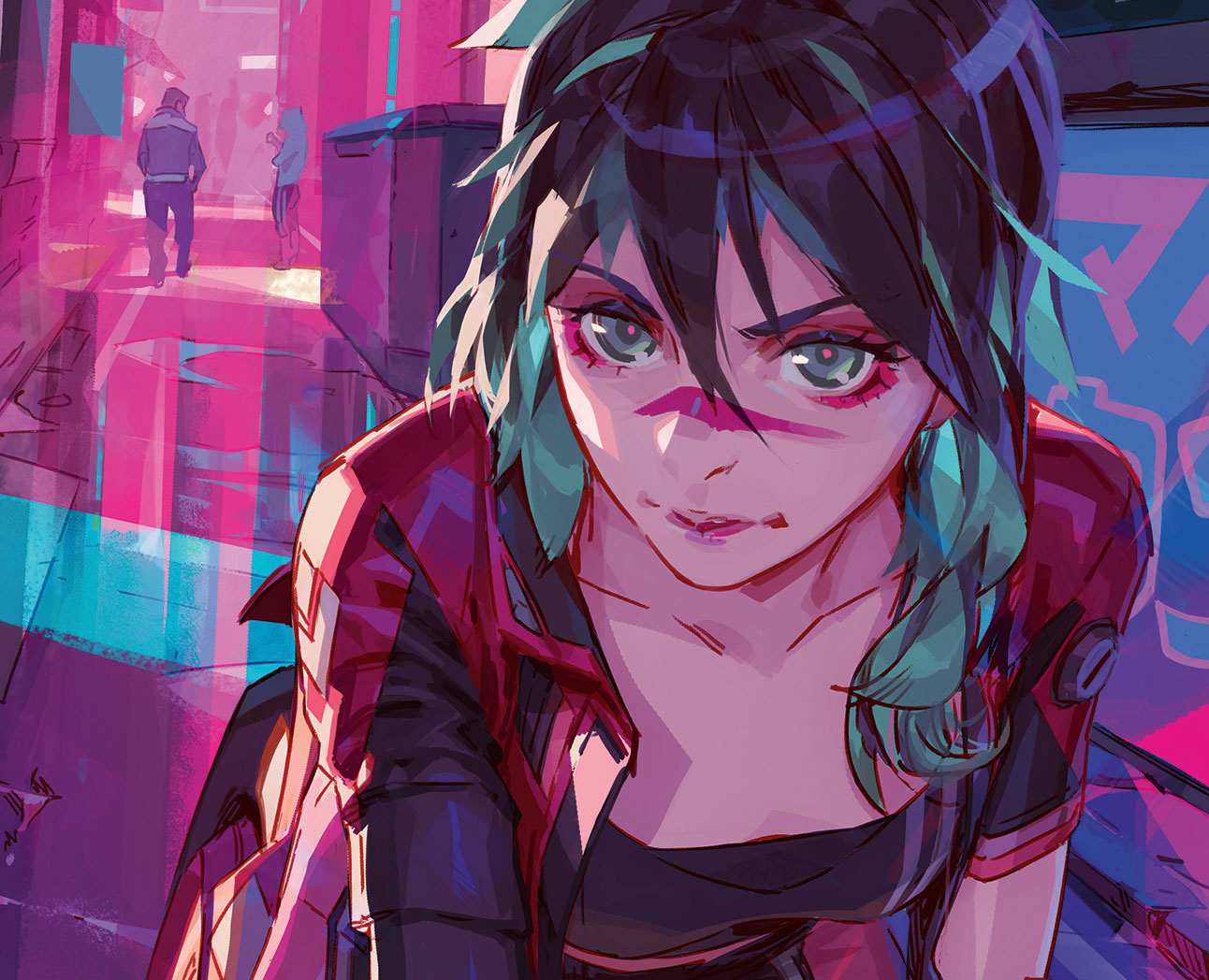
My colours are already established so I select the Eyedropper tool (alt+click) and keep working on shades and volumes, bearing in mind that lighting works differently across a range of surfaces. The darkest zones and contrast are reserved for leather and metal, while skin is worked with a low contrast. I try to merge layers while painting, keeping the background and lights separate from the character.
13. Bring in anime-style effects
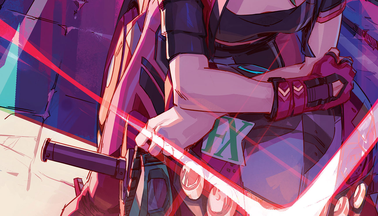
I'm almost there now, so I enhance the overall look and apply my final touches. Inspired by anime I spend a bit of time working up the motorbike headlights, making them big and strong. These geometric forms also help me to fill the composition to the lower-right area of the scene. They're painted with white with some reddish tones on the edges on an Overlay layer mode.
14. Respond to feedback
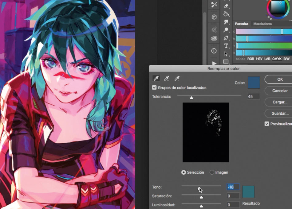
At the request of the ImagineFX team, I change the hair colour and light focus to make the character stand out against the logo. I also do some polishing work and get rid of some details on the background to make the cover text more readable. At any point, it's important to stay focused on the important stuff and not fill everything with unnecessary details that might distract the viewer. To finish off, I apply Filter > Focus > Focus mask to emphasise certain shapes in the scene.
This article was originally published in issue 163 of ImagineFX, the world's best-selling magazine for digital artists. Buy issue 163 here or subscribe to ImagineFX here.
Related articles:
