The birth certificate is reborn!
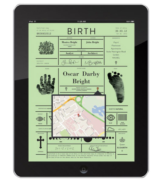
London based creative design agency IWANT gives the all-important document a visually playful redesign for the digital age.
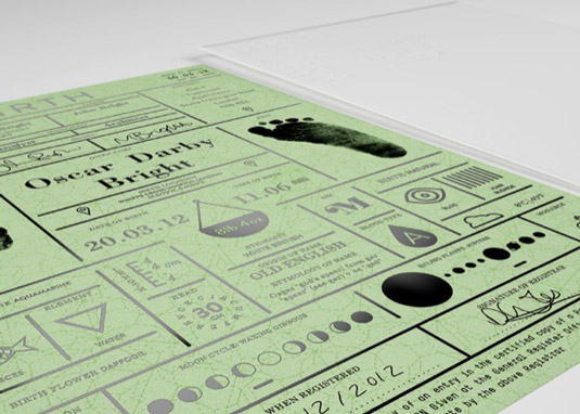
Birth certificates have been issued for centuries now. But this important identification document's design has seen little in the form of change over the years. So the team at creative agency IWANT took upon themselves to bring into the modern age with this cool redesign.
Created as part of Icon Magazine's 'Rethink' feature, which invites designers to reimagine everyday objects in creative ways, IWANT maintained some of the certificate's traditional design elements, while at the same time given it a modern twist.
Out with the old...
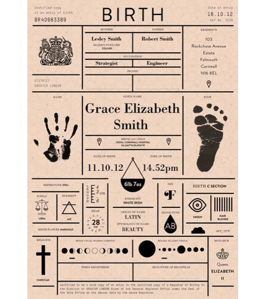
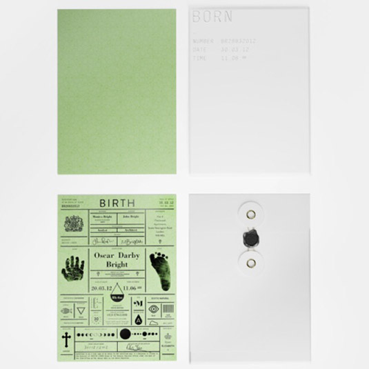
The redesign includes all of the original information currently found on a birth certificate but in a much more visually pleasing way, using simple graphics to convey certain details. The design also adds new features, such as hand and foot prints, birth location coordinates and astrological details.
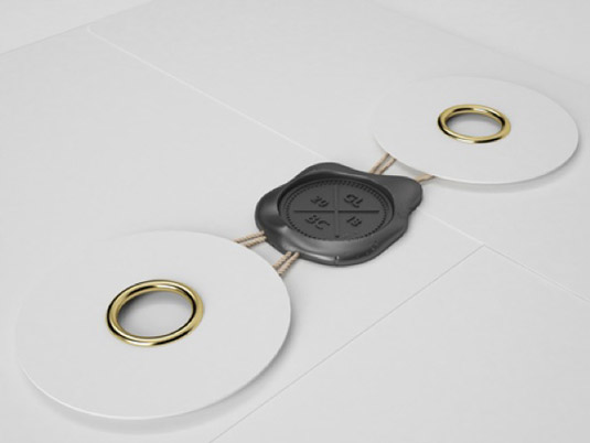
Article continues belowIt comes in four different colours, depending on which season the birth takes place. And to finish, the certificate comes presented in a thick white envelope, sealed with a black wax stamp - a magical touch.
We really like this design, mainly for the brilliant balance of old and new incorporated into it. The certificate still looks and feels important and official, especially with the use of black foil watermarked onto heavy weight card, but also has a sophisticated, modern edge to it too.

Like this? Read these!
- Illustrator tutorials: amazing ideas to try today!
- The ultimate guide to designing the best logos
- Download the best free fonts
What do you think of the birth certificate redesign? Let us know in the comments!
Sign up to Creative Bloq's daily newsletter, which brings you the latest news and inspiration from the worlds of art, design and technology.

The Creative Bloq team is made up of a group of art and design enthusiasts, and has changed and evolved since Creative Bloq began back in 2012. The current website team consists of eight full-time members of staff: Editor Georgia Coggan, Deputy Editor Rosie Hilder, Ecommerce Editor Beren Neale, Senior News Editor Daniel Piper, Editor, Digital Art and 3D Ian Dean, Tech Reviews Editor Erlingur Einarsson, Ecommerce Writer Beth Nicholls and Staff Writer Natalie Fear, as well as a roster of freelancers from around the world. The ImagineFX magazine team also pitch in, ensuring that content from leading digital art publication ImagineFX is represented on Creative Bloq.
