Add an extra dimension to your type
Radim Malinic shares a shortcut for creating eye-popping headline typography without the need for 3D software or plugins.
- Software: Photoshop and Illustrator CS3 or later
- Project time: 3 hours
- Skills: Use different blending options, Edit anchor points, Master Smart Vector Objects, Create Photoshop patterns
As a designer and illustrator, I always tend to look for inspiration far away from my regular field of printed work. Recently, in an exploration of London’s West End, I’ve been looking into unusual combinations of 17th century architectural elements with art deco neon advertising - which formed the basis of my latest solo gallery show.
In this tutorial, I’ll explore old design values even further and shape them into a different and unusual aesthetic; a design that might resemble a futuristic posh biscuit tin, for example, with a fitting sci-fi style packaging design. I’ll explain how you can build up complex vector patterns from just one basic shape, and how to turn a simple serif font into a headline with extra dimension. All this will be done using the most basic features that have been included in Photoshop and Illustrator for more than a decade.
We’ll explore Photoshop’s Layer Blending tools along with the Selective Color adjustment layers, as well as vector shape build-ups in Illustrator via the Offset Path options and custom strokes. Once you’ve mastered the techniques covered here, you can experiment with using them in different ways in your work.
Article continues belowStep 01
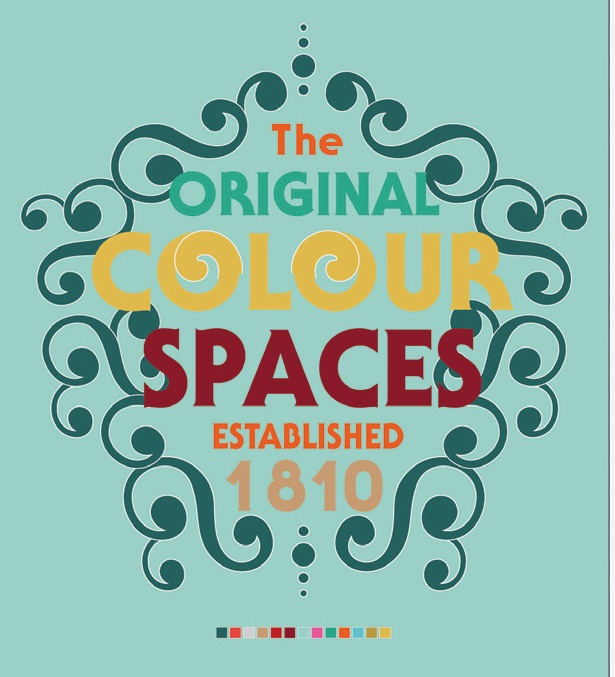
Starting in Illustrator, we will work with an abstract title placed in an A4 canvas. I selected Serif Gothic Std to create my main headline, but you can use any serif font you like. Draw and multiply a swoosh shape, and build up the outline of a crest, positioned below the headline.
Step 02
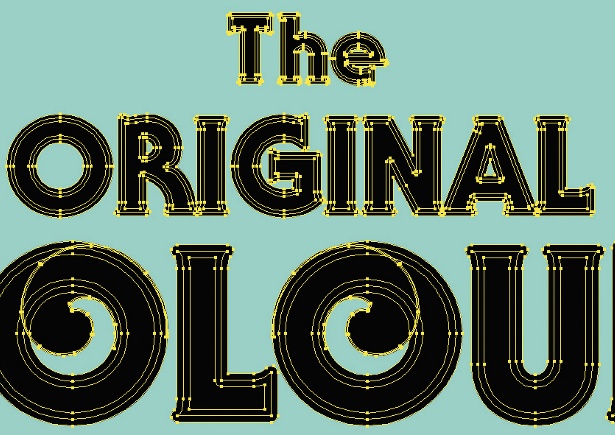
Add a 6pt stroke to each word using the Round Cap and Round Joints settings. This will bold up the type beyond the regular Black version. Copy and paste the type on a new layer and select Outline Stroke (Object>Path>Outline Stroke). Next, select Outline Path to turn all the lines into objects, and choose the Unite filter from the Pathfinder panel.
Step 03
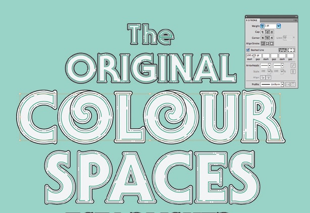
Next, we’ll create two sets of inner paths to help us with adding dimension in later steps. Select each word, and one by one go to Object> Path>Offset Path. Work with two different distances: -0.5mm and -1mm. Afterwards, apply stroke weights of 0.5pt and 1.5pt respectively and tick the Dashed Line option. Change Dash to 100, and Gap to 5.
Step 04
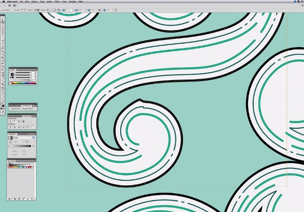
Sometimes the automatic offset process will pick up on imperfections in your anchor points and a smooth curve will gain a few unwanted bumpy points. Click the – key to start removing any rogue points, or alternatively adjust with the Direct Selection tool.
Sign up to Creative Bloq's daily newsletter, which brings you the latest news and inspiration from the worlds of art, design and technology.
Step 05
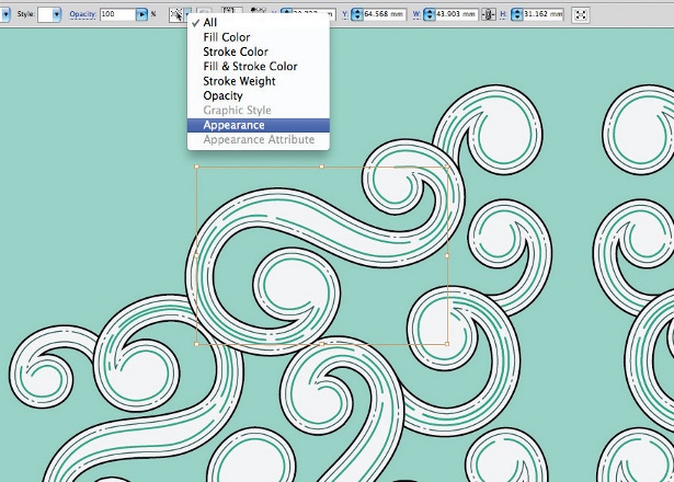
After perfecting your type, repeat the same process with the ornate crest placed below the headline, before placing each object into Photoshop. Help yourself by colour-coding the same groups of strokes and objects with different colours. These groups can be picked up by Select>Same>Appearance.
Step 06
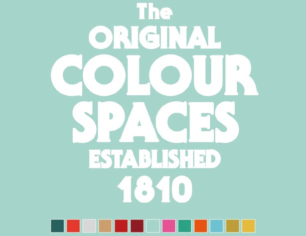
All solid shapes should be imported into Photoshop using the Shape Layers button, and all strokes as Smart Vector Objects. It’s important to follow this rule, as doing so will give you the most flexible way of working without needing to come back to Illustrator for changes. Further colours will be sampled from our interim Swatches panel.
Step 07
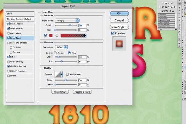
We want to achieve a glowing look that has dimension for the main type. Double-click each shape layer to bring up the Blending Options menu, and add Inner Shadow in a darker colour tone to each fill, plus extra shadow via Inner Glow, Satin and Gradient Overlay. I’ve used the following values: Inner Shadow – Multiply; Opacity: 75%; Size: 55; Noise: 10. Inner Glow – Multiply; Opacity: 70%; Size: 65; Choke: 55; Noise: 10. Satin – Lighten; Distance: 20; Size: 10; Contour: Cove – Deep.
Step 08
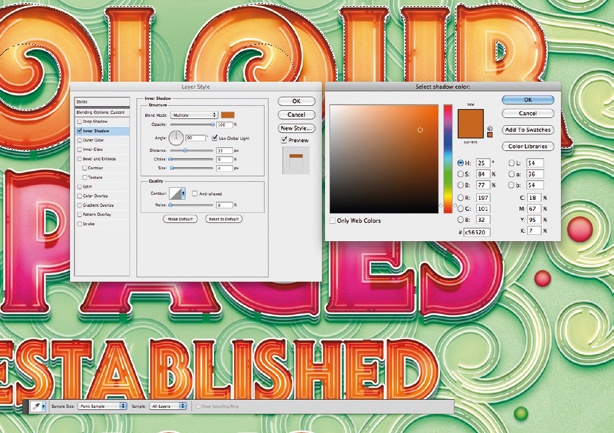
Switch on all stroke layers before you create copies (Cmd/Ctrl+J) of the main type layers. Select them one by one, turn Fill Opacity to 0% and add Inner Shadow set to: Multiply; Distance: 35; Size: 4. Make sure you work with a colour tone that is close to the colour of the word below.
Step 09
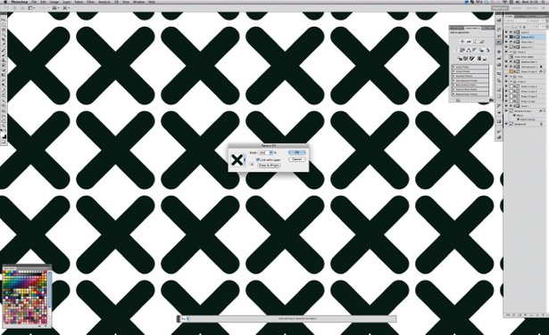
In the penultimate step, we are going to add some subtle texture to the piece. Draw a simple X, or just use a font and create a new pattern. Then, create a Pattern Fill adjustment layer and add it to the top of the stack. Set Scale to 5% and Opacity to 7% via Overlay. This will add a nice tone, as well as a retro feel and texture.
Step 10
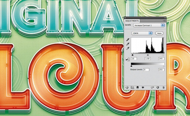
Since we’ve been working on an image that borrows from the past, let’s add a Photo Filter adjustment [Warm Filter 85%], which will unify the colours. To round off the type, add an extra Levels adjustment layer, selecting the Increase Contrast 1 preset. These should make the colours brighter and stronger.
Liked this? Read these!
- Download the best free fonts
- Free Photoshop brushes every creative must have
- Illustrator tutorials: amazing ideas to try today!
- Free Photoshop actions to create stunning effects
- The best Photoshop plugins
- The best free web fonts for designers
- Download free textures: high resolution and ready to use now

The Creative Bloq team is made up of a group of art and design enthusiasts, and has changed and evolved since Creative Bloq began back in 2012. The current website team consists of eight full-time members of staff: Editor Georgia Coggan, Deputy Editor Rosie Hilder, Ecommerce Editor Beren Neale, Senior News Editor Daniel Piper, Editor, Digital Art and 3D Ian Dean, Tech Reviews Editor Erlingur Einarsson, Ecommerce Writer Beth Nicholls and Staff Writer Natalie Fear, as well as a roster of freelancers from around the world. The ImagineFX magazine team also pitch in, ensuring that content from leading digital art publication ImagineFX is represented on Creative Bloq.
