Design a classic serif poster
From choosing the perfect font to bespoke glyphs and ligatures, Emiliano Suárez reveals how to manipulate serif type in your design work.
Sign up to Creative Bloq's daily newsletter, which brings you the latest news and inspiration from the worlds of art, design and technology.
You are now subscribed
Your newsletter sign-up was successful
Want to add more newsletters?
Five times a week
CreativeBloq
Sign up to Creative Bloq's daily newsletter, which brings you the latest news and inspiration from the worlds of art, design and technology.
Once a week
By Design
Sign up to Creative Bloq's daily newsletter, which brings you the latest news and inspiration from the worlds of art, design and technology.
Once a week
State of the Art
Sign up to Creative Bloq's daily newsletter, which brings you the latest news and inspiration from the worlds of art, design and technology.

Seasonal (around events)
Brand Impact Awards
Sign up to Creative Bloq's daily newsletter, which brings you the latest news and inspiration from the worlds of art, design and technology.
As graphic designers, we tend to follow some golden rules: the message must be clear, the colours must have some harmony and the text needs to be balanced and readable.
But sometimes, in order to create something different or something that stands out, we need to take those rules to the limit, mix them up, or even break them. That's what this tutorial is all about. Pretend for a moment that all the glyphs and characters in words weren't created for text, they were created to illustrate.
Every letter is like a very special and unique brush - and you have thousands of them. Just look at your Character palette in Illustrator and imagine how many possibilities typefaces can give you. We are going to explore another way of writing (or a fresh way of illustrating, depending on how you look at it). So, be ready to despoil your mind and start having fun with typography.
Step 01
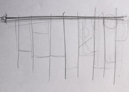
When starting a project from scratch it's always useful to go back to basics - so grab a pencil and some blank paper and sketch some lines. The important thing here is to discover our primary axis, or the core of our eventual image. It doesn't need to be the final thing, but it will give you an idea.
Step 02

The message is important, but in this case how it looks is more important to us. So if you have a favourite quote use it, or simply go to Google, type 'Quote of the day' and hit I'm Feeling Lucky. Here I've simply gone with the traditional pangram 'The quick brown fox jumps over the lazy dog.'
Step 03
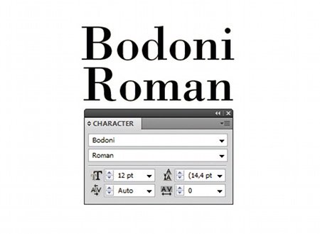
Choosing the typeface is one of the keys to this kind of project. Every typeface or font family has its own personality, and we're going to take full advantage of this. I've chosen the classic Bodoni Roman for this particular project, because it has beautiful serifs and strong stems.
Step 04
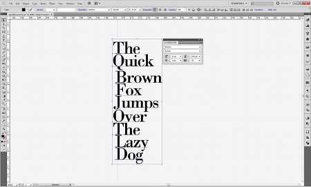
We're ready to start playing, so type your quote in Illustrator. It's important that we keep every word separated from the rest. Start building the main axis. Use the stems of the caps letters to intensify the chosen direction and set the Tracking to -50 in the Character palette.
Sign up to Creative Bloq's daily newsletter, which brings you the latest news and inspiration from the worlds of art, design and technology.
Step 05
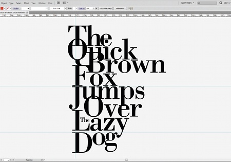
Start filling the white spaces between words. This will give you the sensation of a more compact block of text. It's important to bear in mind the total shape of your artwork, and try to balance between black and white zones. In this case we will need to separate the J from 'Jump' and the D from 'Dog' and align them to the top to make them fit.
Step 06
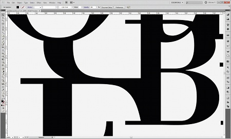
To take advantage of the serifs we need to play with the ligatures between glyphs. As you can see I'm using the descender of the Q to blend seamlessly with the F, and also the serif of the F is also touching the base of the B. All these movements are going to give us the sensation that the words are flowing and that they are naturally positioned.
Step 07
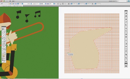
We are going to mask some parts of the glyphs to ensure that the letters are still recognisable. Use the Pathfinder palette. Hit Shift+Cmnd/Ctrl+F9 to show it. Create a round shape using the Elipse tool (L) and put it in front of your glyph. Select both and hit the Subtract icon, holding down Alt as you do so. This enables you to edit it later by double-clicking it. Repeat this step as many times you need.
Step 08
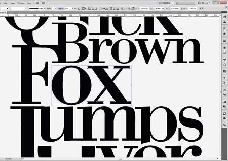
Another good move is to resize some of the characters, especially if you feel that a particular part of the text needs to pop out. For example, I took the 'ox' of 'fox' and scaled it up a little so it fits better between both words. Make sure you're holding Shift so you don't distort the glyphs. Do the same thing with 'Brown', scaling it down so it fits better.
Step 09
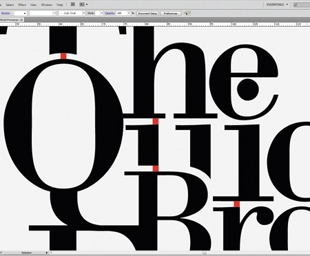
Once we have a good composition we need to start adjusting the spaces between words and glyphs. This will take some time, but it's going to ensure that everything is in place and balanced. Create a square with the Rectangle tool (M) and start matching the gaps.
Step 10
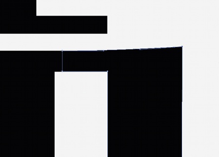
Time to polish our artwork; we've been resizing and masking and we are going to find a lot of nodes that are incorrect. So zoom in and with the Pen Tool (P) start getting rid of those nodes. Make sure that you don't erase a key node or deform anything.
Step 11
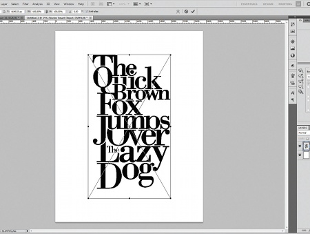
We've finished in Illustrator - time to give some spark to our design. Create a new document in Photoshop at 300dpi so you can print it later. Go to Illustrator, Select All (Cmd/Ctrl+A) and then copy. Go back to Photoshop and paste it in.
Step 12
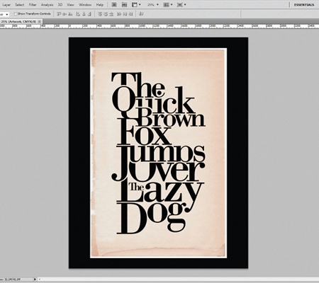
We are going to use a vintage-style paper background to make it look good. You can use any texture you like; I just feel that this kind of serif font works very well with vintage or retro textures. Import your paper image and put it behind your pasted artwork. Fill the background with black - you can do this with the Paint Bucket tool (G) and a black colour.
Step 13
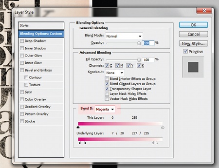
To achieve that age-worn look we need to select our typography composite layer, right-click on it and go to Blending Options. In the Blending Options start playing with the Blend If: sliders until you get that grungy look. Make sure that you select the right channel, which may vary depending on the colour of the layer that is behind - in this case I used the magenta channel.
Step 14
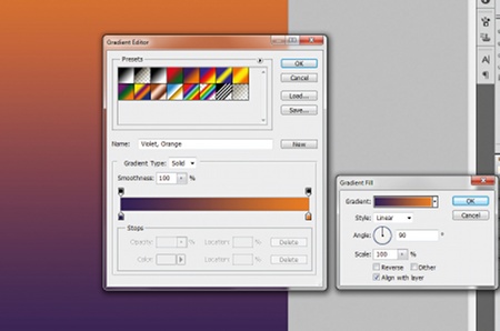
Our next step is to create the final colour scheme for your design. In the Layer palette, create a new Gradient Fill Adjustment Layer. From the presets panel select Violet/Orange, or whatever combination suits you. Press OK and change the transfer mode of the layer to Colour Burn. Put it on the top and decrease the transparency to 50% if you feel it looks too saturated.
Step 15
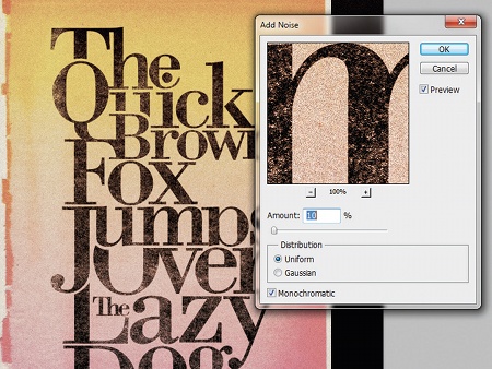
Almost there. We need to improve the vintage look. To do this we are going to add some noise. Go to the top layer in the Layer palette and press Shift+Cmnd/ Ctrl+Alt+E to create a new merged layer of all our layers. With this new layer selected go to Filter>Noise>Add Noise, set it to 10% and press OK.
Step 16
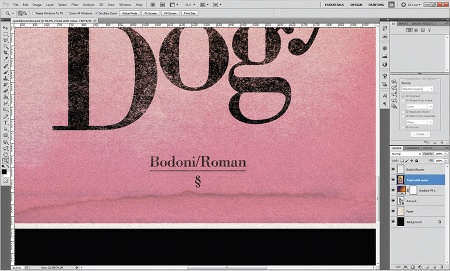
We've finished. When I work on this kind of project with great typefaces like Bodoni I like to sign the artwork with the family font name used in the process - it shows some respect to the original creator.
Words: Emiliano Suárez
A designer from Argentina, Emiliano Suárez loves typography, photography, illustration and especially graphic design in all its forms.
Liked this? Read these!
- Download the best free fonts
- Free graffiti font selection
- Free tattoo fonts for designers
- The ultimate logo design guide

The Creative Bloq team is made up of a group of art and design enthusiasts, and has changed and evolved since Creative Bloq began back in 2012. The current website team consists of eight full-time members of staff: Editor Georgia Coggan, Deputy Editor Rosie Hilder, Ecommerce Editor Beren Neale, Senior News Editor Daniel Piper, Editor, Digital Art and 3D Ian Dean, Tech Reviews Editor Erlingur Einarsson, Ecommerce Writer Beth Nicholls and Staff Writer Natalie Fear, as well as a roster of freelancers from around the world. The ImagineFX magazine team also pitch in, ensuring that content from leading digital art publication ImagineFX is represented on Creative Bloq.
