7 inspiring examples of the hand lettering trend
Best-in-class work from the world's foremost hand lettering artists.
From artisan chalkboard designs, to intricately crafted packaging designs and beautifully ornate typographical illustrations, hand lettering is a massive trend that doesn't show any sign of waning.
Lettering differs substantially from type design – we're not just talking about finding a great handwriting font here. All the craft goes into creating a group of bespoke letterforms for a particular purpose, rather than designing a versatile system of characters for multiple applications.
Hand lettering is also distinct from calligraphy. The latter is about penmanship – writing letters. Hand lettering is about draftsmanship – drawing letters.
Article continues belowDespite its name, hand lettering doesn't have to be drawn by hand. Although many top lettering artists employ traditional tools such as pencils, pens, brushes or chalk, others work digitally, in whole or part – particularly where hand lettering is required as part of the logo design process.
Hand lettering is a hugely in-demand pursuit, and there are many world-class practitioners, from Marian Bantjes to Jessica Hische. Here, we've asked a selection of top lettering artists to pick a single highlight from their portfolio. Read on to be inspired by seven inspiring examples of the hand lettering trend...
01. Gypsy Tonic by Tom Lane
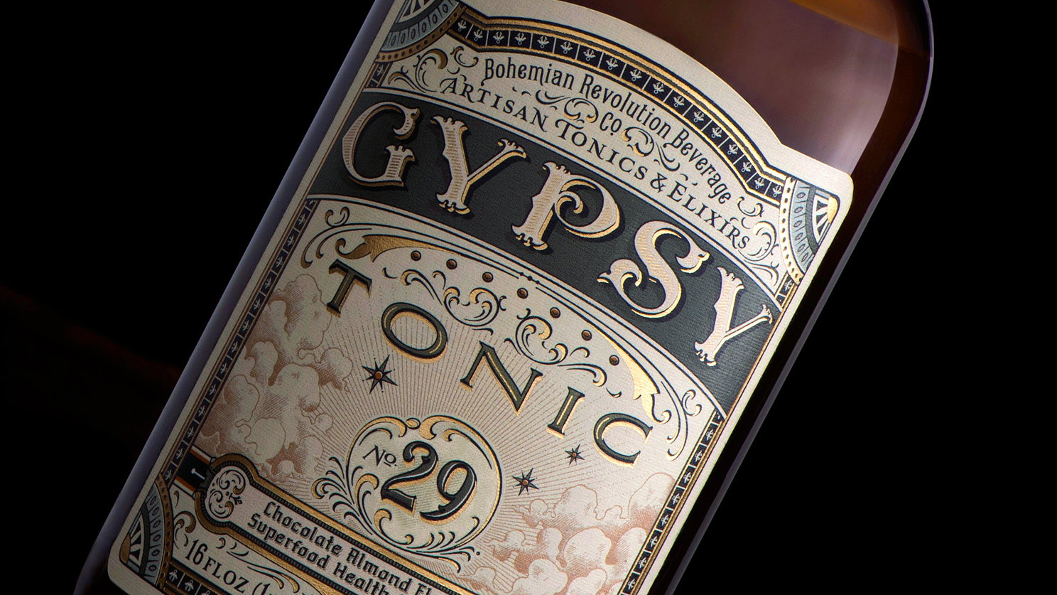
Hand lettering can be beautifully effective when applied to label design, such as this standout example by Liverpool-based designer Tom Lane, aka Ginger Monkey. Commissioned by the Bohemian Revolution Beverage Company in 2015, Lane's Gipsy Tonic project was a true labour of love, and it was 18 months before the bottles were on the shelves.
The client, Brandon Johnson, had a very specific brief: "He explained that he had a narrative to convey through particular imagery, and that he wanted to do this whilst capturing a 1800s apothecary scene vibe," explains Lane. "We both did our research into the time period and visual material that captured the look and feel."
Sign up to Creative Bloq's daily newsletter, which brings you the latest news and inspiration from the worlds of art, design and technology.
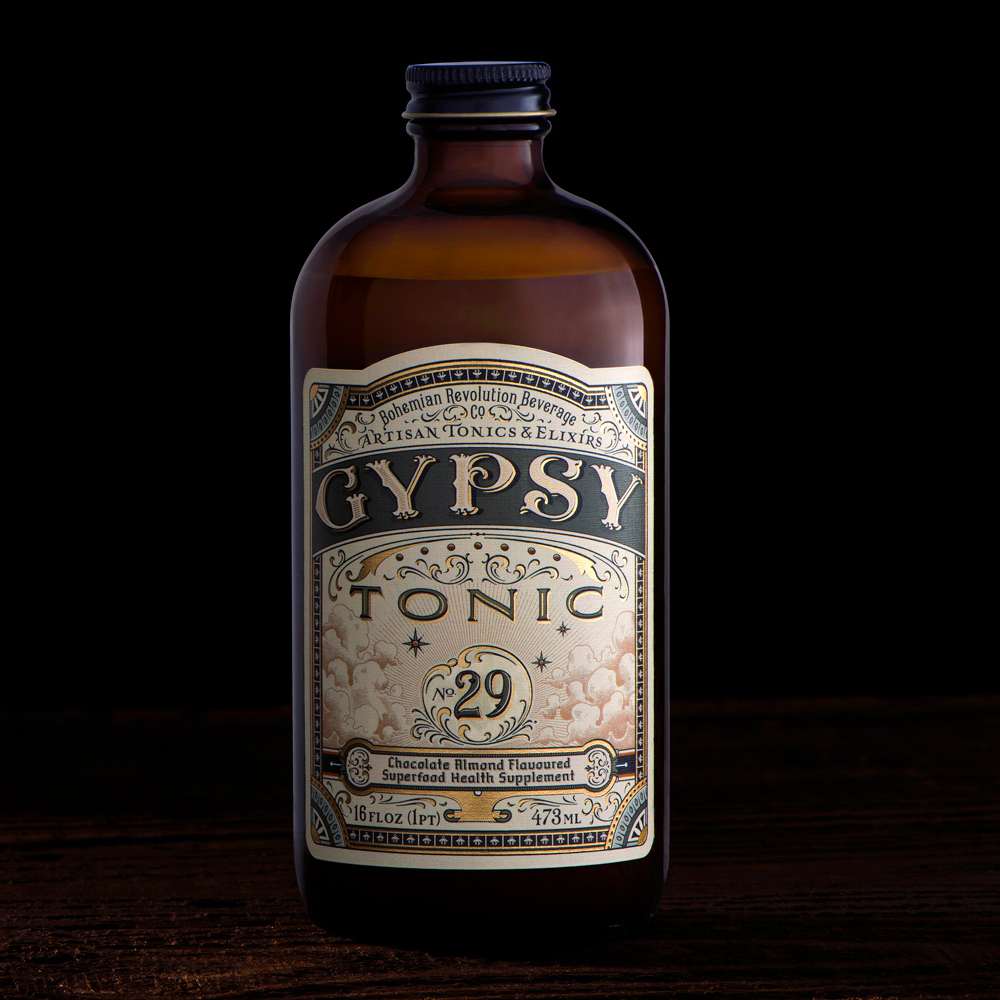
"The hardest part of these types of projects is to turn a detailed pencil sketch – with bespoke lettering, illustration, and decorative devices – into vector artwork without losing the soul of the drawing," he continues. "However, through that process I’m also able to tighten up and elevate the artwork, as well as providing myself with a useable file for the printing process."
Lane's client list includes Nike, Coca-Cola, Sony, Pernod Ricard and Heston Blumenthal, but he picked this particular project as a highlight largely because of the enjoyable, collaborative nature of the project. "Brandon was great to work with, and this was a real passion project for him," he smiles.
02. Holiday Sampler by Mary Kate McDevitt
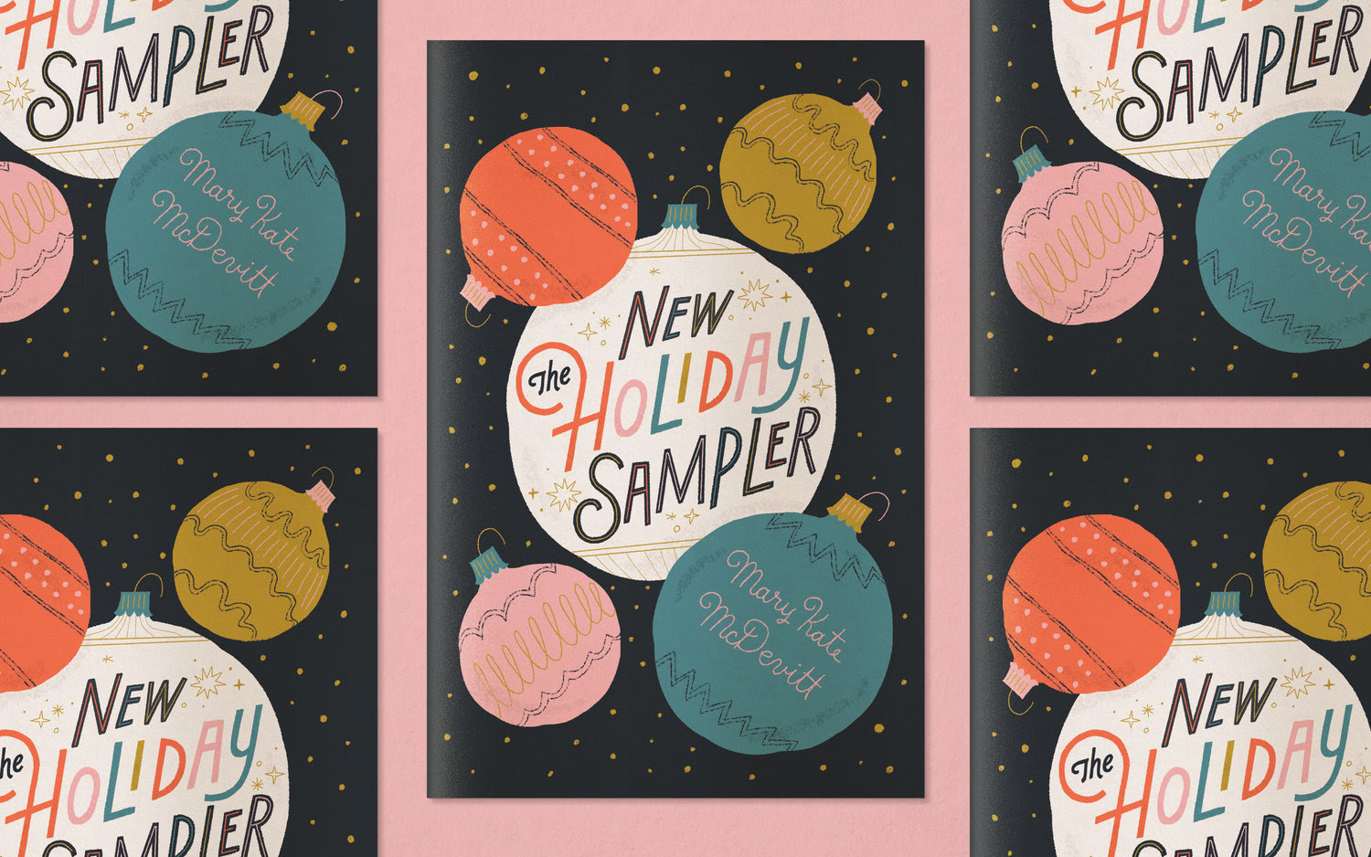
At the more playful, colourful end of the hand lettering spectrum is this charming personal project from Philadelphia-based Mary Kate McDevitt, whose clients include Chronicle Books, Penguin, Nintendo and Nike. "Personal work is the best way to experiment with styles, colours, and ideas," she insists.
McDevitt's 2017 Holiday Sampler is her current favourite project – and it happened quite organically. Stuck for ideas for her regular Christmas card, she ended up designing a full-blown zine inspired by festive songs. "I was inspired by album covers and cards from the 50s," she explains. "I wanted to keep it a little retro, but not overly so, to still fit my style."
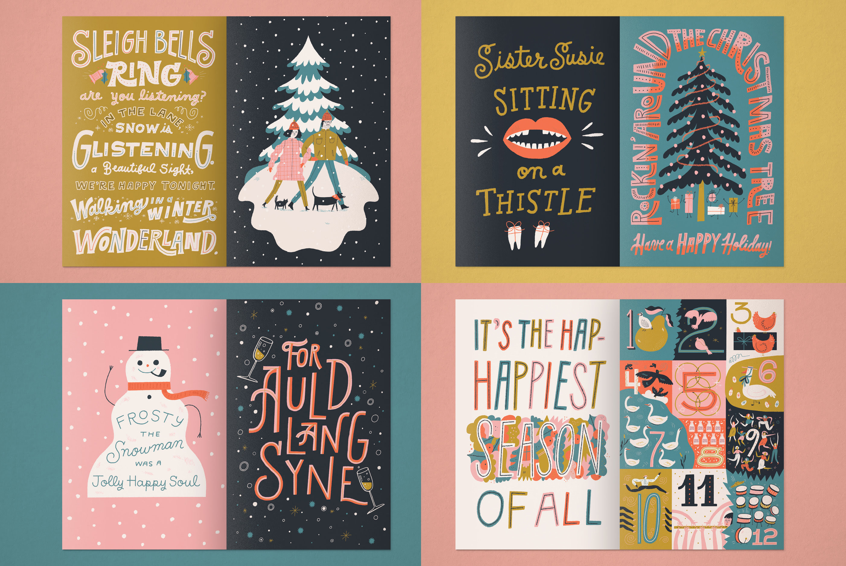
Festive lyrics formed a big part of the project, and McDevitt chose to keep the hand lettering refined and simple to fit with the 1950s aesthetic – but still had plenty of scope for playful, colourful experimentation with different letterforms.
"I announced I'd be sending out cards to anyone who provided me with an address on Instagram before the project was completed," she recalls. "I had a response from so many people, which inspired me to make something extra special."
03. King logo by Rob Clarke
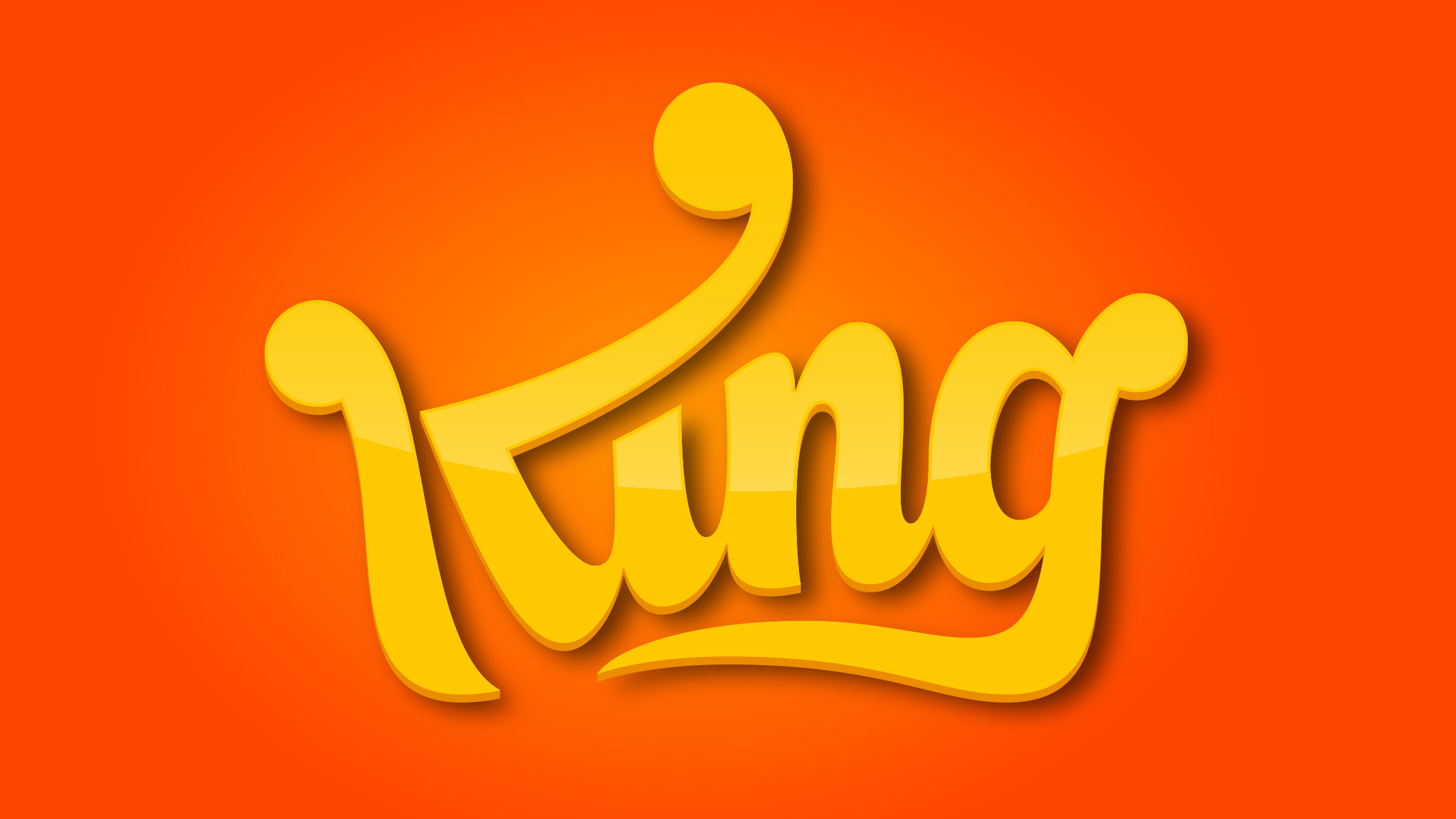
Hand lettering can form a significant part of the logo design process, particularly when a unique typographical flourish is required. One example is Rob Clarke's logo for King, the mobile game developer best known for Candy Crush Saga.
A prolific lettering artist, having crafted hand lettering for the likes of Dulux, Sainsbury’s, Carlsberg, Cadbury and Capitol Records, Clarke selected the King logo – which he worked on with Venture Three – as his number-one folio highlight.
"The brief was simple: create the word King in the shape of a crown," he recalls. "What I’ve always liked about this logo is that it communicates the idea purely through lettering, without the use of a symbol or illustration. It pushed me creatively and took many iterations before coming to the final solution."
04. The Process Is The Inspiration by Ken Barber
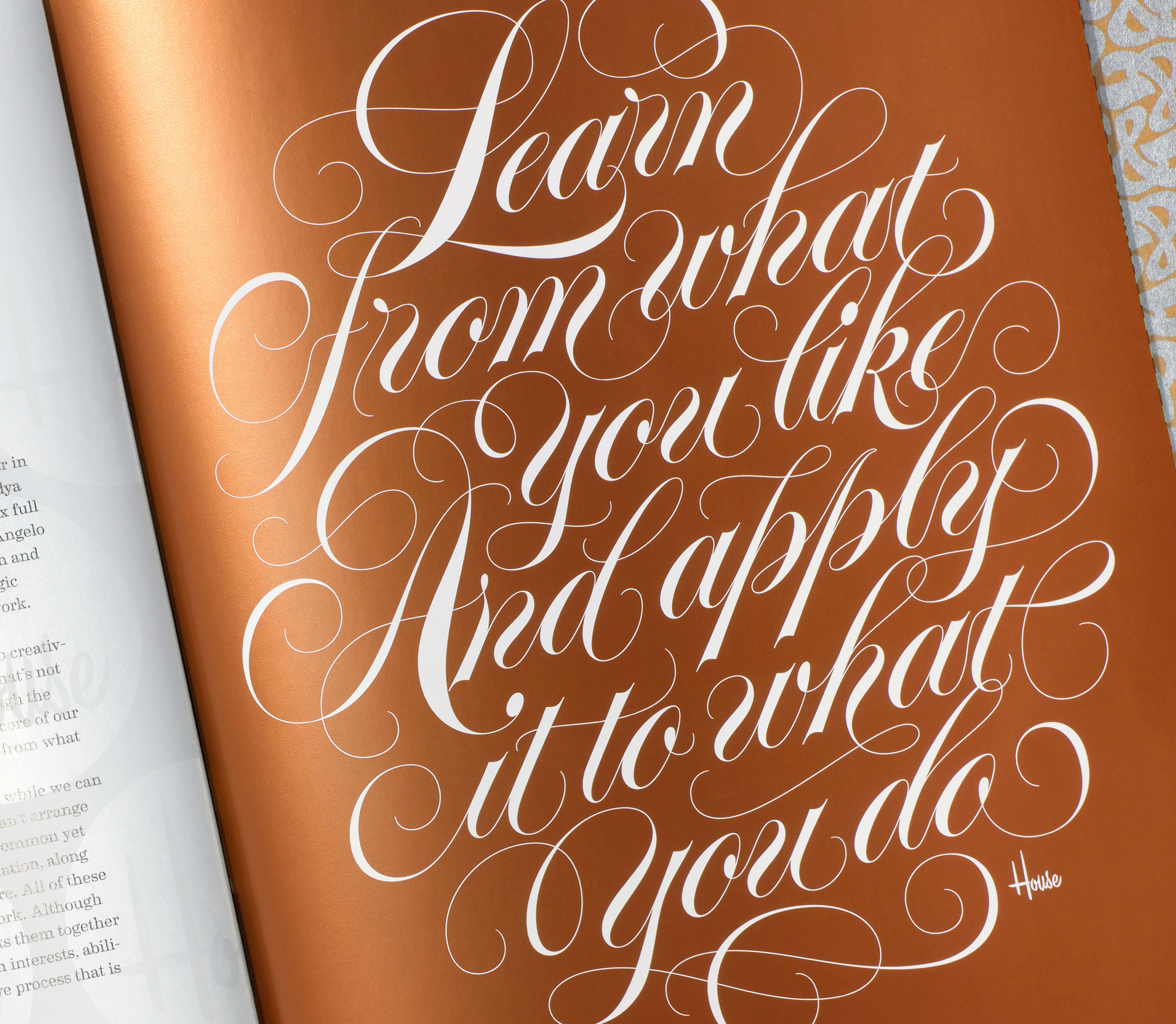
As head letterer and director of typeface development at font foundry and design studio House Industries, Ken Barber has a significant body of work to choose from. He opted for an ornate, calligraphic-style along the theme from his co-authored book, House Industries: The Process Is The Inspiration.
"The design riffs on Spencerian Lettering (not to be confused with the American handwriting style of the 1800s), which emerged in the late 20th century as a super-charged hand-drawn take on formal roundhand script," he explains. "High contrast strokes and wildly-embellished flourishes make its creation all the more challenging – and rewarding – when composing elaborate layouts like this."
"When Rich [Roat, co-founder of House Industries, and co-author] passed away unexpectedly in November 2017, this particular work gained even greater personal significance, as it concludes one of the last projects we did together."
05. London map by Linzie Hunter
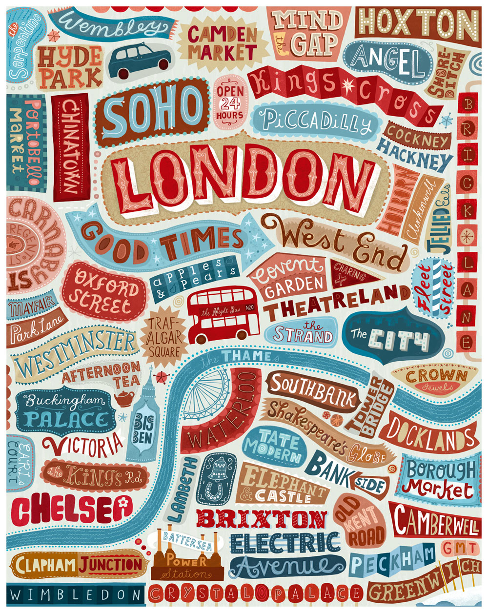
Illustrator and hand lettering artist Linzie Hunter has worked with many of the world's leading brands, including Apple, Nike, Barnes & Noble, BBC, Harper Collins, the Guardian and Time magazine. But like Lane, she believes smaller independent clients can often yield the most exciting results creatively.
Hunter is particularly fond of a hand-lettered map of London, commissioned by French art print company Small Wall. "Although it was created a while back, it still showcases the main characteristics of my style: hand-drawn, decorative lettering with illustrated elements, and a reduced colour palette," she says.
For this piece, she started with a detailed pencil sketch before rendering the final lettering in Photoshop – although she admits she often works directly in Photoshop nowadays, or on her iPad using an Apple Pencil and Procreate. "One thing that's still the same is how much I rely on my sketchbooks," she adds. "Daily drawing, using pens and pencils, has become an essential part of my working practice."
06. Jerusalem by Seb Lester
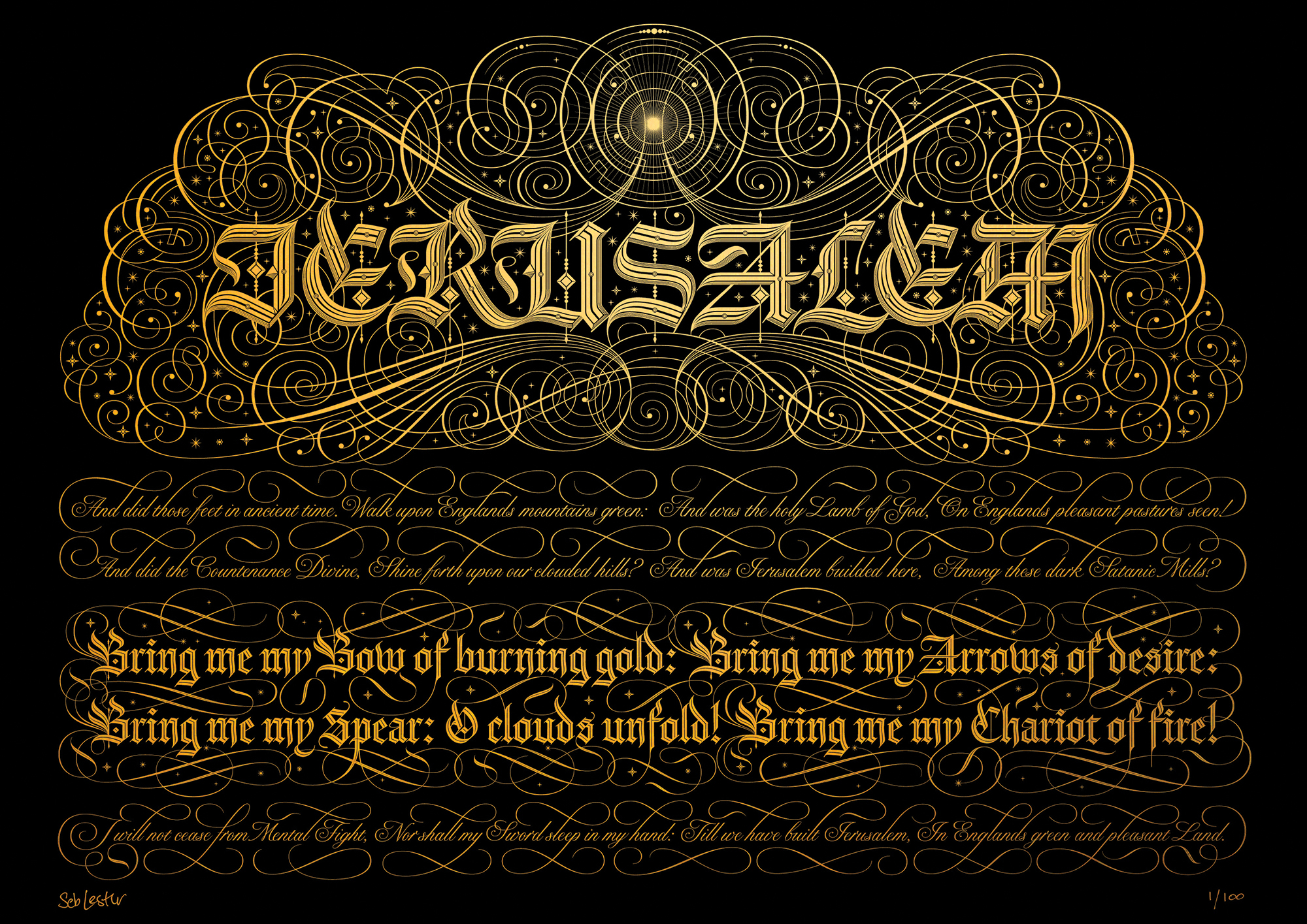
Renowned artist, type designer and calligrapher Seb Lester has attracted millions of views for his viral videos in which he skilfully draws famous brand's logos by hand. Formerly a senior type designer at Monotype, his commercial clients include NASA, Apple, Nike and Intel, and custom typefaces for The Telegraph, Waitrose and the 2010 Vancouver Winter Olympics, amongst others.
The depth and breadth of his portfolio aside, however, Lester is most proud of his typographical tribute to William Blake's Jerusalem. "I've enjoyed Blake's poetry since I was a student in London," he reveals. "I am not religious, but I find the words of Jerusalem captivating. It's ultimately a poem about hope and revolution."
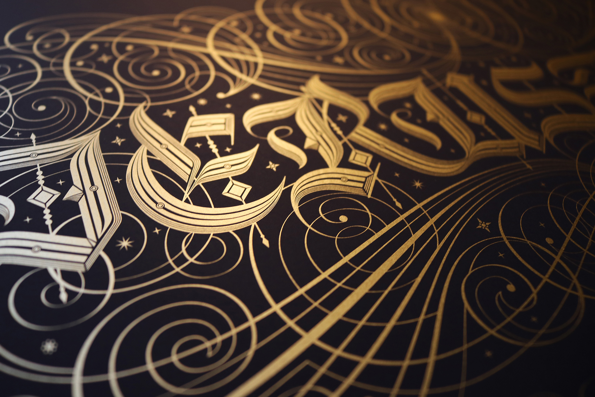
Lester's biggest challenge, he admits, was to find a visual match for Blake's "intense, epic, evocative and rich" masterpiece. Packed with an incredible amount of fine detail, the resulting artwork is available as a limited-edition screen print.
07. Float Fest logo by Simon Walker

Designer and custom typographer Simon Walker has worked with Nickelodeon, Vanity Fair, Pepsi, ESPN, Nike and Target. His portfolio highlight, however, is a '70s rock album cover' inspired logo for Float Fest, an annual music event based in his home state of Texas, USA.
"My love for this logo is in direct opposition to how the project went as a whole: the client and I were unable to come to a resolution on anything I was doing, so we eventually parted ways," he confesses. "But what I ended up with was a lockup that came together kind of miraculously."
"Ligatures seem to still be really popular at the moment, but I'm always at pains to show people that ligatures should never be forced – they should flow organically from the letters themselves," he continues.
"In this case, I think I broke a personal record by using one stroke to finish five separate letters. It's not something I could've forced if I'd tried – I felt like it was just there waiting to be discovered."
Related articles:

Nick has worked with world-class agencies including Wolff Olins, Taxi Studio and Vault49 on brand storytelling, tone of voice and verbal strategy for global brands such as Virgin, TikTok, and Bite Back 2030. Nick launched the Brand Impact Awards in 2013 while editor of Computer Arts, and remains chair of judges. He's written for Creative Bloq on design and branding matters since the site's launch.
