Behind the scenes: how a Disney logo is created
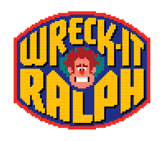
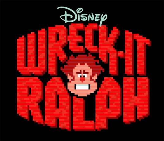
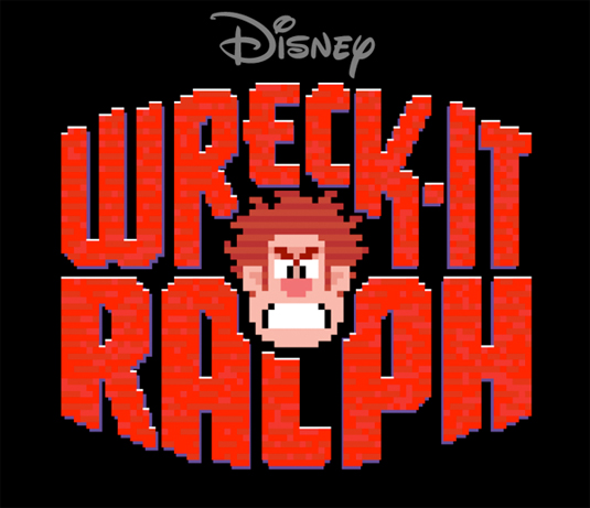
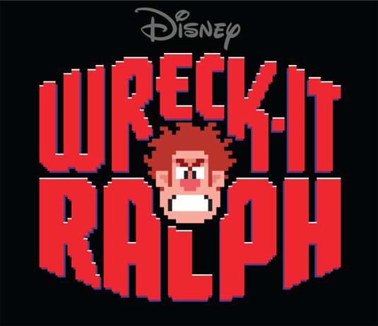
Graphic Designer Michael Doret allows an insight into his working method for his Wreck-it Ralph logo.
Sign up to Creative Bloq's daily newsletter, which brings you the latest news and inspiration from the worlds of art, design and technology.
You are now subscribed
Your newsletter sign-up was successful
Want to add more newsletters?

From a design perspective, Disney's logos are almost as iconic as their movies. Graphic designer Michael Doret has worked on many a motion picture and here, we take a trip behind-the-scenes to gauge his process for creating his recent 'Wreck-it Ralph' logo.
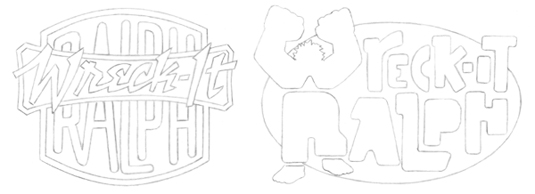
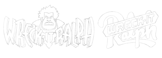
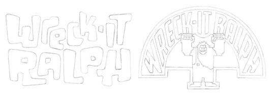
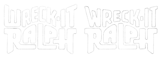
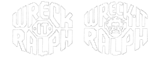
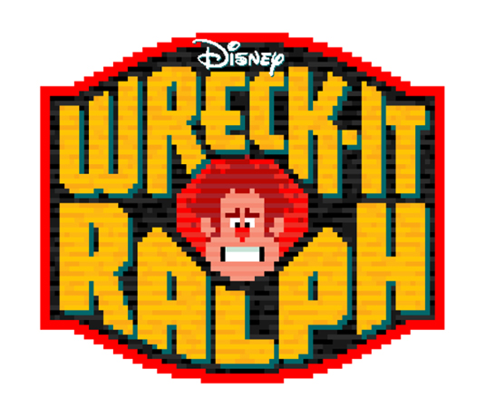
The process of developing the title treatment extended over several months, with Michael keen for the logo to be as playful and reminiscent of classic arcade logos of the '70s. Some of the letterforms used were reminiscent of the shapes in the character and it was then that he came up with the idea of an 8-bit logo surrounding an 8-bit face.
Toning down the 'angry' Ralph face and incorporating the Disney logo into the finished piece, Michael then had to create a border. Working through a number of badges, it was eliminated completely for simplicity. All this hard work resulted in another impeccable Disney logo that is able to sit alongside some of their best.
Article continues below 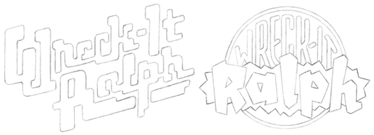
See more of Michael's logo work over on his Behance page.
Like this? Read these!
- The best free web fonts for designers
- Useful and inspiring flyer templates
- The best 3D movies of 2013
Which Disney logo is your favourite? Let us know in the comments box below!
Sign up to Creative Bloq's daily newsletter, which brings you the latest news and inspiration from the worlds of art, design and technology.

The Creative Bloq team is made up of a group of art and design enthusiasts, and has changed and evolved since Creative Bloq began back in 2012. The current website team consists of eight full-time members of staff: Editor Georgia Coggan, Deputy Editor Rosie Hilder, Ecommerce Editor Beren Neale, Senior News Editor Daniel Piper, Editor, Digital Art and 3D Ian Dean, Tech Reviews Editor Erlingur Einarsson, Ecommerce Writer Beth Nicholls and Staff Writer Natalie Fear, as well as a roster of freelancers from around the world. The ImagineFX magazine team also pitch in, ensuring that content from leading digital art publication ImagineFX is represented on Creative Bloq.
