
There's nothing like a new logo design to provoke outrage; a lot of people simply don't like change and react negatively when something familiar is suddenly replaced by something new and different.
So it's no surprise that the new CBBC logo has received a hostile reception; particularly when you take into account that a lot of the people reacting in such a way have grown up with the channel's previous logo, which served for a creditable 10 years.
Designed by Red Bee Creative – which you'll remember was also responsible for the BBC Three redesign at the beginning of 2016 – the colourful new logo kind of spells out CBBC, and is described by CBBC Controller, Cheryl Taylor, as "a colourful and versatile identity that is box fresh and fit for purpose in a mercurial and constantly shifting media landscape."
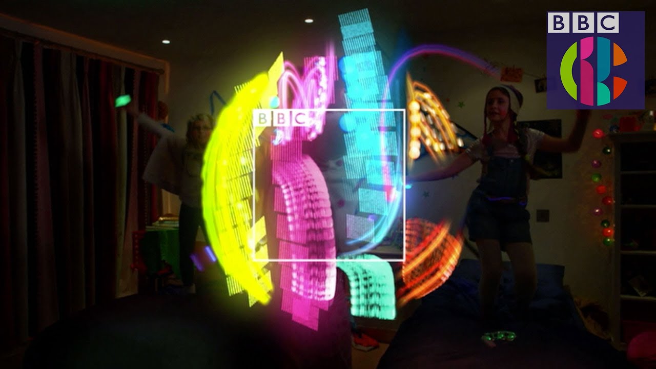
And as part of an entire identity package, the new logo seems a much better fit than it does when seen in isolation. Of course, many commentators have been quick to attribute the work to fictional buzzword-spouting agency Perfect Curve, as seen in BBC comedy series Twenty-Twelve and W1A.
Interestingly, while there's been a fair bit of negative reaction from the design community, none of it's been especially scathing and, on the whole, gives the new logo design a pretty fair ride.
And quite a few people rather like it.
What do you think? Let us know in the comments.
Liked this? Read these!
- How to become an art director
- Get to grips with the golden ratio in this easy guide
- Check out these great examples of negative space
- The beginner's guide to flat design
- We reveal where to find logo design inspiration

