
Last week, US phone network Verizon revealed a new logo design (above) and the internet did not approve of the Pentagram redesign – and it got quite ugly, with rival carriers joining in the howls of derision on social media.
Yes, it's yet another controversial rebrand! And the debate over the new Verizon logo gets surprisingly nasty…
Posted by CreativeBloQ on Friday, 4 September 2015
On his Dribbble page, Decu says: "I wonder if they thought about this solution – integrating the checkmark into the V and possibly using it as a standalone symbol."
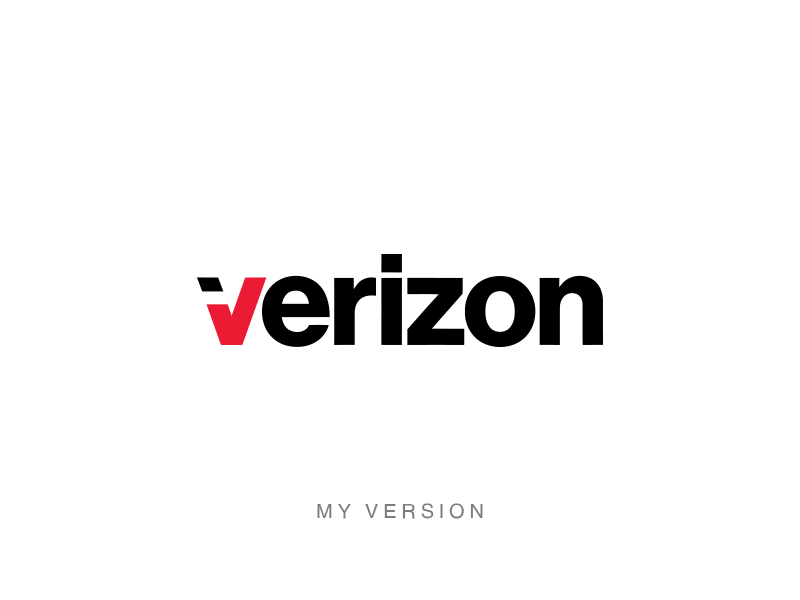
Have a look for yourself – do you think Decu's logo is better than Pentagram's work? Many of our Facebook followers do – tell us what you think in the comments.


Liked this? Read these?

LATEST ARTICLES
