Make your own typeface toy for kids - and type nerds!
Neal Fletcher decided that one of his university projects was just too good to waste - and now hopes to turn his Typeface Kit into an educational tool.
Sign up to Creative Bloq's daily newsletter, which brings you the latest news and inspiration from the worlds of art, design and technology.
You are now subscribed
Your newsletter sign-up was successful
Want to add more newsletters?
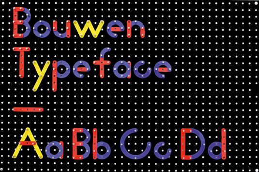
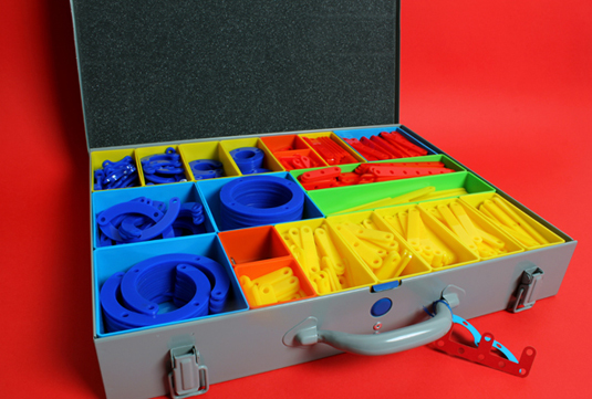
Recent graphic design graduate Neal Fletcher’s passion for typography led to him teaching himself how to create his own new typefaces - and now he wants to bring that joy of discovery to a whole new, and younger, audience with his Bouwen Typeface Kit: a modular construction set that explores and demonstrates the construction of letterforms...

When did you first develop the typeface itself, and what was your one central influence?

"The typeface was developed at university. The idea behind the typeface was to physically demonstrate something that I'd found while drawing typefaces over and over again: to keep continuity throughout a typeface, all the letters need to maintain the same characteristics and style.
"This kit demonstrates this literally, breaking a typeface down into 20 parts, allowing you to construct uppercase, lowercase, numerals and punctuation characters, aimed at children and type nerds alike."
Article continues belowHow long did it actually take you to create the kit, and were there any unexpected - or even expected - difficulties on the way?
"All in all, from start to finish the kit took around two months to design and construct. The only real difficulties were getting the measurements just right - the holes in the Perspex needed to be perfect to the millimetre, which involved a lot of trial and error."

Was it intended as an experiment, or would you like to develop the project commercially as a teaching tool?
"Initially it was merely an experiment, taking the opportunity to demonstrate an idea I've wanted to work on for a while. Since completing the project, because of the feedback I've had, it’s now my plan to develop it further as a fun teaching tool."
What’s your take on the teaching and appreciation of typography, and letterforms generally?
"I feel that typography and the appreciation of letterforms is an essential part of being a graphic designer. It should be an integral part of all graphic design degree courses."
This mini-interview was originally published in Computer Arts issue 205.
Sign up to Creative Bloq's daily newsletter, which brings you the latest news and inspiration from the worlds of art, design and technology.
Like this? Read these!
- The 30 best free fonts for designers
- 75 top typography tutorials
Have you seen any book cover designs that have caught your eye? Let us know in the comments box below!

The Creative Bloq team is made up of a group of art and design enthusiasts, and has changed and evolved since Creative Bloq began back in 2012. The current website team consists of eight full-time members of staff: Editor Georgia Coggan, Deputy Editor Rosie Hilder, Ecommerce Editor Beren Neale, Senior News Editor Daniel Piper, Editor, Digital Art and 3D Ian Dean, Tech Reviews Editor Erlingur Einarsson, Ecommerce Writer Beth Nicholls and Staff Writer Natalie Fear, as well as a roster of freelancers from around the world. The ImagineFX magazine team also pitch in, ensuring that content from leading digital art publication ImagineFX is represented on Creative Bloq.
