5 rules for visual direction in interaction design
Jerry Cao of UXPin explains how to ensure your visuals work with in harmony with user interactions.
Sign up to Creative Bloq's daily newsletter, which brings you the latest news and inspiration from the worlds of art, design and technology.
You are now subscribed
Your newsletter sign-up was successful
Want to add more newsletters?
We don't want to undercut the significance of words, but we don't want to downplay visuals, either. Both are equally important elements of interaction design. Words are interactions, but the visuals (like icons, menus, graphics, etc.) are what users actually interact with. While some usability experts might cite Craigslist or even Amazon as examples of ugly but usable (and popular) sites, there's no doubt that aesthetics serve a function.
Win clients & work smarter with our FREE ebook: get it now!
Emotion is key to the user experience: websites with nice visuals relax users and improve credibility and usability. Considering the short attention span of most users, perception is oftentimes reality: if the visuals are terrible, users won't bother diving deeper into your interaction design.
We'll examine the importance of vision as it relates to interactions and how to ensure clear orientation, navigation, and consistency.
01. Respect the dominance of vision
Let's start with a demonstration. Take a look at the word below:

Clearly, we all know which colour the word "yellow" represents. But when most people read the above, they likely comprehend only red. The look of the typeface supersedes the actual meaning of word.
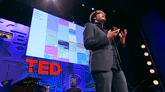
As humans, vision is our dominant sense. While other animals rely more on hearing and smell, we are sight-driven creatures. As David McCandless, data journalist and infographic expert, explains in a compelling TED Talk, we use all of our senses, but most of our brainpower goes into sight — though we may be hardly aware of it. He describes it with a computer analogy...
Sign up to Creative Bloq's daily newsletter, which brings you the latest news and inspiration from the worlds of art, design and technology.
"Your sense of sight is the fastest. It has the same bandwidth as a computer network. Then you have touch, which is about the speed of a USB key. And then you have hearing and smell, which has the throughput of a hard disk.
"And then you have poor old taste, which is like barely the throughput of a pocket calculator. And that little square in the corner, a naught .7 percent, that's the amount we're actually aware of. So a lot of your vision — the bulk of it is visual, and it's pouring in — it's unconscious."

But what does that mean for you with regards to interaction design? It means that every visual decision you make for your product will have an enormous impact on the interaction, even if only subconscious.
Stephen P. Anderson, product design consultant, points out that visuals will affect more than the experience, they'll also affect the user's behaviour.
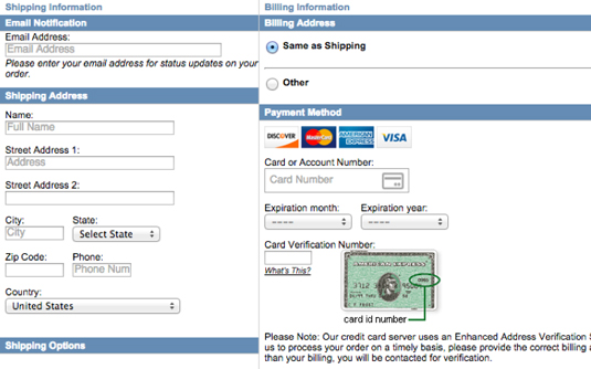
This means that a good visual design can improve sales, increase signups and conversions, and encourage certain user behaviors. Take a look at the two checkout forms below:
Checkout Form A
Checkout Form B
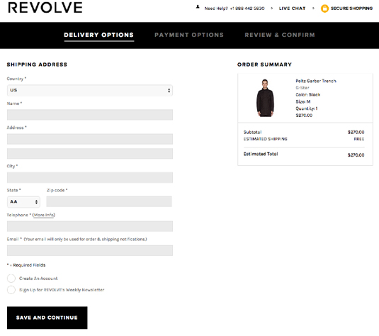
Keeping in mind that one of the goals of interaction design is to make the user think as little as possible, which would you guess is more conducive to a sale? Which is more visually pleasing?
The top sample seems to repulse users with its claustrophobic spacing and overload of text, while the bottom sample is colourful, aesthetic, and seems simple (even though the user is more-or-less entering the same data).
Because interaction design is all about creating things that people actually want to use, attractive things are more desirable and therefore work better.
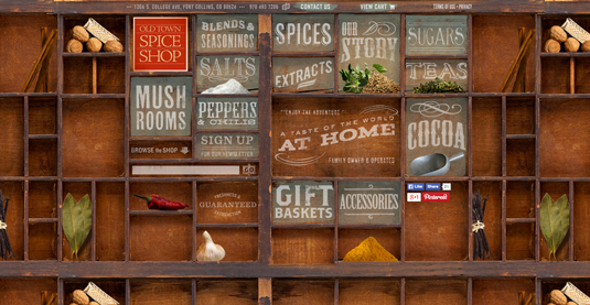
But more than just inviting interaction, smart aesthetic design also provides an extra layer of understanding. If you look at the Old Town Spice Shop example above, you can see how the cabinet layout of the site immediately suggests the company's purpose and spice products.
While you can debate whether users would see the cabinet first or the words like "Spices" and "Extracts" first, there's no doubt that the two work in harmony.
02. Provide clear orientation and navigation
Users browsing the web are not unlike nomads. People have a general sense of where they want to go, but still need some direction and cues. The way they do it is by creating mental maps, and since we just established that humans are visual creatures, we're going to need a few visual markers to find our way.
In a way, your navigation needs to act like a GPS. Users need to know their current location, what routes are possible, and what the next steps should be.
Breadcrumbs are the most explicit way of satisfying all three requirements. A common UI pattern like this one from Newegg below, this treatment leaves a clear visual trail for users to track their visit.

But breadcrumbs must be treated as a backup option for users, because they're not a visually intuitive method of clicking between pages. They're mostly used in sites with complex hierarchies, such as e-commerce sites, and aren't required for simpler sites. When in doubt, refer back to your site map and see if adding breadcrumbs would improve usability or just add clutter.
Signifying words, breadcrumbs, links — in addition to menus, search fields, and clickable icons — are all sight-based tools in your design toolbox that help you create a sense of orientation and navigation. When it comes to the primary navigation, you need to make a strong visual impression.
If you'd like to learn more about navigation best practices, check out our free ebook Web UI Design Best Practices, and this 5-part series on simplifying navigation for interaction design.
Next page: three more rules for visual direction in interaction design

The Creative Bloq team is made up of a group of art and design enthusiasts, and has changed and evolved since Creative Bloq began back in 2012. The current website team consists of eight full-time members of staff: Editor Georgia Coggan, Deputy Editor Rosie Hilder, Ecommerce Editor Beren Neale, Senior News Editor Daniel Piper, Editor, Digital Art and 3D Ian Dean, Tech Reviews Editor Erlingur Einarsson, Ecommerce Writer Beth Nicholls and Staff Writer Natalie Fear, as well as a roster of freelancers from around the world. The ImagineFX magazine team also pitch in, ensuring that content from leading digital art publication ImagineFX is represented on Creative Bloq.
