Create a vector icon in Adobe Fireworks
Fabio Benedetti looks at how easy it is to create a bespoke icon with Adobe's screen design tool.
Sign up to Creative Bloq's daily newsletter, which brings you the latest news and inspiration from the worlds of art, design and technology.
You are now subscribed
Your newsletter sign-up was successful
Want to add more newsletters?
One of the most fascinating fields in visual design is icon design. Nowadays we're invaded and bombarded by icons everywhere: on products, printed materials, packaging, the web and overall in software. Designing icon sets presents some challenges, of course, but it's also a very interesting exercise that allows you to learn new things and develop greater attention for details.
Icons can communicate a message very quickly, occasionally in a way that is quicker than words. Most importantly, if well designed, they can be understood by everyone, no matter their language or culture. In this tutorial we're going to explore how to design a cloud icon for a cloud-based software to share and upload files.
In recent years, the business in the cloud has exploded (in a positive way!), so if you're working in visual design, it's very likely you'll stumble upon a task that entails designing an icon with some sort of cloud element to it. For this task, we'll use Adobe Fireworks, a vector-based tool that supports raster graphics as well.
Article continues belowFrom web design, UI design icon design or even wireframing, Fireworks offers speed and flexibility superior to more expensive software. Even though Adobe decided to stop further development on Fireworks, many designers are still using it because of its straightforward interface, accuracy and capacity to achieve pixel-perfect results in a relatively short time.
01. Get started
When designing an icon, I generally start sketching out ideas on a notepad in order to have a clearer picture of where I'm heading to. However, a cloud icon is something that has strong circular geometry, so if using pen and paper isn't your thing, you can start by opening Fireworks, or your favourite vector tool.
The main part of this exercise is based on circular shapes and a strong rational. Instead of Photoshop, for example, Fireworks is very object-oriented rather than layer based, so don't worry too much about naming your layers. You can drag the object onto the canvas directly by selecting them with the Pointer tool (V).
02. Two circles
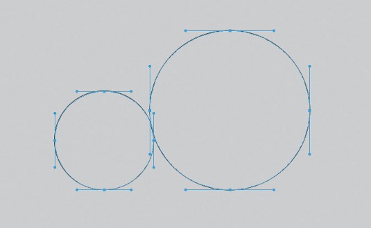
Set up your canvas to 800px wide and 1000px high. Give it a light grey background (for example, #CCCCCC) and select the Ellipse tool (U).
Sign up to Creative Bloq's daily newsletter, which brings you the latest news and inspiration from the worlds of art, design and technology.
(The sizes of the different circles we're going to design are purposely chosen, but we'll come back to this in step three.)
With the Ellipse tool selected, press Shift and draw a perfect circle of 180px by 180px. Copy and paste it (Cmd+C , Cmd+V) and scale the new circle to the size of 291px by 291px.
In order to do that, select the shape, use the shortcut Cmd+Shift+T and then, from the numerical transform window, select the Resize option.
03. Golden ratio
The two circles we've designed follow a common rule found in mathematics and in nature that's generally called the golden ratio, based on Fibonacci's theory. The golden ratio identifies the relationship between two proportions. These two circles follow a ratio (called the Fibonacci ratio) of 1:1.61. That means that, if the first circle is 180px, we can multiply that by 1.61 and get the other diameter for the circle, which is approximately 290px.
In design in general, the use of the golden ratio is pretty common because it creates pleasing compositions to the eye.
04. Copy and paste
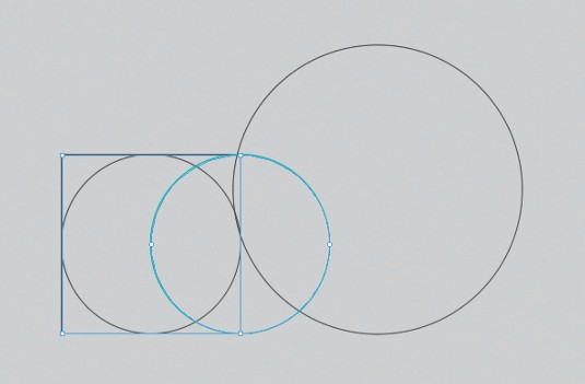
Copy the smaller circle (180px) and move it to the left until the first half of the circle intersects the square in the exact middle. To do that you can either copy and paste the shape in place (Cmd+C, Cmd+V) or select the circle pressing alt on the keyboard and dragging it to the right. This command will duplicate the shape. If you want to be even more precise, you can select the shape, press Alt+Shift and move the shape. With this command the circle will move on a fixed horizontal axis without moving up and down.
05. Shape-building
Our cloud is starting to take shape. For now, we have an outline view. If you're an Illustrator user, you can see how Fireworks behaves in a similar manner but also how quickly you can build shapes. At this stage, copy the shapes on the left-hand side of the big circle, reflect them and position them to the right of the circle in order to create a symmetrical shape. To do that, select the shapes on the left, right click and from the contextual menu, select Transform>Flip Horizontal. Then move them to the right to create the backbone of the cloud.
06. Lose the unwanted bits
Now you can start to get rid of the unwanted shapes (such as the circles on the left-hand side and the right-hand side and the squares). Select them with the direct sub-section tool (A) and press Delete. Otherwise, you can do that from the Layer panel.
The beauty of Fireworks is that you can select, copy, paste and deal directly with objects rather than focusing to much on layers. After deleting the unnecessary shapes, fill the three remained shapes with a solid light grey colour (#BBBBBB).
07. Fun with paths
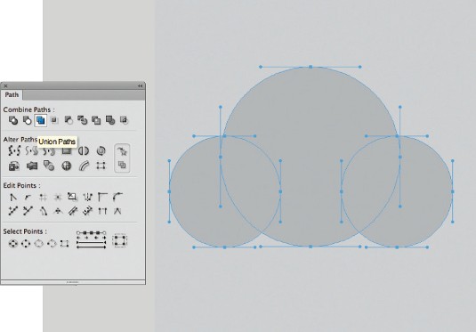
We're now going to use one of the most important panels in Fireworks: the Path panel. From the toolbar window select Path and the path panel will appear. With the sub-selection tool (A) select all three circular shapes. Make sure you use the sub-selection tool and that the three circles are not grouped, otherwise the Union Shape tool from Path will not work. Once you have the three shapes selected, click on the Union Paths icon and the shapes will merge into a single one. This is very similar to the Pathfinder tool in Illustrator, but has some nice features, which we'll explore further. You should now have one shape on your canvas and be able to see the anchor points.
08. Refine the details
We have a basic shape of a cloud on the canvas. The job is now refining the details and make sure that the icon is meaningful for our task. Select the Rectangle tool (U) and design a rectangular shape 264px by 64px. Position it at the bottom of the cloud in order to make the bottom of the cloud a straight line.
One thing to remember is that, in Fireworks, everything snaps to pixel by default. There's no need to activate the snap to pixel function as in Photoshop. On the other hand, if you're resizing a vector shape and you need tot get rid of half pixels, just press Cmd+K and this will fix the issue.
09. Make an outline
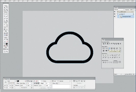
Now some fun for the next part. We want the icon to be simple and light. Therefore, we're going to use an outline shape instead of a full shape. In the Property panel, set the fill to null or transparent and the outline stroke to 30px black. Set the value of the Edge to 3 to make the hardness of the stroke a bit softer and appealing to the eye. You should also align the stroke to outside using the dedicate command underneath the stroke size in the property panel. You should have your cloud shape now outlined in black. With the pen tool (P), remove unnecessary anchor points if you need to.
10. Modify the stroke
Some tweaks to the icon are needed in order to add another element. Ideally, add an arrow pointing upwards to represent uploading files into the cloud. To do that we need to modify the stroke. Here, we explore one of the most interesting features of the Path panel in Fireworks. Select the shape and, from the Path panel, click on the icon resembling 2S (called Convert Strokes to Fills). It will expand the stroke to a solid shape and may take a bit of memory, so be patient. It's something similar to the Expand function in Illustrator, but a little more straightforward to achieve.
11. Create some space
We need to make some space for the arrow. To do that, let's redraw a circle of 180px with the Ellipse tool. Position the circle in the middle of the bottom of the cloud. You can use the Align panel to be 100 per cent precise. From Window, choose Align.
Once the shape has been aligned in the middle, we're going to go back to our Path panel and use the Punch Path tool.
12. More refinement
The shape we have now has to be refined as we don't want to leave straight or rough edges where the gap has been opened in the cloud bottom line.
Let's draw two circles both of 30px by 30px and position them at the edges where the circle shape has been cut off in order to make the cloud silhouette smooth and neat. Once that's done, let's merge them with the cloud shape using the Path panel tool Union Path.
13. Take a look
Before going on with the arrow, let's have a look a the geometry of the icon so far. Everything should be well-aligned and smooth. The golden ratio we used is definitely making the final product pleasing to the eye.
14. Start the arrow
Let's have a closer look at the arrow. With the rectangle tool, draw a vertical rectangular shape 36px wide and 200px high. Then from the Property panel, set the 'roundness' to 100%.
15. Finish the arrow
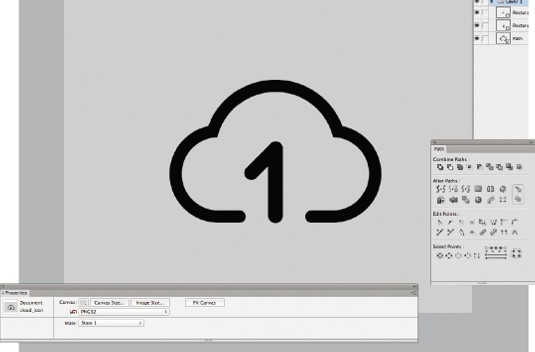
We can now finish up the shape of the arrow pointing upwards. Make sure the bottom of the arrow is aligned with the edge of the cloud.
Design a rectangular shape 35px by 120px and rotate it 45 degrees. Align it to the top of the base of the arrow. Copy and paste it and flip it horizontally to create a rounded arrow shape.
16. Merge it all together
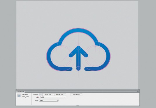
Now that the shape of the arrow is done, let's merge all the vectors together and apply a gradient to make the cloud icon more interesting. Apply a linear gradient that goes from top to bottom (#0085B2 to #0059B2) to have a shade of blue that reminds us of the tone of a clear sky.
17. Take another look
Let's check the geometry again. Have a look at how everything is perfectly aligned and how the shape is crafted with logic and consistency.
18. Finished!
Now that the icon is ready, you can place it everywhere you like. You can use it as a splash screen element, on a login form, or even on a desktop, or in online stores. As it's vector-based, you can scale it up and down without losing any details. Enjoy!
Words: Fabio Benedetti
This article originally appeared in net magazine issue 253.

The Creative Bloq team is made up of a group of art and design enthusiasts, and has changed and evolved since Creative Bloq began back in 2012. The current website team consists of eight full-time members of staff: Editor Georgia Coggan, Deputy Editor Rosie Hilder, Ecommerce Editor Beren Neale, Senior News Editor Daniel Piper, Editor, Digital Art and 3D Ian Dean, Tech Reviews Editor Erlingur Einarsson, Ecommerce Writer Beth Nicholls and Staff Writer Natalie Fear, as well as a roster of freelancers from around the world. The ImagineFX magazine team also pitch in, ensuring that content from leading digital art publication ImagineFX is represented on Creative Bloq.
