How to use AB testing, eye tracking and Website Optimizer
What’s the best way to present content: a grid or list view? Alastair Campbell explains how Nomensa used A/B testing, eye tracking, Google Analytics and Website Optimizer to help the .net team decide for the launch of www.netmagazine.com
Sign up to Creative Bloq's daily newsletter, which brings you the latest news and inspiration from the worlds of art, design and technology.
You are now subscribed
Your newsletter sign-up was successful
Want to add more newsletters?
This article originally appeared in issue 216 of .net magazine - the world's best-selling magazine for web designers and developers.
When the .net magazine site relaunched, with a new design and more regularly updated content, one requirement was that the new site should better present the articles to encourage click-through. But which format would be best?
A typical approach is the blog style, where you have a linear list of the latest articles. There might be a thumbnail, a heading and a short description of the article. However, the team was interested in using a grid layout that was less text-heavy, and potentially would be easier to scan over.
Article continues belowThat’s where we at Nomensa came in. We’d already done some usability testing on early wireframes of the homepage, and could be quite confident that people would be happy with the grid view. The layout should encourage scanning and make decisions easy, we reasoned. A grid layout takes up less vertical space and, as everyone knows, people don’t read online anyway. The graphically richer grid layout should be a slam dunk, right?
There was a niggling feeling that it might not be, so we needed to find an answer. Asking people wasn’t really going to help here; it isn’t a matter of preference, it’s a matter of performance. It’s also a case where asking someone to think about their preference could change it.
We needed a quantitative method that would track a lot of people and assess their decisions for two different versions. So we settled on using A/B testing of two different views, the list and the grid view.
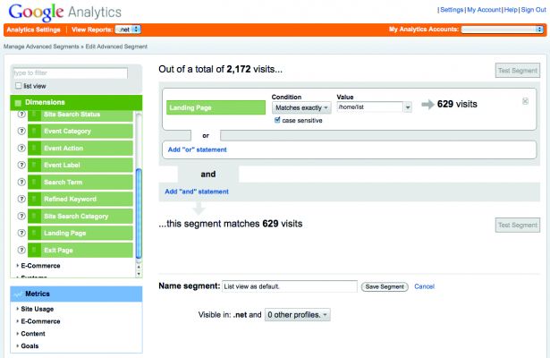
The next step was to use Google Analytics to discern any difference between list and grid views. There’s a particular feature of Analytics that makes it an excellent companion to GWO: advanced segments.
Sign up to Creative Bloq's daily newsletter, which brings you the latest news and inspiration from the worlds of art, design and technology.
Applying an advanced segment is like filtering the analytics data on a particular variable. There are lots of options. For example, you might want to view only sessions that came from Twitter, or only sessions that lasted more than two minutes. You can then view the bounce rates, time on site, average pages and all the usual metrics.
Tracking with Analytics
The segments we wanted to create were based on the landing page people would see, so we were able to use the same URLs we used for the optimisation set-up. One segment was created for the default view, where the landing page URL was simply a forward slash. The second segment was for the alternative view, located at /home/list.
After a day, we had more than 600 people in each condition, and for every numerical measure in Google Analytics, there was no significant difference. After all that set-up, it appeared (at first glance) that there was no difference. Then, we looked at the main navigation paths from the landing page. When looking at the grid view, the most popular next pages were split evenly between the main navigation and reading an article. For the list view, more people would select an article than look at the navigation.

It wasn’t a huge difference, but there was a 15 per cent greater chance that people would select an article from the list view. For comparison, everyone received the default grid view on the popular Tutorials page, and the effect was gone.
Intriguing, but it’s difficult to know how possible it is to generalise that effect. It would help to know why the list view encouraged article views, so we turned to a more qualitative method.
Eye tracking
Eye tracking is popular in user research, providing direct insight into where people are looking. There has been some controversy in the UX community about the usefulness of eye tracking, especially when it’s used by default. In many cases, a standard usability set-up will provide the same answer as a set-up with eye tracking, so it’s hard to justify the extra equipment cost.
For the .net website, though, we were trying to understand how people scanned the design, so eye tracking could provide some important clues.
The test set-up was short and sweet. Each participant was asked to look at the new .net magazine homepage and to select an article they’d like to read. Half of the participants were first shown the list view, before doing the same task on the grid view. The other set of participants were first shown the grid view.
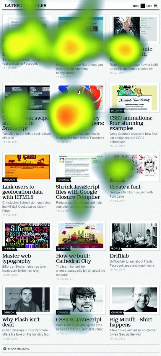
The eye tracking image showed the grid view of the homepage and, initially, this didn’t provide much in the way of clues. We could tell that the text titles garnered the vast majority of gaze, but this was the same for both grid and list versions.

The difference was apparent only when you watched the gaze trails build up. With several participants, it became apparent that scanning the list was more predictable, generally one at a time.
When people were scanning the grid version of the homepage, the order was not the well-known ‘F’ pattern. You might expect people to scan the grid left to right, row by row. The actual pattern was much more scattered, sometimes going down the middle and branching out to either side.
There are a several possible explanations for this less predictable gaze pattern. It might be that:
- People are simply more used to the linear version, therefore they are more used to scanning that presentation
- The linear nature of the list version is considerably easier to scan
Does it matter that people take a random approach to scanning the grid version? Maybe not
for all sites, but the articles are the key reason for people to visit .net magazine. If people are more likely to get to an article when the list view is available, that’s an important consideration for the homepage and section pages.
With more participants, we might find that content guides people’s gaze. For example, particular keywords or imagery might draw more people’s attention. Another possibility is that there are low-traffic areas from a scanning point of view. The fourth and sixth articles (second row on the left and right) were not looked at as much as the fifth article.
The answer
To make a general claim about the usefulness of grid layouts, we’d need to run this test with many more participants and use a randomised content ordering. However, for the purpose of the .net magazine website, we could be pretty confident in saying that switching to a list view would increase the amount of people who go directly to an article.
There is a caveat, though. Once a site is live and used regularly, people build up habits in
how they use it. Facebook is probably the most famous example, where changes to the interface caused users to complain and even set up online campaigns about the change. The .net site has been live since March, so it might be that people have become used to the current view.
Some of the feedback from the usability testing suggested that people would like to choose layout style, so the new .net site has always provided the choice to switch layout style with one click.
I’m not worried about a backlash, but it will be interesting to see how many people make a
conscious choice about it.
A/B testing with Website Optimizer
Google’s Website Optimizer (GWO) enables you to set up simple A/B testing, or more complex multivariate testing. There are times when multivariate testing is needed, such as working out the most effective order for three or more items on a page. However, for comparing a list view to a grid view, the A/B experiment style is perfect.
To set up A/B testing with GWO you need three things:
- A start page, usually the current or default page that you have now.
- An alternative page, which varies in a way that you think will affect users.
- An end page, which GWO will use for calculating conversion.
When you’ve set up or identified these pages, you can put them into GWO and it will give you three blocks of JavaScript to include in each page.
It’s vital that you can add the JavaScript to the top of each page’s source code, because that is the mechanism for assigning people to the different conditions.
When a user hits the start page, the JavaScript randomly assigns them to one of the conditions, A or B. If the user is assigned to B, they are forwarded immediately to the
alternative page.
NB: If a user doesn’t have JavaScript enabled or it’s being stripped en-route, they won’t count in the results or statistics. You then launch the experiment, and people will start being assigned to each version of the page. What you’re expected to do is wait for sufficient conversions for it to become statistically valid. However, in this case we don’t have an end page for conversion because it’s an article site rather than a set journey – any article is good! We did have to put an end page into GWO, but we won’t need to use the conversion metric.

The Creative Bloq team is made up of a group of art and design enthusiasts, and has changed and evolved since Creative Bloq began back in 2012. The current website team consists of eight full-time members of staff: Editor Georgia Coggan, Deputy Editor Rosie Hilder, Ecommerce Editor Beren Neale, Senior News Editor Daniel Piper, Editor, Digital Art and 3D Ian Dean, Tech Reviews Editor Erlingur Einarsson, Ecommerce Writer Beth Nicholls and Staff Writer Natalie Fear, as well as a roster of freelancers from around the world. The ImagineFX magazine team also pitch in, ensuring that content from leading digital art publication ImagineFX is represented on Creative Bloq.
