Web fonts: the .net top 20
It’s easier than ever to get creative with typefaces. Elliot Jay Stocks picks 20 web fonts that demand your visitors’ attention
Sign up to Creative Bloq's daily newsletter, which brings you the latest news and inspiration from the worlds of art, design and technology.
You are now subscribed
Your newsletter sign-up was successful
Want to add more newsletters?
To say that right now is an exciting time for web typography is to make something of an understatement. Recent technological leaps and bounds have brought us one step closer to typographical nirvana on the web, and it’s a step that’s been an awfully long time coming.
The freedom to use typefaces beyond the ‘web safe’ fonts installed on most systems has come about largely thanks to three major and near-simultaneous technological factors: firstly, the widespread support for @font-face in browsers; secondly, the emergence of font delivery services such as Typekit and Fontdeck; and thirdly, the development of a new font format – the humble WOFF file – to address many of the foundries’ privacy concerns.
But with great power comes great responsibility. Just because we can choose from a vast library of web fonts doesn’t mean we have to
But with great power comes great responsibility. Just because we can choose from a vast library of web fonts doesn’t mean we have to; there’s something to be said for painting with a limited palette. Not only that, but there are a lot of sub-standard fonts out there, and with many of them being free, their usage is often widespread but undeserved. In fact, this is part of a much larger problem: the misconception – particularly within the web design community – that fonts aren’t worth paying for.
This is damaging for both the worldwide network of talented type designers and the design community as a whole. A typeface, like any form of design, is created by craftsmen over a substantial period of time, using the talent and experience they’ve been honing for many years. The benefits of a professionally designed web font — various weights and styles to form a complete family, carefully considered kerning pairs, multi-language support with international characters, expressive alternate glyphs to add character and variety to type-setting — are very rarely found in a font available for free.
It’s for this reason that we’ve focused almost entirely on 20 fonts that require some sort of purchase, although many of the Typekit-served fonts are available within their free package. We’ve also focused primarily on typefaces that work well for the relatively small body type we use regularly on the web, rather than display faces more suited to very large headings.
20 Avenir
Classification: Sans serif
Sign up to Creative Bloq's daily newsletter, which brings you the latest news and inspiration from the worlds of art, design and technology.
Designer: Adrian Frutiger
Avenir’s design is based upon the ubiquitous Futura (which was designed as ‘Die Schrift fur die Neue Zeit’ – ‘the typeface for the New Time’), but Avenir is described by designer Adrian Frutiger as having a more human touch. Despite its popularity as a corporate typeface, it’s a well-rounded geometric sans with a subtle personality that adds a friendly smile to serious content. Several years later, Akira Kobayashi completed Avenir Next, which refined the original and added italics and small caps.
19 FF Kava
Classification: Sans serif
Designer: Yanone
When Kaffeesatz was released for free around the time browser support for @font-face became more prevalent, it found popularity among many web designers and brought designer Yanone to the attention of FontShop FSI, who commissioned him to produce a professional version of the typeface. Rather than simply adding extra glyphs to the font, it was completely redrawn from the ground up, keeping much of its character but including features such as a black weight, small caps and international language support. The result is FF Kava.
18 Times New Roman
System font
Classification: Serif
Designer: Victor Lardent, Stanley Morison
As strange as it may seem to list a system font associated with the world of Word documents and suits who can’t be bothered to change the defaults, Times New Roman is a surprisingly robust typeface when given a little TLC. The 2008 Seed Conference website made particularly good use of Times by giving it the feel of a display face. Simon Collison, a designer known for his appreciation of Times’s flexibility and use of it on his personal site, says that 'it actually feels quite good to be taking a tired old typeface and trying to squeeze every possible ounce from it'.
17 Bree
Typekit, Fontdeck
Classification: Sans serif
Designer: Jose Scaglione, Veronika Burian
Full of personality and unashamedly casual, Bree might seem suited only to headings rather than body type, especially as it was born from TypeTogether’s logo. However, a closer look reveals that, while headings are certainly its forte, Bree performs surprisingly well at smaller sizes. It’s also just one of the many beautiful typefaces to be born of the collective brains of Jose Scaglione and Veronika Burian, two type designers who met while completing the MA in Typeface Design at the University of Reading, a course widely considered to be one of the best in the world for aspiring type designers.
16 FF Trixie
Classification: Typewriter
Designer: Erik van Blokland
Trixie was one of the first true typewriter fonts and is an excellent choice if you’re going for distressed headings. Simulating the aesthetics of ink being misprinted by a typewriter is no mean feat when the text also needs to remain totally legible, yet Trixie manages to succeed on both counts.
15 Centro Sans Pro
Fontdeck
Classification: Serif
Designer: Panos Vassiliou
Many super-families or ‘type systems’ enable designers to mix serifs and sans-serifs to achieve simultaneous consistency and contrast, and Centro is one such super-family. It has been described as an ‘invisible’ typeface, where its single greatest attribute is its impressive legibility. The sans is strong and sturdy, with a large x-height and, quite simply, it looks absolutely great in use on screen.
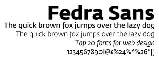
14. Fedra Sans
Typotheque
Classification: Sans serif
Designer: Peter Bil’ak
At the heart of Typotheque’s font library, Fedra is a super-family that was designed to work just as well on screen as in print, and actually started life as a corporate typeface for German insurance company Bayerische Ruck. The design faced disaster when the client first acquired and then cancelled the project, then faltered again when Typotheque’s office equipment was stolen. But, with designer Peter Bil’ak being forced to go back and re-examine the typeface, the final design was all the better for the set-backs, and the eventual result was a set of extremely versatile fonts.
13 Museo Slab

Typekit, Fontdeck, Font Squirrel
Classification: Slab serif
Designer: Jos Buivenga
The original version of Museo has become extremely popular among web designers and is one of the few semi-free web fonts (several of its weights are free) to make it onto this list. Its newer slab variant is a little less playful than standard Museo, and so offers a slightly more authoritative tone, along with a welcome element of variety, given how widely spread the original version has become.
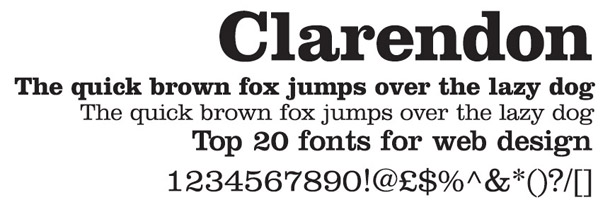
12 Clarendon
Classification: Slab serif
Designer: Robert Besle, Hermann Eidenbenz
This classic British slab serif is a must-have on any ‘top typefaces’ list. Redrawn by Hermann Eidenbenz to include several weights and widths, Clarendon is offered as a web font by Fontdeck. Also of note is Sentinel by Jonathan Hoefler and Tobias Frere-Jones. Their Clarendon-based typeface added true italics, although sadly there’s currently no web font version, so any web designer desperate to use this typeface must resort to font replacement methods such as sIFR, Cufon, or – dare we say it – image replacement. Certainly not ideal, and perhaps not truly a font for the web (yet), but one too beautiful, too robust, and just too damn popular to omit entirely.
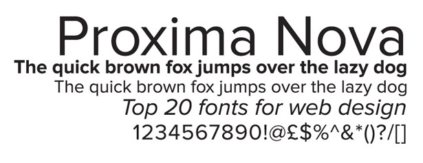
11 Proxima Nova
Typekit, Fontdeck
Classification: Sans serif
Designer: Mark Simonson
Described as a design that straddles the gap between typefaces like Futura and Akzidenz-Grotesk, Proxima Nova is remarkably versatile, and the family includes several weights and widths, bringing the total font count to an impressive 42. Extremely readable thanks to its geometric clarity and humanist feel, it’s a hybrid that works in a variety of scenarios.
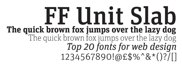
10 FF Unit Slab
FontShop
Classification: Slab serif
Designer: Erik Spiekermann, Christian Schwartz, Kris Sowersby
The slab style of the Unit super-family – which is often referred to as the grown-up sister of Meta – is a personal favourite of many, including me, and I chose it as the official typeface of my print magazine 8 Faces. It comes across as powerful and almost brutish at its heaviest ‘Ultra’ weight, yet can be seen as deceptively subtle at its thinnest ‘Thin’ weight – the typeface is a great all-rounder that’s just overbrimming with personality. A variation of Unit Slab – Espi – is used as Edenspiekermann’s corporate typeface.
09 Calluna
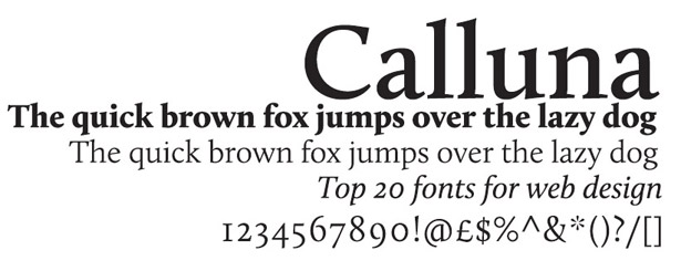
Classification: Serif
Designer: Jos Buivenga
Born as the result of an experiment designer Jos Buivenga was performing with an early version of Museo Slab, Calluna is actually his first serious text face. Much like Meta Serif, it manages to exude no small amount of personality even when used at smaller, body type sizes. Like many of Jos’s latter-day fonts, there are plenty of OpenType features included, and the regular weight is available completely free.
08 Ronnia Condensed
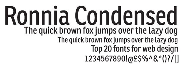
Classification: Sans serif
Designer: Jos Scaglione, Veronika Burian
Condensed faces are often used for attention- grabbing headlines, and often we reach for hard, industrial faces such as Alternate Gothic and its ilk. Sometimes something a little softer is required, though, and that’s where Ronnia’s condensed flavour comes in. Its gentle, playful form plays well with Bree, although it comes across as a little more authoritative: a friendly face with some gravitas.
07 Droid Sans
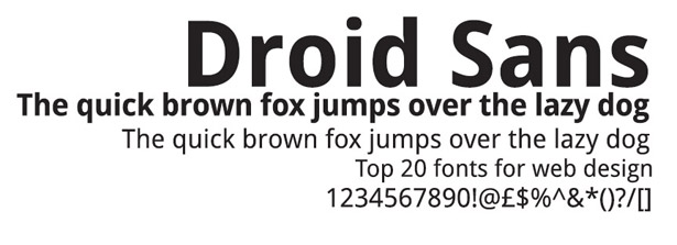
Classification: Sans serif
Designer: Steve Matteson
A truly modern type super-family, Droid was designed by Ascender’s type director Steve Matteson for use on mobile devices; its name is derived from the Android platform. The sans is a highly legible, friendly typeface with upright stress, open forms and a neutral appearance. To make the most of type appearing on small screens, the letterforms are very slightly condensed. The entire family features multi-language support so is well-suited to far-reaching websites and applications.
06 FF Tisa
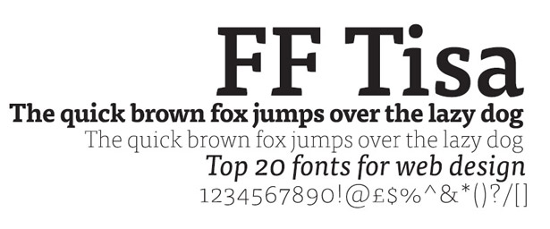
Classification: Serif
Designer: Mitja Miklavi
Although initially designed for use in magazines, Tisa has become popular on the web, perhaps because – like the majority of typefaces here – its large x-height makes it highly legible as on-screen body type. Taking slab serifs as an influence and then offering a softer, low-contrast end product, the typeface was originally designed by Miklavi to fulfil the requirements for the aforementioned MA in Typeface Design at Reading.
05 FF DIN
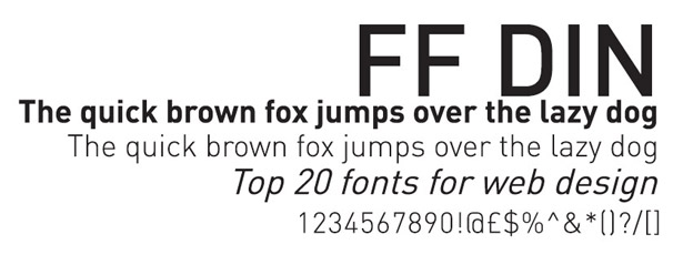
Classification: Sans serif
Designer: Albert-Jan Pool
DIN embodies the spirit of German efficiency (DIN stands for ‘Deutsche Industrie-Norm’ or ‘German Industrial Standard’) and has its roots in signage – everything from road signs on the Autobahn to house numbers. It was celebrated for its no-nonsense geometric style and adorned German design for years in the form of DIN 1451: DIN-Mittelschrift and DIN-Engschrift, its condensed companion. It was updated and expanded into a family of five weights by Albert-Jan Pool in 1995 and has recently been given more stylistic variants, including DIN Rounded.
04 Helvetica

Classification: Sans serif
Designer: Max Miedinger, Eduard Hoffmann
It seems almost impossible to discuss the subject of typography without mentioning Helvetica. Thanks to its generous usage by what seems like every designer in existence, the typeface has achieved legendary status; its name and style known to the general public as well as type aficionados, partly due to the 2007 film by Gary Hustwit. Originally named Die Neue Haas Grotesk and created to compete with Akzidenz-Grotesk, it represents the Swiss style of graphic design from the 1950s, but its widespread appearance in virtually every design context has resulted in the typeface becoming somewhat homogenised, and it has been re-imagined in various (inferior) forms such as Arial. Nevertheless, it remains a modern classic.
03 Alternate Gothic No 1

Classification: Sans serif
Designer: Morris Fuller Benton
A fantastic typeface for headlines, Alternate Gothic and its variants remain a hugely popular choice for those in need of a hard-hitting, almost brazen typeface. Legible at relatively small sizes despite being condensed, it’s a bold and formidable face; a slice of American industrialism performing magnificently in the digital age. An open source re-drawing, League Gothic, was released by The League of Moveable Type and has since become widely popular on the web, thanks in no small part to it being freely available to download.
02 FF Meta Serif
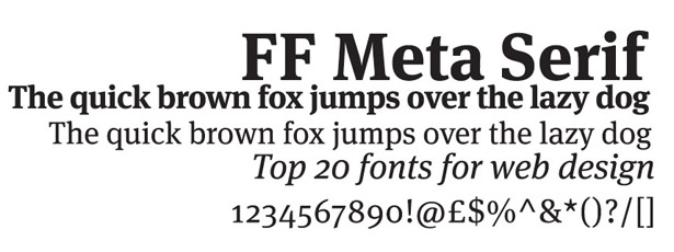
Classification: Serif
Designer: Christian Schwartz, Erik Spiekermann, Kris Sowersby
Erik Spiekermann describes his Meta family as "the nearest thing I’ll ever have to a classic", and he’s being modest, because Meta really is a classic, especially its serif. It’s an authoritative typeface that works well in a variety of scenarios and offers a logical upgrade to designers who have previously been using Times New Roman. It works well with the other flavours of Meta and also with the Unit super-family. Support for international characters and a wide variety of glyphs for numerals, fractions and so on mark it out as a high-level professional font. More details can be found at metaserif.com.
01 Georgia

System font
Classification: Serif
Designer: Matthew Carter
What? A system font in pole position? As hard as it may be to believe, Georgia comes up again and again as the people’s favourite when talking about type that works well on the web. Perhaps it’s because it was designed for screen rather than print; perhaps it’s because it manages to offer timeless beauty in its simple, understated design; perhaps it’s because it has Old Style Figures as default! Extremely legible at small sizes and somewhat majestic in its italic form, Georgia proves its worth despite the new wealth of alternatives, and reminds us that sometimes the best tools are sitting right in front of us.
For more info on type terms, check out the What is Typography? post on our sister site Creative Bloq.

The Creative Bloq team is made up of a group of art and design enthusiasts, and has changed and evolved since Creative Bloq began back in 2012. The current website team consists of eight full-time members of staff: Editor Georgia Coggan, Deputy Editor Rosie Hilder, Ecommerce Editor Beren Neale, Senior News Editor Daniel Piper, Editor, Digital Art and 3D Ian Dean, Tech Reviews Editor Erlingur Einarsson, Ecommerce Writer Beth Nicholls and Staff Writer Natalie Fear, as well as a roster of freelancers from around the world. The ImagineFX magazine team also pitch in, ensuring that content from leading digital art publication ImagineFX is represented on Creative Bloq.
