Google's new gaming logo is cleverly off-brand
The new identity for Stadia is deliberately different to Google's other services.

Sign up to Creative Bloq's daily newsletter, which brings you the latest news and inspiration from the worlds of art, design and technology.
You are now subscribed
Your newsletter sign-up was successful
Want to add more newsletters?
Is there no stopping Google? The tech company already has its fingers in an awful lot of pies, but yesterday saw Google muscle its way into the gaming market with the launch of Stadia – a kind of Netflix for games. However, the branding and logo for the game streaming service cleverly keeps the brightly coloured Google aesthetic at arm's length.
Revealed by Phil Harrison, Google's new head of gaming, Stadia is a digital gaming platform that promises to stream titles that deliver a better-than-console experience. Available across a range of devices, including phone, tablet and TV, Stadia already boasts Doom Eternal among its roster.
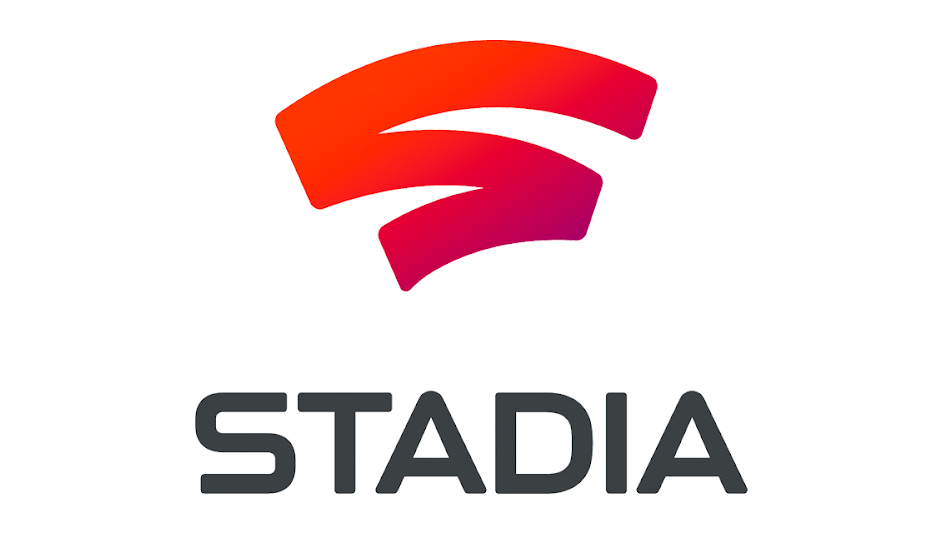
As well as raising expectations and eyebrows with gamers, the launch of Stadia has also caught the attention of designers thanks to its branding and logo design. Check out how the chunky, wavy 'S' logo works in context with the launch video, below.
Article continues belowThe future of gaming is not a box. It's a place.This is Stadia. One place for all the ways we play → https://t.co/v2jJTUWkYz pic.twitter.com/LlIHbjigDRMarch 19, 2019
As we've come to expect from a big brand launch, the Stadia identity has come in for a lot of flak already. Some critics have shot down the logo's shape and gradient colours for looking too retro, while others have accused the scribble-like design for being lazy.
Whether you like it or not, one thing's for sure: the new Stadia logo doesn't look like it belongs to Google. The reds, yellows and greens that make other services recognisably 'Google' are nowhere to be found. Instead there's a soft red-purple gradient, and an accompanying curved sans-serif font at odds with the lettering used by its parent company.
So why would Google want to underplay its connection? Well, as it enters a new market, Google has to tread a little more carefully than usual. It needs to win over game developers and studios
Stadia isn't the first Google-owned brand to stray form its house-style either. Android's cute robot mascot doesn't scream Google, and neither does YouTube, which the search giant acquired in 2006.
So why would Google want to underplay its connection, at least in terms of branding? Well, as it enters a new market, Google has to tread a little more carefully than usual. It needs to win over game developers and studios who could be reluctant to sign away control over distribution and potentially even revenue.
Sign up to Creative Bloq's daily newsletter, which brings you the latest news and inspiration from the worlds of art, design and technology.
As the new kid on the block, Google could play nice with these game makers. But if Stadia takes off, players could be tempted to head over to Google's own titles that are powered by its industry-leading hardware.
When you look at it like this, the Stadia identity is very slick indeed. The name itself, which is the plural of 'stadium', conjures up images of connectivity, play and inclusiveness. Paired with a logo that could claim the letter 'S' as a piece of territory in the same way Google has cornered the letter 'G', and you have a brand has all the makings of something big.
Related articles:

Dom Carter is a freelance writer who specialises in art and design. Formerly a staff writer for Creative Bloq, his work has also appeared on Creative Boom and in the pages of ImagineFX, Computer Arts, 3D World, and .net. He has been a D&AD New Blood judge, and has a particular interest in picture books.
