
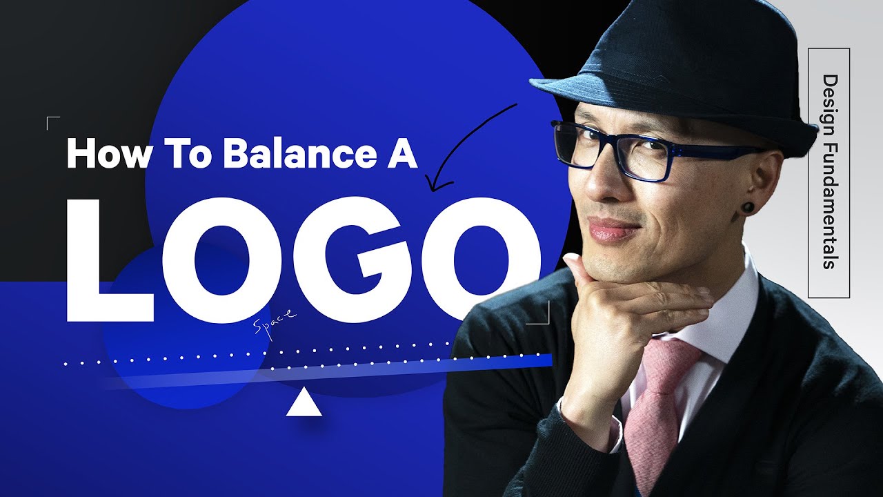
Have you ever designed a logo, got approval from the client, then seen it in action and thought it looked unbalanced? This can happen to digital designers for a number of reasons. So, to help your logos look more rounded and cohesive, The Futur Academy recently shared a brief video packed with useful design tips as part of its logo therapy sessions.
Hosted by Futur's founder, Chris Do, the short clip sees graphic designer Jelvin Base walk you through bitesized advice to keep in mind while refining your work. It's important to keep in mind, though, that these suggestions will help you to achieve an optically balanced logo design rather than a mathematically balanced one.
There's no hard and fast formula for creating a balanced logo because designs vary so much. But while you won't necessarily be able to rely on the golden ratio to create a harmonious logo all the time, you will be able to use Base's insights to push your creations in the right direction. Check them out below.
If this has whetted your appetite for more logo videos, head over to Futur's YouTube channel where you'll find clips covering hand lettering, basic principles, and even advice on how to price your logo design services.
Related articles:

