McDonald's proves its brand strength with blurry ads
We can't quite see McDonald's latest campaign, but we're lovin' it.

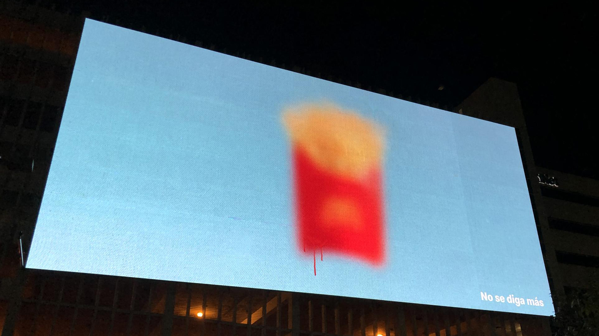
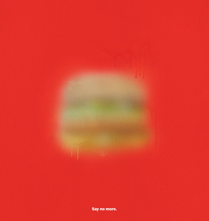
Don't worry, you're not losing your sight. And there's nothing wrong with your screen, either. These McDonald's adverts currently on display in Puerto Rico are deliberately blurry. However, we bet you know exactly which fast food items they're advertising.
Rather than playing it safe to ensure that passers-by remember that McDonald's exists (as if they could possibly forget), this quietly confident campaign from local agency TBWA\San Juan has some fun with the strength of McDonald's brand.
Titled 'Say No More', this campaign knows that the Golden Arches' red and yellow colour scheme, and its products, speak for themselves. It relies on just a vague approximation of its food to whet people's appetites, and really, what more do you need? Depending on your viewpoint, this is either a testament to the success of the brand, or a worrying comment on consumer habits. Or a bit of both.
Article continues belowCheck out the images below and see how recognisable the McDonald's brand is by clicking left to right through the gallery.


In a crowded landscape of leaflets and billboard advertising though, brands have to be careful not to over-saturate customers with hard-sell promotions. However, with these impressionistic images, McDonald's stands apart from the pack by dialling down the intensity of the message.
As far as recent fast food promotions go, we give this one the green light. It's certainly a more dignified effort than the recent Burger King campaign, which encouraged people to burn its rivals posters with an augmented reality app.

Related articles:
Sign up to Creative Bloq's daily newsletter, which brings you the latest news and inspiration from the worlds of art, design and technology.

Dom Carter is a freelance writer who specialises in art and design. Formerly a staff writer for Creative Bloq, his work has also appeared on Creative Boom and in the pages of ImagineFX, Computer Arts, 3D World, and .net. He has been a D&AD New Blood judge, and has a particular interest in picture books.
