New Canva logo is a triumph
For a graphic design platform that's famous for its logo maker, it's pretty important that it gets its own logo right. And it seems that Canva has – at least for those who noticed the difference. The company quietly updated the logo on its platform this week and only pointed out the change a few days later.
Some users claim to have noticed the new logo immediately – and say they thoroughly approve. Others are still wondering what the difference is – but that might be part of the logo's success in this case. Remember, if you need tips for your own work, in Canva or not, be sure to read our golden rules of logo design.

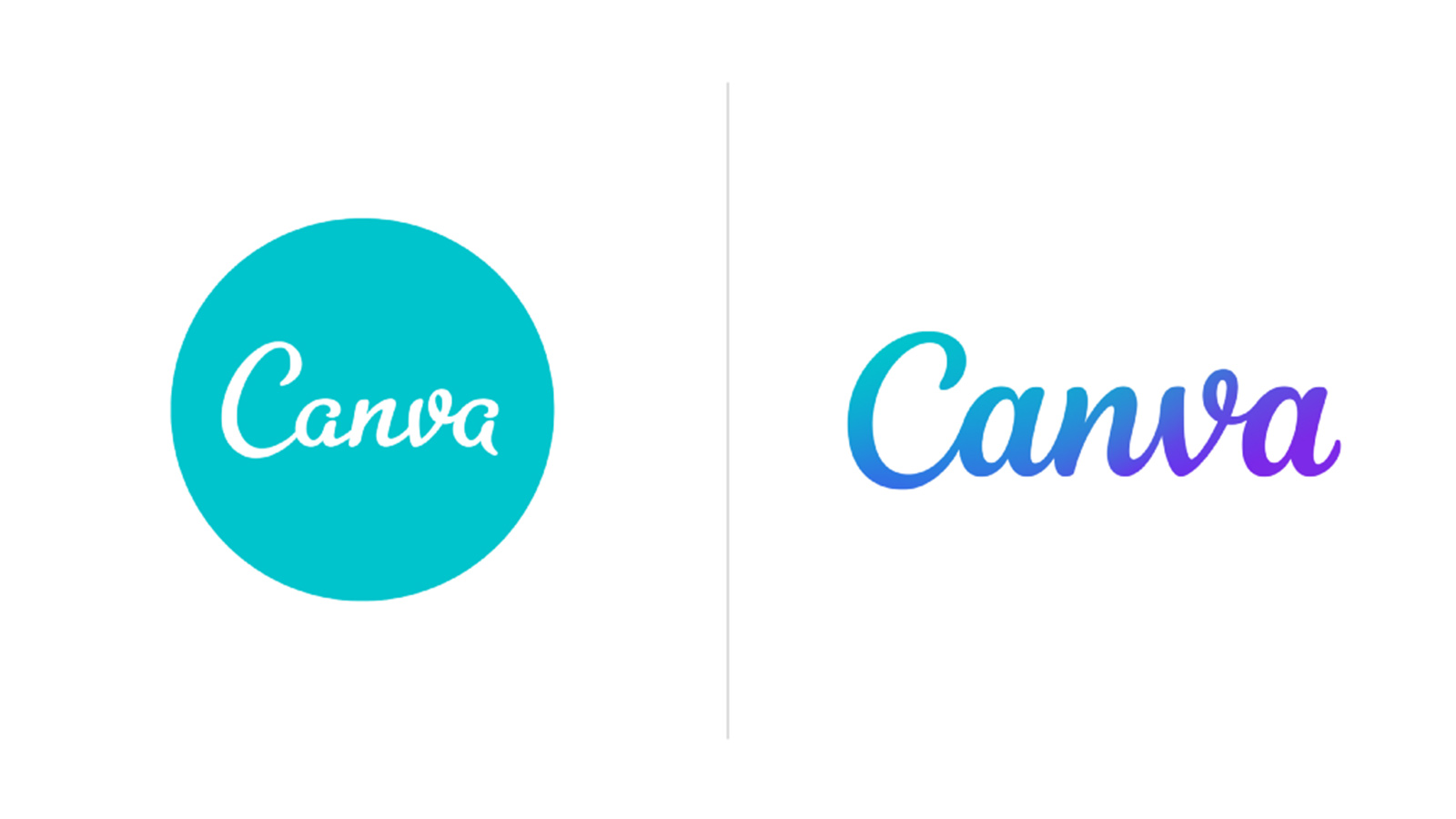
The new design makes what might seem to be some very subtle changes to the script typography while adding a radiant turquoise to purple gradient that sits very comfortably with Canva's existing branding. That clear link to the existing branding makes it very familiar while also looking sleeker and more modern, which is probably why some users have been scratching their heads wondering what's changed.
Article continues belowCanva says the reason for the change was to make the logo to be more flexible, for use on billboards as well as tiny buttons for example. Suffice it to say, it didn't simply use a template from its own logo maker for the update. It brought in type designer and lettering artist Rob Clarke, who worked on improving the legibility of the logo's script, particularly the two 'a'. According to a piece Canva published on Medium, the team went through 75 iterations to arrive at the new logotype before then adding the gradient and also creating a motion version of the logo.

"The New Logo is amazing!🙌💙💙 Just a little change in the hand lettering made a huge difference.😊," one user commented on Instagram. "Very cool, simple clean and smooth," another said. However, some are struggling to tell the difference.
"Hmm.... What's different from the previous one? 🤔🤔 ... this is the logo I see everyday on the website, no?" was one response on Instagram.
But the biggest question people are asking on Instagram, of course, is can you design the new Canva logo in Canva? According to Canva, you can. And it shows how logos can be shared across teams using Canva's software (not a platform we'd recommend for professional graphic designers, but it certainly makes design simple for those without experience – see our guide to the best logo designer for more details).
A post shared by Canva (@canva)
A photo posted by on
All in all, we feel this is one case of a brand getting a logo redesign right. While a lot of customers can't tell the difference, that's perhaps a good thing in this case. Canva's not attempting a wholescale rebranding here, but an updating of its existing branding to make it more flexible and to ensure its longevity.
Sign up to Creative Bloq's daily newsletter, which brings you the latest news and inspiration from the worlds of art, design and technology.
For more successful examples, see our article on logo redesigns that got it right, and also see our guide to where to find logo design inspiration. If you're interested in using Canva yourself, see the current subscription prices below.
Read more:

Joe is a regular freelance journalist and editor at Creative Bloq. He writes news, features and buying guides and keeps track of the best equipment and software for creatives, from video editing programs to monitors and accessories. A veteran news writer and photographer, he now works as a project manager at the London and Buenos Aires-based design, production and branding agency Hermana Creatives. There he manages a team of designers, photographers and video editors who specialise in producing visual content and design assets for the hospitality sector. He also dances Argentine tango.
