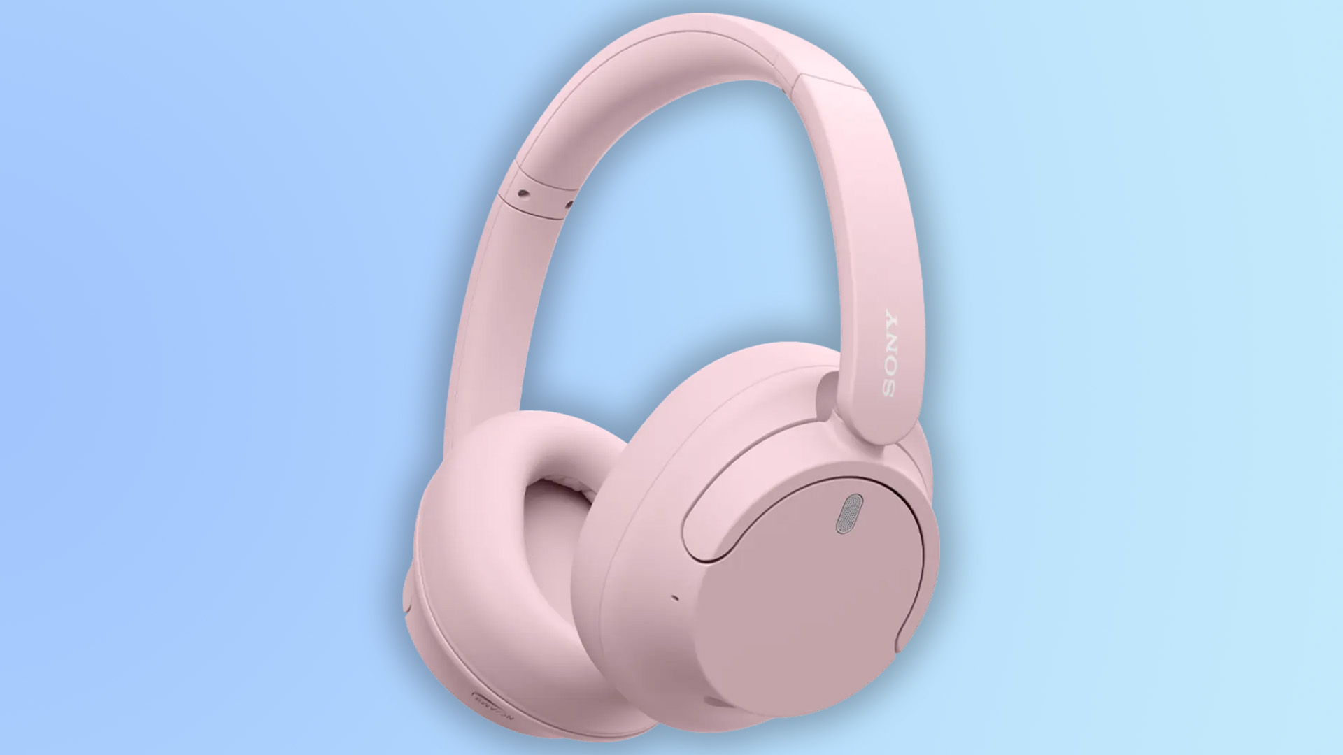
That new Google Chrome icon is more interesting than I thought
(But it's hardly iconic.)
Sign up to Creative Bloq's daily newsletter, which brings you the latest news and inspiration from the worlds of art, design and technology.
You are now subscribed
Your newsletter sign-up was successful
Want to add more newsletters?
When Google revealed a 'new' Chrome logo last month, the internet responded with a collective shrug. Like pretty much every new logo released in the last few years, it's simply a flatter version of the previous design. But now that it's finally rolled out, it's a little more interesting than it first seemed.
Chrome hit the big '100' this week, with the hundredth update for the browser available for download. It's an iterative update, offering a few security and bug fixes. But with it comes the new icon – or should we say icons. (Looking for inspiration? Check out our guide on how to design a logo.)
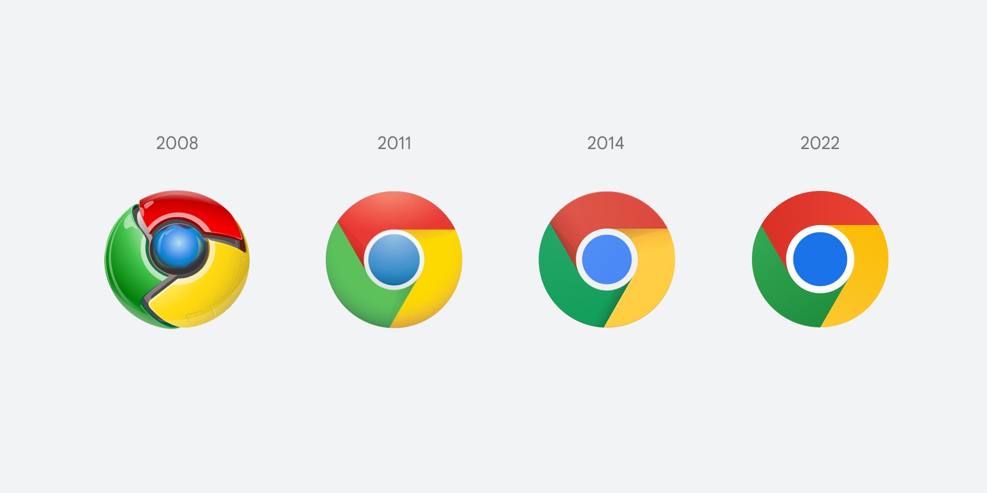
That's right, it turns out there are multiple versions of the new Chrome icon, depending on what browser you're using. While every version has done away with the shadows inside the circular design, there are clear differences between the Windows and macOS designs. The former is entirely flat, whereas the other is in keeping with the rest of macOS's vaguely skeuomorphic aesthetic, with a slightly raised, 3D look.
Article continues below 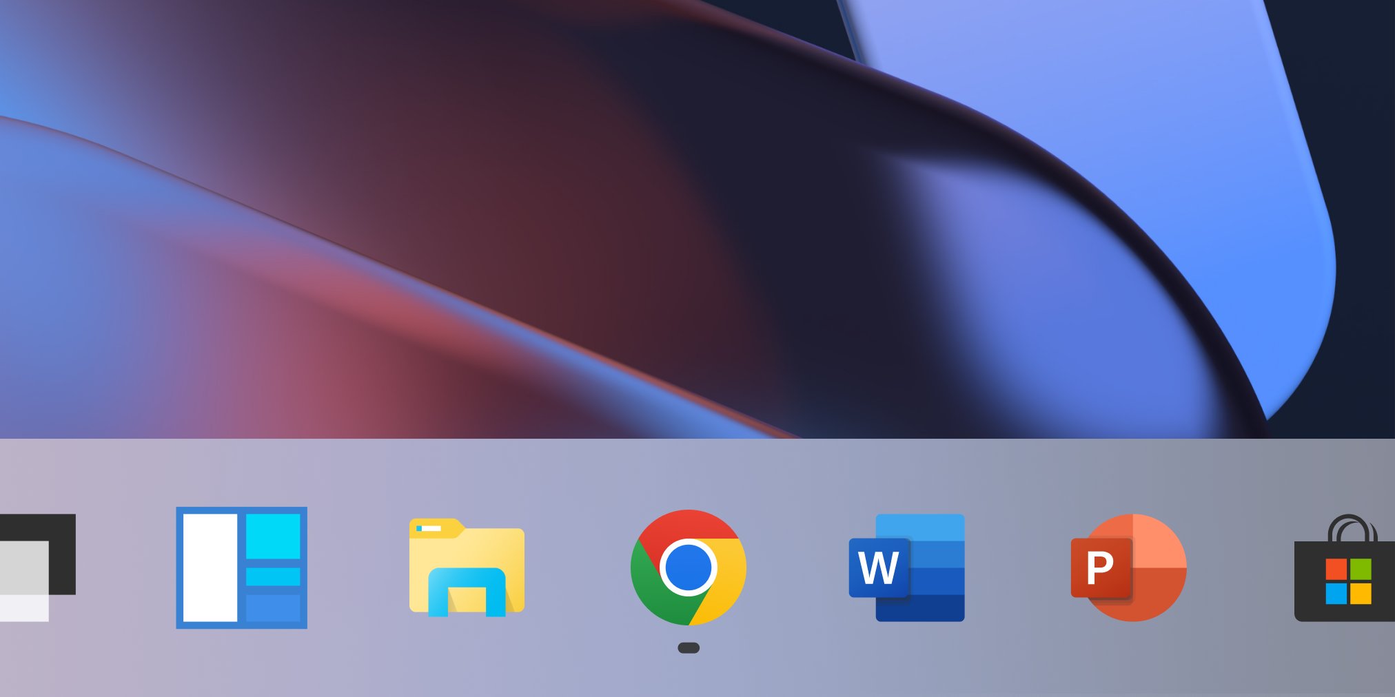
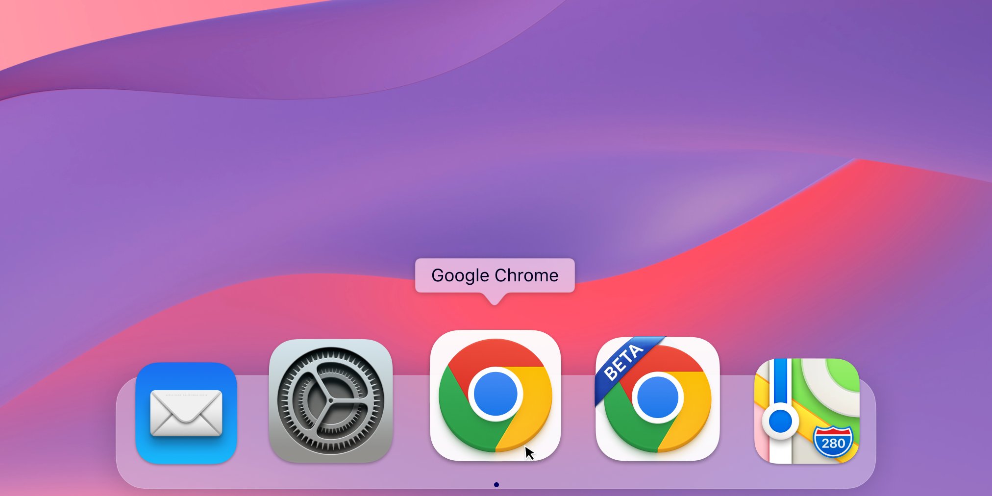
While hardly earth-shattering, the inclusion of OS-specific designs does make the design refresh feel a little more creative. In a world of strict brand guidelines and consistency, there's almost something a little playful about the various subtly different designs. (Almost.)
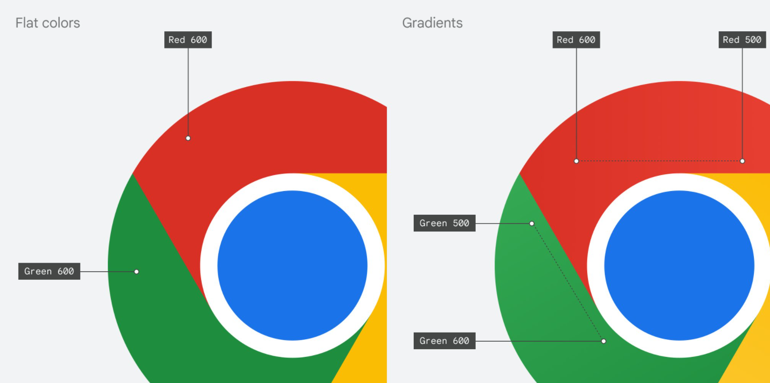
As well as changing the shadowing, Google altered the colours of the new icons. At first glance, you wouldn't notice, but designer Elvin Hu recently explained that instead of flat, block colours, the new version incorporates a subtle gradient. This is because the team "found that placing certain shades of green and red next to each other created an unpleasant colour vibration."
Last month, the internet found much mirth in its similarity to the previous design. "It took 8 years to make those changes that will go unnoticed to the human eye," one Twitter user commented, while another added, without a hint of sarcasm, "OMG Google has single handily undisputedly without a shrivel of doubt BROKEN THE INTERNET in its groundbreaking next-generation design – this will be studied for centuries to come as never in HUMAN HISTORY has such a masterful design been created by humankind in its 200,000 years." Fair enough.
But hey, multiple very-slightly-new designs are better than one very-slightly-new design, right? And at least none of them are a total disaster – who can forget Amazon's disastrous new app icon from last year?
Sign up to Creative Bloq's daily newsletter, which brings you the latest news and inspiration from the worlds of art, design and technology.
Read more:
- Download Photoshop: How to try Photoshop with Creative Cloud
- So apparently this is the best video game controller of all time
- People think the new Buick logo looks like, er, lots of things

Daniel John is Design Editor at Creative Bloq. He reports on the worlds of design, branding and lifestyle tech, and has covered several industry events including Milan Design Week, OFFF Barcelona and Adobe Max in Los Angeles. He has interviewed leaders and designers at brands including Apple, Microsoft and Adobe. Daniel's debut book of short stories and poems was published in 2018, and his comedy newsletter is a Substack Bestseller.
