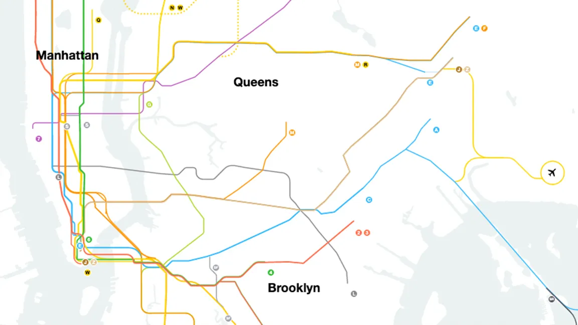
Along with the Statue of Liberty and the Empire State Building, New York's subway map is one of the most iconic pieces of the city. And over 40 years after the map arrived in 1979, it's just been given its biggest design overhaul yet.
The Metropolitan Transportation Authority (MTA) has unveiled a live digital subway map which, using MTA's own data, shows trains moving in real-time, as well as letting users check for service alterations. We've no doubt it will become one of the most useful data visualisation tools around for New Yorkers.
Finally, something good in 2020.New York, meet your new Subway map.https://t.co/TiSu1wSi4UOctober 20, 2020
The web-based map was created in collaboration with Brooklyn-based design firm Work & Co, and can be accessed on a multitude of devices without needing to be downloaded. With the map currently in beta stage, users are encouraged to provide feedback via a Google form.
As well delightful moving train animations (below), the map features enhanced zoom abilities (revealing details such as individual lines and subway entrances), accessibility information and emergency alerts direct from the MTA’s data feed.
Work & Co calls the live map "a more accurate, tech-forward option to printed maps and those commonly used on station walls". The studio says the map project took on new meaning with the advent of the coronavirus pandemic, "illustrating how accurate train time data is not only critical for managing commutes but can help riders plan for more efficient riding and limited time in public places".
To coincide with the live map's release, Work & Co collaborated with acclaimed documentary director Hustwit to create a short film titled The Map (above). This explores how one of the world's most complex transit systems can be simplified with the help of new technology and, most importantly, good design.
The New York subway map has a fascinating history, as detailed by this stunning animated slideshow from last year. If you're looking for more compelling pieces of data visualisation, our 62 best infographics include some truly mind-blowing examples (including our favourite, an infographic about infographics).
Read more:

