Tom & Jerry logo gets Hollywood-style makeover (but is it the best yet?)
Short answer: No.
Sign up to Creative Bloq's daily newsletter, which brings you the latest news and inspiration from the worlds of art, design and technology.
You are now subscribed
Your newsletter sign-up was successful
Want to add more newsletters?
A new logo has been released for the upcoming Tom & Jerry film, set to hit the big screen next year. Though fans will be delighted to see the animated adversaries haven't changed much, the logo is a departure from the playful script of old – in fact, it's been transformed into a slick, shiny piece fit for Hollywood.
While the Tom & Jerry logo has been altered since the show started running in 1941, the main components have mostly remained constant, providing the feeling of familiarity all good logos convey (like these on our best logos list). In a bold move, the new logo has done away with many of these elements for a new era.

Much to the relief of fans, who feared the new film would be created using CGI, the new film is to be partially animated in a similar way to Who Framed Roger Rabbit. The new logo appears to echo this style – with the animated characters peeking out of the slightly bland background lettering in the same way we imagine them to stand out against the reality of the live action scene and actors. The logo is slanted forwards, giving the whole thing an imposing, towering feel fit for the big screen.
Article continues belowThe characters have been subject to a bit of a face lift – nothing too extreme but their faces are a little stretched, with elongated features and subtle colour differences.

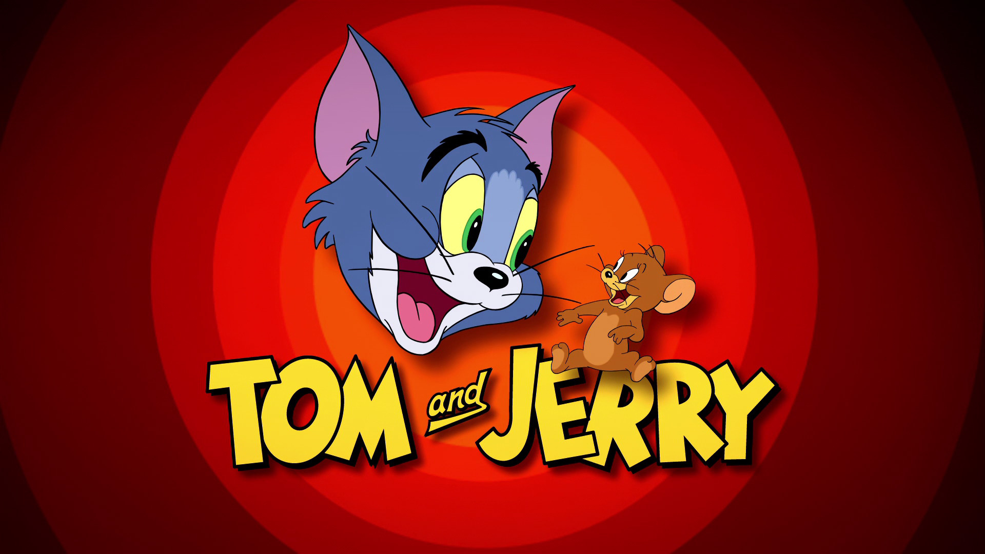
Set against a simple white background, the lettering is quite a departure from most other versions of the logo. The jaunty slanted lettering has been totally straightened and there's no hint of the playful font seen above – the new flattened 2D art style font is to be taken more seriously. We like the juxtaposition of the smoothed out, grown-up font against the cheekiness of the familiar characters poking through, even though we do kind of miss the character previous fonts conveyed.
The only issue we have, and we're sorry to say this as we're usually big fans of the ampersand (see its amazing history here), is the replacement of the 'and' with an ampersand. The handwritten, underlined 'and' of previous iterations was spot on stylistically, and the style of this ampersand just doesn't seem to fit. It's like a Times New Roman ampersand got dropped in as an afterthought.

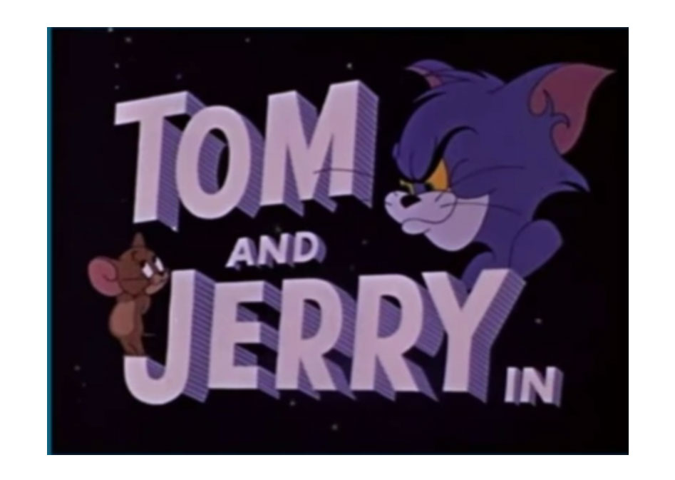
Saying all that, given the long history of the Tom & Jerry Show, the logo has taken on a myriad of different forms, so some of these elements have been seen before (check out the evolution here). In fact, the new logo reminds us most of those found in the 1960s, with its straight font and block font format.
Sign up to Creative Bloq's daily newsletter, which brings you the latest news and inspiration from the worlds of art, design and technology.
It hasn't always gone well for film producers reinventing old favourites (remember what happened to poor old Sonic?) but we think the design of the new film looks like a winner so far.
Though from a standalone design perspective we prefer the some of the old logos, we think we understand what the logo is trying to convey with its shiny, 2D art style. Tom and Jerry have been polished up for their new challenge whilst remaining true to their roots, and this logo puts them in the spotlight.
Read more:

Georgia has worked on Creative Bloq since 2018, and has been the site's Editor since 2023. With a specialism in branding and design, Georgia is also Programme Director of CB's award scheme – the Brand Impact Awards. As well as immersing herself with the industry through attending events like Adobe Max and the D&AD Awards and steering the site's content streams, Georgia has an eye on new commercial opportunities and ensuring they reflect the needs and interests of creatives.
