New Olympic museum logo is pure design gold
Five stars for these stripes.
It's been a tough year for sports, with even the Olympics themselves put on hold. But while Tokyo 2020 won't be happening until 2021, there's one Olympic event still due to take place this year: the opening of the United States Olympic and Paralympic Museum – which has just revealed its brand new logo.
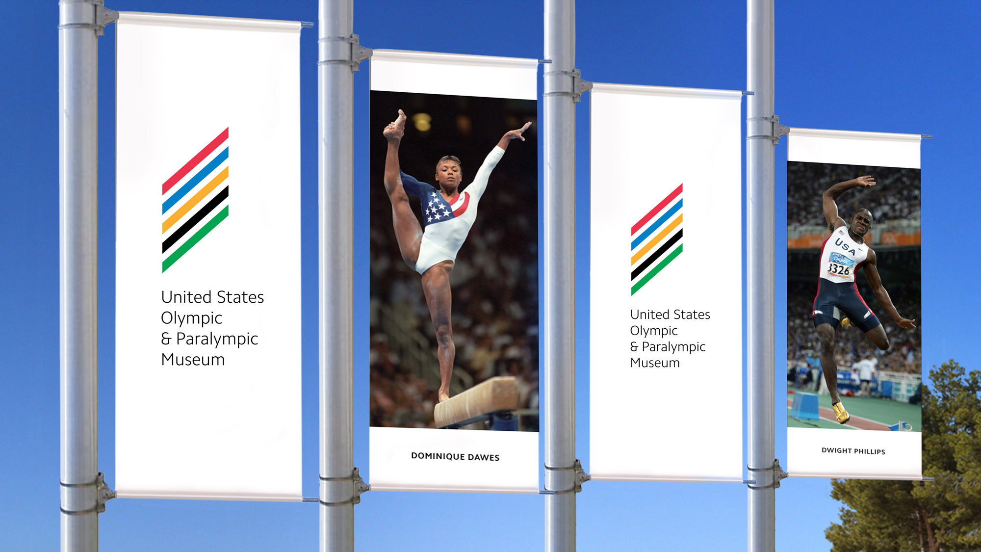
Located in southwest Downtown Colorado Springs, the new museum will document the history of Team USA in the Olympic and Paralympic Games. The logo (below), designed by New York-based Chermayeff & Geismar & Haviv, features five diagonal lines in the same colours as olympic rings – one of the world's most recognisable logos (don't forget to check out our best logos list).

On the museum's website, CEO Christopher Liedel says that the logo was born out of imagining "three flag poles in front of the museum, with the Olympic rings on one flag and the Paralympic agitos on another," and picturing what would look good in between them. We'd say it's very successful on that front – maintaining the instantly recognisable aesthetic of the olympic rings, while turning it into something new, and dare we say iconic, in its own right.

According to Chermayeff & Geismar & Haviv, the logo "takes its colours from the Olympic rings, its stripes from the American flag, and the diamond silhouette from the building’s façade," while coming together to create "an abstract flame". If we were to read that before seeing the logo, we'd be expecting an absolute mess of different ideas, so it's impressive that the agency was able to combine them within such a simple logo.

If we had one criticism, perhaps it isn't clear at first glance that this is a logo for a museum focused solely on America at the Olympics, rather than the games as a whole. That said, we'd rather see a logo as clean and classy as this than something overtly patriotic.
Its refreshing to see such a simple piece of Olympic-themed branding. The postponement of Tokyo 2020 has led to some confusing messaging, from the games keeping their 2020 logo, to NBC's truly baffling logo for next year's coverage. Still, things will be better in four years, right? The Paris 2024 logo has already been mercilessly mocked, so perhaps not.
Read more:
Sign up to Creative Bloq's daily newsletter, which brings you the latest news and inspiration from the worlds of art, design and technology.

Daniel John is Design Editor at Creative Bloq. He reports on the worlds of design, branding and lifestyle tech, and has covered several industry events including Milan Design Week, OFFF Barcelona and Adobe Max in Los Angeles. He has interviewed leaders and designers at brands including Apple, Microsoft and Adobe. Daniel's debut book of short stories and poems was published in 2018, and his comedy newsletter is a Substack Bestseller.

