The last 6 presidents' favourite colour palettes, revealed
30 years of Oval Office interiors.
Sign up to Creative Bloq's daily newsletter, which brings you the latest news and inspiration from the worlds of art, design and technology.
You are now subscribed
Your newsletter sign-up was successful
Want to add more newsletters?
If, like many of us, you've spent a lot of time working from home over the last few months, you've probably given some thought to how your setup looks. No matter how much space you have available, a few design touches here and there can make it feel uniquely yours – whether it's the kitchen table, a corner of the living room, or the Oval Office.
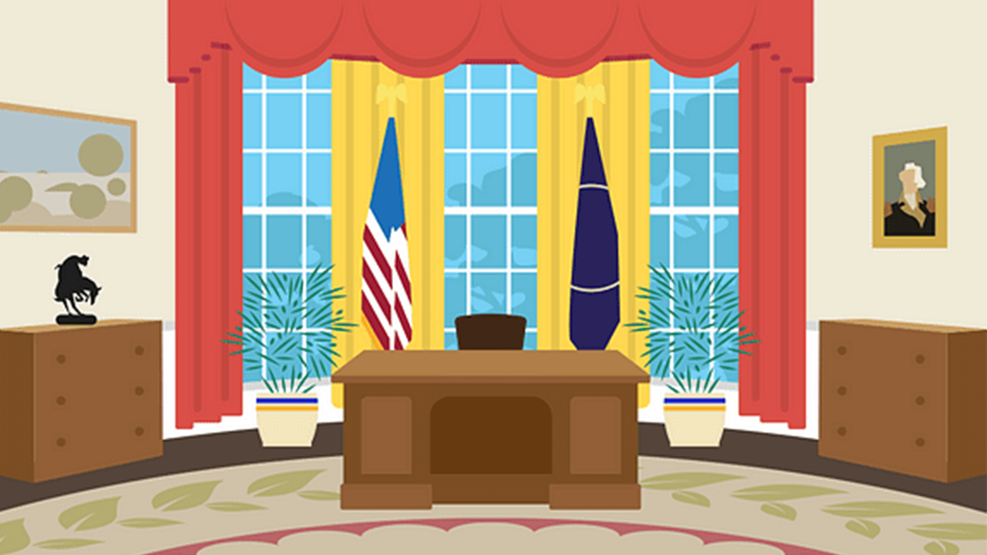
Yes, even presidents like to add a personal touch to their workspace, as demonstrated by a fun series of illustrations depicting the interior design of the Oval Office over the last 30 years. (Check out our guide to the best office chair or our top office organisation ideas if you're looking to spruce up your own setup.)

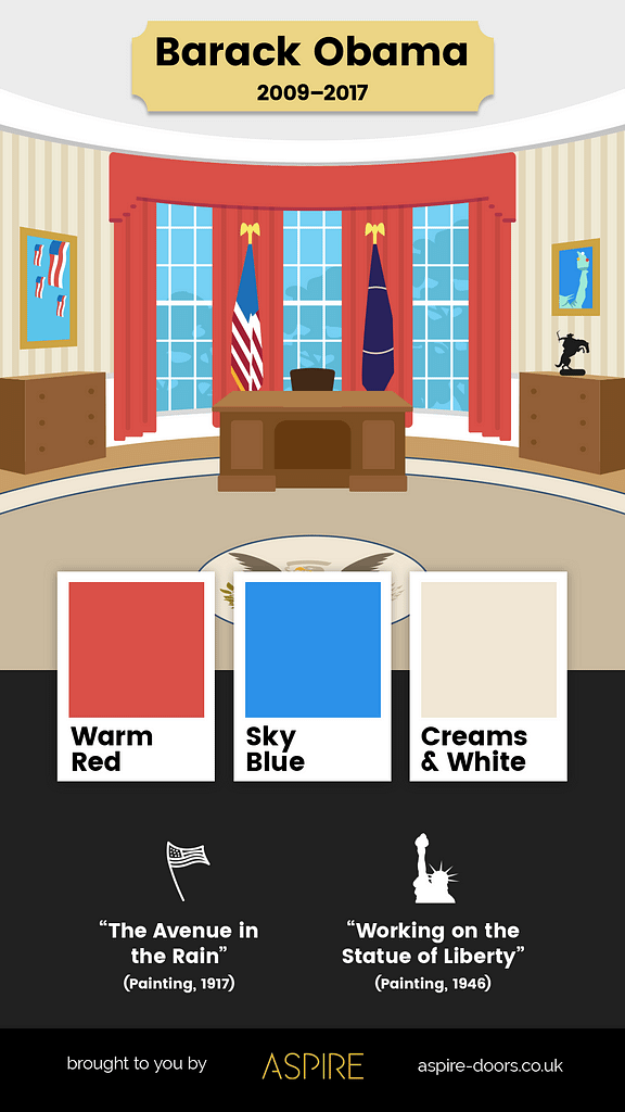
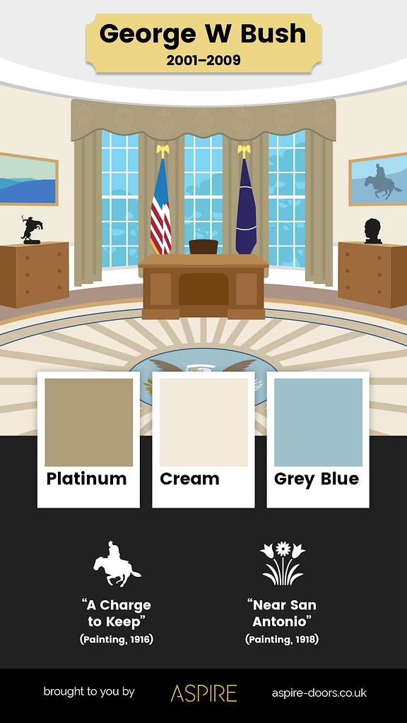
Aspire Doors has recreated how the last six US presidents have decorated the Oval Office, revealing some fascinating differences – and similarities. As well as the furniture and decorations, the illustrations reveal the top three colours present in each iteration of the famous office. Spoiler alert: it seems none of the last six presidents were forward-thinking enough to opt for both of Pantone's 2021 colours of the year.
Article continues below 
Whereas Donald Trump's office featured a "rich colour palette of gold, navy and platinum," Barack Obama opted for a scheme "not too far removed from the American flag" – warm red, sky blue, and cream and white (above). Perhaps the most minimal palette belonged to George W Bush, with a surprisingly muted combination of platinum, cream and grey-blue (below).

But there are some elements that remain unchanged throughout. The white wainscot panelling at the back of the room is untouched, while the chest of drawers to the left of the office is present in every version. Hey, maybe it's just a really, really good chest of drawers.
The illustrations are a fascinating look at how subtle interior design tweaks can transform the look and personality of a room. And of those tweaks, perhaps the most notable is colour. Indeed, as our colour theory guide reveals, making the most of relationships between different hues is one of the most vital art techniques you can master.
From these envy-inducing Hollywood-inspired home offices to Panasonic's bizarre working from home cubicle, we've seen no shortage of weird and wonderful ways to make your home setup more interesting (if not a little distracting). If you're still getting used to working from home, our guide to working from home has you covered.
Sign up to Creative Bloq's daily newsletter, which brings you the latest news and inspiration from the worlds of art, design and technology.
Read more:
- Apple's new product category is NOT what we were expecting
- The best cheap laptop deals and discounts in 2021
- Apple Pencil vs Apple Pencil 2: Which should you buy?

Daniel John is Design Editor at Creative Bloq. He reports on the worlds of design, branding and lifestyle tech, and has covered several industry events including Milan Design Week, OFFF Barcelona and Adobe Max in Los Angeles. He has interviewed leaders and designers at brands including Apple, Microsoft and Adobe. Daniel's debut book of short stories and poems was published in 2018, and his comedy newsletter is a Substack Bestseller.
