As 2020 draws to a close, Pantone has released its annual colour of the year. But, according to the colour experts, 2021's vibe is to be expressed in not one, but two separate hues. It's only the second time this has ever happened, which is suitably reflective of the times (they're unprecedented, if you hadn't heard).
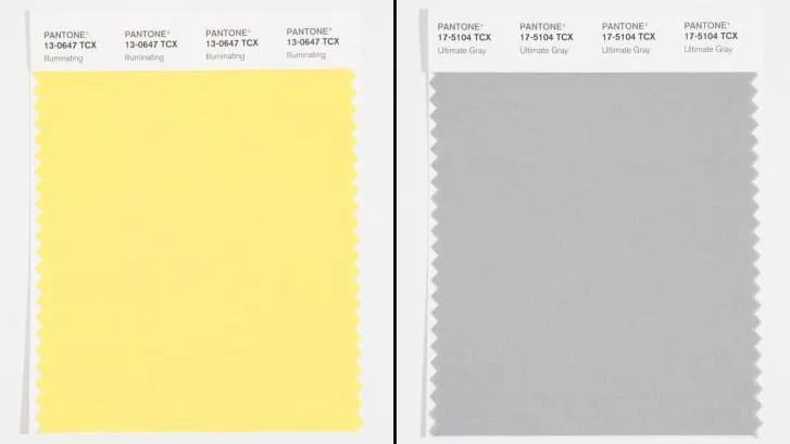
The colours chosen (see them above) are 'Illuminating' (Pantone 13-0647, a light yellow), and 'Ultimate Grey' (Pantone 17-5104, the clue's in the name). Given next year is hanging in the balance right now, it could be said that Pantone is covering all bases for how it could pan out. But apparently we're to see the two colours as a 'unified pair' – symbolising the solidarity that will be needed for what's ahead. If you want to learn more about the importance of colour, see our guide to colour theory.
PANTONE 17-5104 Ultimate Gray + PANTONE 13-0647 Illuminating, a marriage of color conveying a message of strength and hopefulness that is both enduring and uplifting. Visit https://t.co/Tskl0gMXYB to discover more.#Pantone #pantone2021 pic.twitter.com/utJ0sceAA9December 9, 2020
According to Pantone Colour Institute's executive director Leatrice Eiseman, the combination is "practical and rock solid but at the same time warming and optimistic, this is a combination that gives us resilience and hope." That all sounds heartwarming, and it's definitely a feeling we'd love to tap into moving forward – but how have the colour choices been received?
Well, there are some voices calling out Pantone for cheating by using two colours, but we don't necessarily have a problem with this. Colours work in contrast and harmony when placed side-by-side, creating new meanings and implications for each hue. Tapping into this effect to reflect a convoluted, confusing time (that's also provoked mixed emotions) feels like an apt decision.
They’ve done two before, Rose Quartz and Serenity in 2016December 9, 2020
Other takes put the colours very separately to reflect different parts of the year, with grey being viewed as 'depressing' rather than practical and grounding...
I don't know. Grey is such a depressing colour to be the colour of the year. Even in the combination.December 10, 2020
And some are wistful for the relatively uncomplicated (and, let's be honest, calming) days of pastel-hued 2016 – the other time two colours were used together.
2016 still the best color of the year for me sry https://t.co/Pfagg3oGYK pic.twitter.com/CY8g8nQJTtDecember 10, 2020
Pantone has had its finger on the pulse of cultural events this year, and compared to some of the other colour releases these feel somewhat sedate (not that we mind, if next year falls in line, of course). So far this year, Pantone gave us in-your-face Period Red, designed to embolden people who menstruate (and made people sort-of cross), and Ultra Black – a collaboration with rapper Nas, created in response to the Black Lives Matter movement.
The outlook would certainly feel rather different if Pantone had gone for similarly strident hues to represent the whole of next year. We'll take the gentleness, thanks.
Read more:

