Pancake chain flips logo in sweet rebrand
International House of... what?

Good branding is all about communicating a company's product or meaning through design. With this in mind, we have to give the International House of Pancake's simple but effective 'rebrand announcement' a pass.
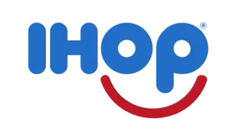
Posting on its Twitter account on Monday, the breakfast food chain announced that it's flipping the lettering in its logo design, going from IHOP to IHOb. Cue speculation as to what the mysterious 'b' could stand for.
For 60 pancakin’ years, we’ve been IHOP. Now, we’re flippin’ our name to IHOb. Find out what it could b on 6.11.18. #IHOb pic.twitter.com/evSxKV3QmTJune 4, 2018
Considering that pancakes are famous for being flipped (or dropped on the floor), this letter flip is a clever link between the food and the brand. Last year Golden Syrup tried to incorporate the flip into their celebratory Pancake Day packaging, although they didn't go so far as to turn the lettering upside down.
Article continues belowIf getting tossed around in a frying pan is a pancake's main selling point, at least IHOP saw this angle through in its branding. Elsewhere on its Twitter account, the social media manager is reduced to posting a barrage of strange and tenuously pancake-related tweets in an effort to drum up attention, possibly running into the same creative obstacles that face not-so-cool companies who struggle to come up with cool branding.
IHOb? What could it b? #IHObJune 5, 2018
So what does the 'b' stand for? Barnacles? Brexit? We were expecting it to be 'breakfast' in an effort to better reflect all of the food on offer, especially seeing as Ihop's executive director of communications, Stephanie Peterson, is reported to have said "we’re serious about the quality of food and our menu, and this name change really reflects that."
As it happens, the 'b' stands for 'burgers', tying into a new line of Ultimate Steakburgers launched by the chain.
It was a bold publicity move for a company that has traded under the same name for 60 years. Sceptics who were unconvinced that the decision was little more than a publicity stunt were proved right as the name IHOP isn't going anywhere.
Sign up to Creative Bloq's daily newsletter, which brings you the latest news and inspiration from the worlds of art, design and technology.
The whole event has been a good lesson in how you don't need a big budget to successfully bring together a product and branding, and generate a whole lot of attention in the process.
Related articles:

Dom Carter is a freelance writer who specialises in art and design. Formerly a staff writer for Creative Bloq, his work has also appeared on Creative Boom and in the pages of ImagineFX, Computer Arts, 3D World, and .net. He has been a D&AD New Blood judge, and has a particular interest in picture books.
