Presidential hopeful's design toolkit is a vote-winner
Pete Buttigieg rejects red, white and blue for earthier tones.
If there's one thing that we can all agree we're really looking forward to, it's definitely the next US Presidential election, right? Seeing how well the last one went, we're sure you're just as excited about the 2020 election as we are.
And while the election's still over 18 months away, the hopeful candidates are starting to jostle for position, and among the Democrats after the job, there's one that's really grabbed our attention.
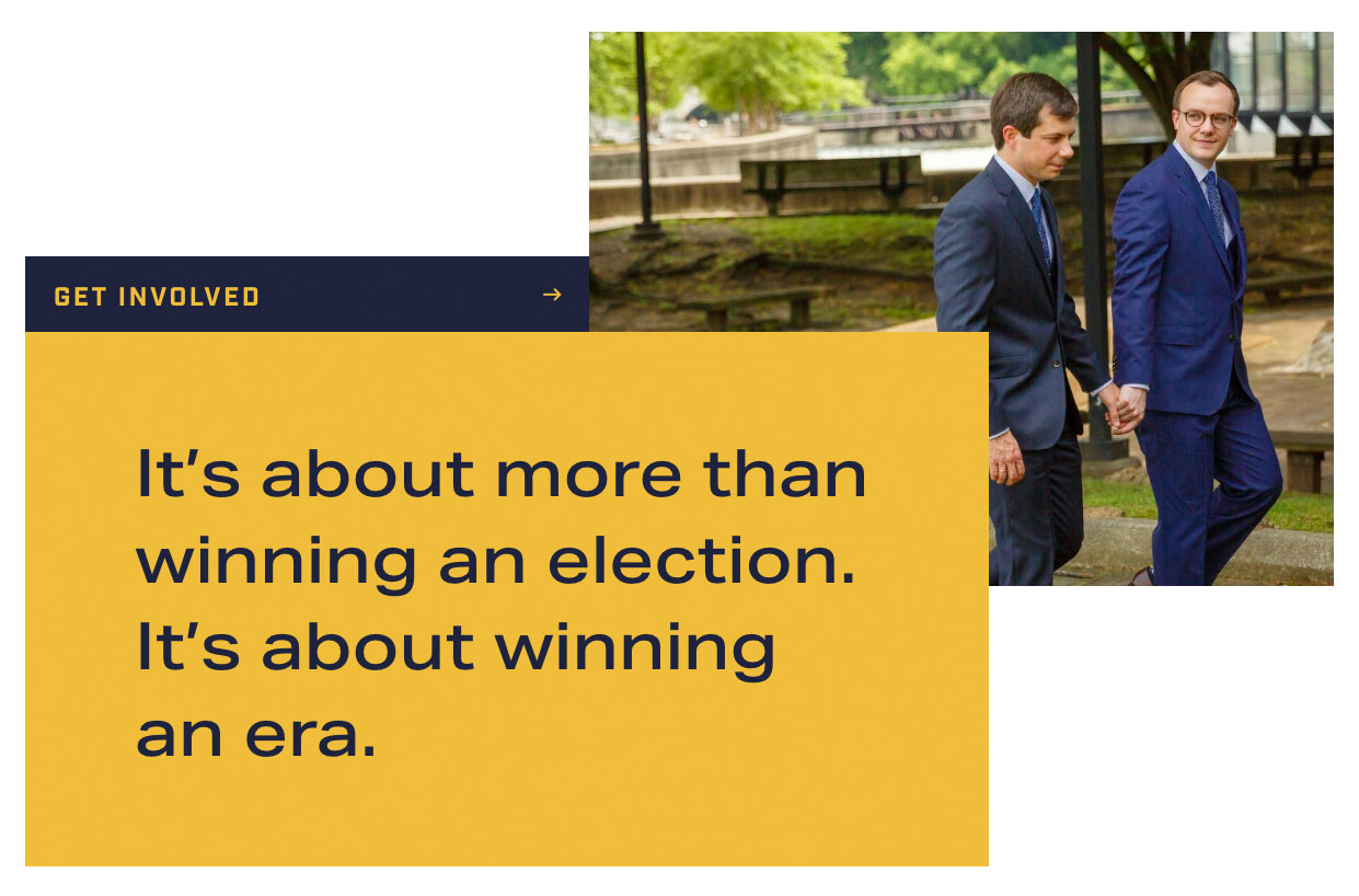
Pete Buttigieg's the mayor of South Bend, Indiana, and notably he's the first ever openly gay presidential candidate. And as part of his campaign, he's made his design toolkit publicly available, making it easy for anyone to show their support while keeping things nicely on-brand.
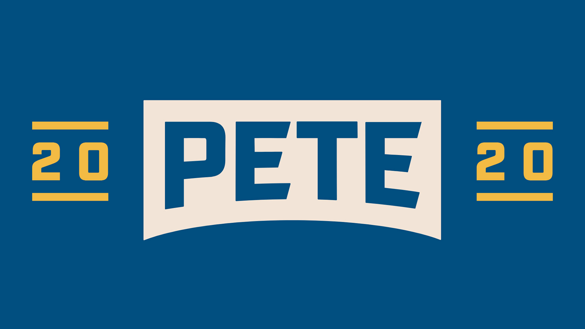
Article continues belowThe Pete For America design toolkit consists of four main elements, and they all add up to a beautifully concise presidential design style guide.
First up there's the inevitable Pete 2020 logo, and it's a simple bridge motif, based on the Jefferson Blvd Bridge in South Bend. It's described as a symbol of the innovative thinking that Buttigieg brings to leadership. And yes, he definitely intends to bridge America's divisions.
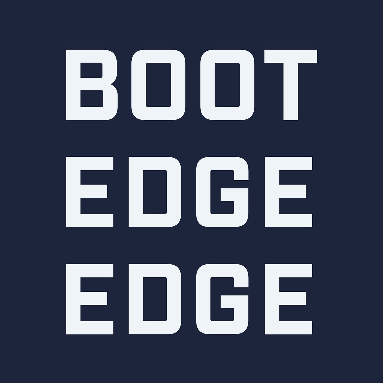
Alongside the bridge-based logos, though, there's another one that we absolutely love. We had to stare at the Boot Edge Edge logo for a minute, trying to figure out what it meant, and then we realised it's the answer to the one question everyone has about Pete Buttigieg: how the hell are you supposed to pronounce that name? Now you know.
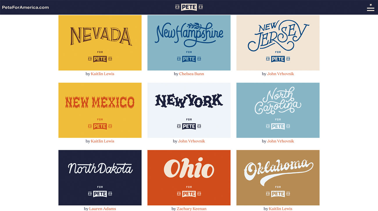
The visual fun continues over in the Team Pete section of the toolkit, where there's a set of 50 state-specific signs ready to download in all manner of sizes and file formats. Each state has its own hand-drawn text, with a pool of over a dozen artists taking care of the lettering duties. The page also mentions interest group graphics to go with the state graphics, but they don't seem to be ready yet; there's also an email link where you can suggest other graphics that might be useful.
Sign up to Creative Bloq's daily newsletter, which brings you the latest news and inspiration from the worlds of art, design and technology.
Excitingly, the design toolkit rejects the traditional campaign colour scheme of patriotic red, white and blue, which seems to us to be the perfect reason to back Pete Buttigieg all the way. His campaign palette features a whole nine colours, and is described as an ode to Pete's hometown, and his life there.
It's a splendidly earthy palette, and the colours have been given evocative names such as Heartland Yellow, Rust Belt and Strato Blue; there are even two colours named after his dogs: Buddy Gold and Truman Brown.
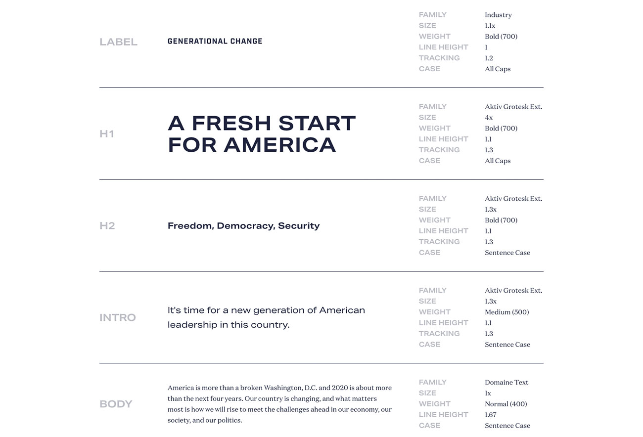
Finally there's the typography. The toolkit states, "Our brand typography pays homage to America’s industrial legacy, to Pete’s ability to convey substantive ideas plainly, and to his bold vision for a modern America that reaches for the future with focus and clarity."
This translates into three typefaces: the primary, Aktiv Grotesk Extended, is a sleek sans serif that's meant to feel timeless. For labels and signposting, there's Industry from Fort Foundry, a square geometric font with roots in the visual language of American manufacturing, and for more readable body copy there's Domaine Text, a sophisticated serif that pairs well with Aktiv and Industry.
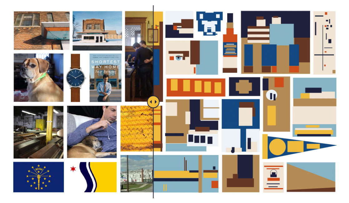
Buttegieg's already doing pretty well in the running for the Democratic nomination; he currently seems to be fourth in the running, behind Bernie Sanders, Kamala Harris and Joe Biden. And while he's going to have his work cut out against these big names, this visually powerful grassroots campaign could see him making gains. And as we all know too well, anything can happen in American politics, so watch this space.
Related articles:
Jim McCauley is a writer, performer and cat-wrangler who started writing professionally way back in 1995 on PC Format magazine, and has been covering technology-related subjects ever since, whether it's hardware, software or videogames. A chance call in 2005 led to Jim taking charge of Computer Arts' website and developing an interest in the world of graphic design, and eventually led to a move over to the freshly-launched Creative Bloq in 2012. Jim now works as a freelance writer for sites including Creative Bloq, T3 and PetsRadar, specialising in design, technology, wellness and cats, while doing the occasional pantomime and street performance in Bath and designing posters for a local drama group on the side.
