Rolling Stone bucks the flat logo trend
In recent years, logos have been going in one direction and one direction only. Logos have been getting flatter and more minimal as brands seek a cleaner, more modern look that works in small applications such as mobile screens and app icons. It's refreshing then to see a brand go the other way – at least to an extent.
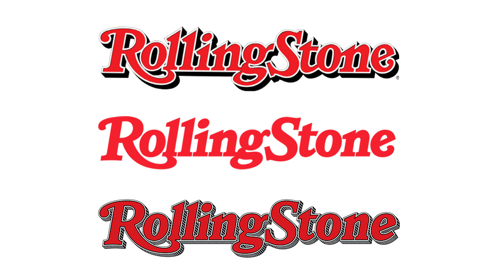
The US publication Rolling Stone has revealed a new logo to accompany the revamp of its website, and the design's notable for bringing back the shading that was previously jettisoned back in 2019. It's not a return to the old logo, but it combines elements of several previous iterations with a cleaner look and variations for small applications that retain the feel of the traditional brand identity. It should put a smile on the faces of everyone who's complaining that logos are all starting to look the same.

Designed by Jesse Ragan of the independent font foundry XYZ, the new logo combines elements of the lettering from several previous iterations. Ragan says that Rolling Stone CEO Gus Wenner felt the publication's visual identity had "lost its signature audacity" when the shading was dropped in 2019. However, he couldn't simply revert to the old logo, which, designed in 1981, looked dated and was overly complex.
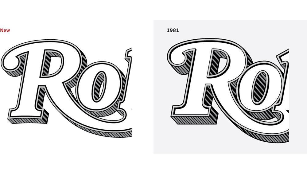
Article continues belowInstead, he sought to find the best of both worlds with a new logo that reflected the brand's legacy but would be clean enough for modern uses. Ragan absorbed details from the previous logos, choosing characteristic elements that worked: the crisp serifs from 2018, the ball terminal on the R from 1981 and a simplified E from 1977.

XYZ said it reverse engineered the shading that celebrated type designer Jim Parkinson introduced in 1977, a process it describes as a "labour of love" for Parkinson's work. It then tweaked the design so that the letterforms no longer overlap. The new shading is shallower and other details have been simplified
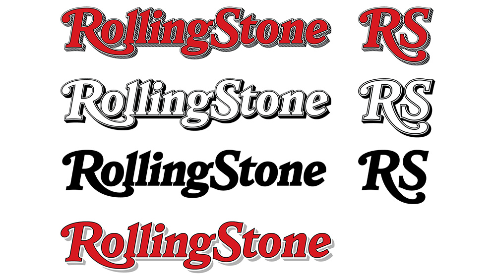
This apparent bucking of logo design trends was made possible by recognising that one logo alone wouldn't do. Instead, XYZ produced a family of logos, with a flattened single-colour version, a simplified small-size version that had bigger letterspacing and a simplified shadow but at first glance looks like the full-size logo. There's also a monogram for use as an app icon or favicon. It has its own characteristics – the swash descender on the R references the main logo but it isn't the same.

It's refreshing to see a brand bucking the trend towards simplification, sometimes at the expense of brand identity, and we also like to see a return to the creation of logo families rather than aiming for a one-size fits all approach. The links between the different variations of the logo make it instantly recognisable that they're part of the same brand. If you're looking for more inspiration for your own work, don't miss our guide to how to design a logo and our pick of the best logos of all time.
Sign up to Creative Bloq's daily newsletter, which brings you the latest news and inspiration from the worlds of art, design and technology.
Read more:

Joe is a regular freelance journalist and editor at Creative Bloq. He writes news, features and buying guides and keeps track of the best equipment and software for creatives, from video editing programs to monitors and accessories. A veteran news writer and photographer, he now works as a project manager at the London and Buenos Aires-based design, production and branding agency Hermana Creatives. There he manages a team of designers, photographers and video editors who specialise in producing visual content and design assets for the hospitality sector. He also dances Argentine tango.
