They say that if you want to ruin someone's life, simply teach them how to spot bad kerning. But if you want to take things a step further, just point them at Can't Unsee.
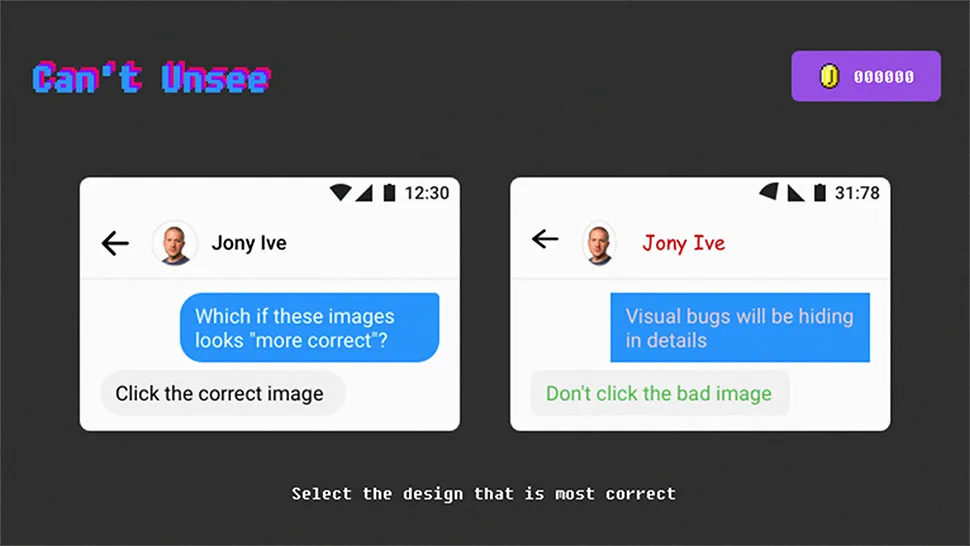
Can't Unsee is a little online game created by Alex Kotliarskyi that'll draw your attention to all the little details that make up good – and bad – UI design. Each round shows you two similar images of an interface, and all you have to do is decide which design is the most correct. Once you've made your decision, Can't Unsee overlays the images on top of each other so that you can compare the two by switching between them.

Kotliarskyi's quiz starts off nice and easy with dodgy web fonts and wonky icons, but quickly becomes more difficult as it asks you to identify more subtle UI design errors such as poor padding, incorrect alignment and bad image aspect ratios. By the end of the quiz, you'll find yourself staring at pairs of near-identical images, trying to spot the difference, then not being sure which one's worse and finally questioning your entire sense of aesthetic judgement, which is always fun.
Each correctly identified piece of good design earns you points, and at the end of the game you can opt to have your score – and the time it took you to complete the quiz – submitted to an online high score table for additional bragging rights.

While it's all maybe just a little too focused on iOS interfaces, most of the fundamentals it covers are applicable to all areas of UI design. And while much of it is stuff that you, a designer, are likely to already know about, it's a perfect way to test your attention to detail.
It's also a great way to educate friends and family who don't really understand what you actually do all day. So go on, share it with them, and who knows, maybe you can ruin their lives a bit at the same time.
Related articles:

