Christopher Nolan forced to back-pedal on Tenet movie logo
The original wasn't as original as it seemed.

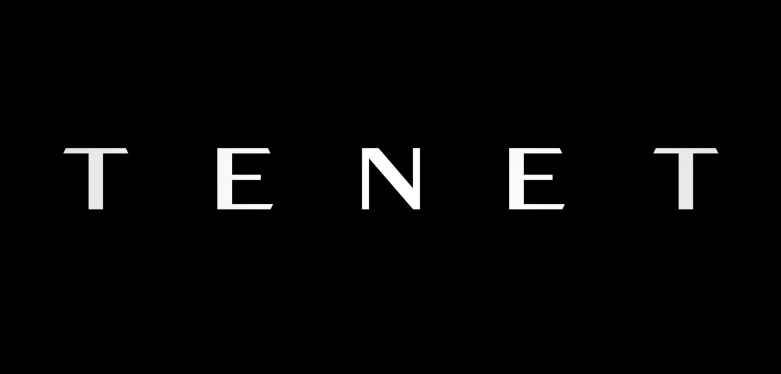
When the highly mysterious (cough...confusing) trailer for Christopher Nolan's latest film arrived in December, it was accompanied by a simple yet effective logo, with the final two letters of the palindromic title flipped upside-down. While this has led to various fan theories about a symmetrical structure for the film itself, the real mystery is how the studio managed not to spot that its logo already existed.
Ensuring that your logo isn't easily mistaken for another is one of the fundamental rules of our logo design guide (which it seems Warner Bros would do well to read). After the trailer was released, a bicycle company named Tenet Components posted to Instagram, complaining about the "apparent negligence" of the logo's similarity to its own:
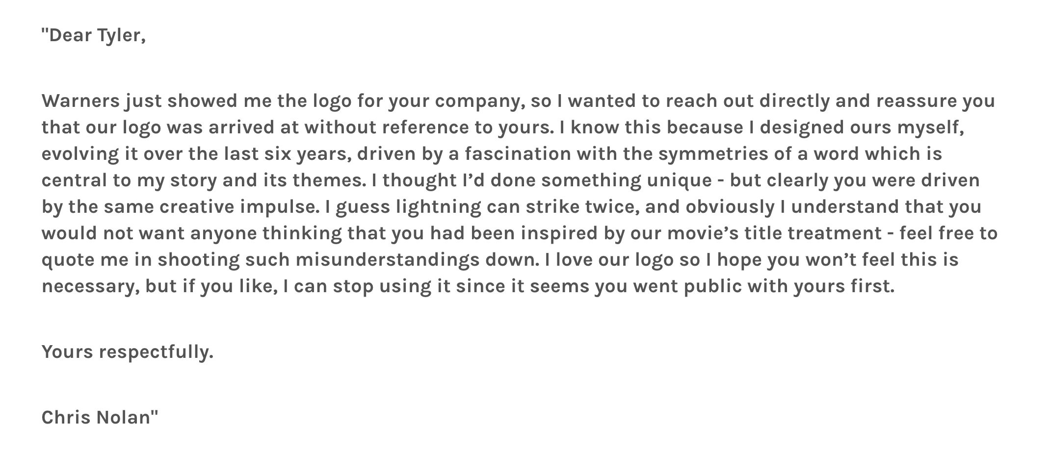
This is where it gets interesting. Rather than faceless legal correspondence from the studio, Tenet Components' owner Tyler Deschaine received a letter (below) from Christopher Nolan himself. The letter assured him that the similarity was coincidental, and noted that Nolan designed the logo himself "over the last six years" (perhaps one of our Photoshop tutorials could have sped things up a little).

Deschaine shared the email in a blog post on Tenet Components' website, along with his reply, asking that Nolan's logo "use a different font or stylisation" to make it more distinct from his own. Lo and behold, the latest Tenet trailer features an updated logo (below) with the same font as before, but the final two letters no longer upside-down.

It's refreshing to see a situation like this resolved so amicably, with no apparent bitterness on either side – Nolan's personal offer to stop using the logo seems particularly gracious in a world of lawsuits and cease-and-desists. But it also feels like an admission that, yep, his logo is literally the same as Tenet Components – and the bike company got there first. Perhaps Nolan can take some solace from the fact that he isn't the first to lose a logo race – the US government recently had the Space Force logo swiped by Netflix.
Next time it comes to designing a logo, we'd recommend Nolan checks out our logo design inspiration guide. it's full of tips for kickstarting the creative process and coming up with an original design that you won't have to back-pedal on.
Read more:
Sign up to Creative Bloq's daily newsletter, which brings you the latest news and inspiration from the worlds of art, design and technology.

Daniel John is Design Editor at Creative Bloq. He reports on the worlds of design, branding and lifestyle tech, and has covered several industry events including Milan Design Week, OFFF Barcelona and Adobe Max in Los Angeles. He has interviewed leaders and designers at brands including Apple, Microsoft and Adobe. Daniel's debut book of short stories and poems was published in 2018, and his comedy newsletter is a Substack Bestseller.

