
As a graphic designer, there are endless opportunities across the globe. But have you considered that there are some locations better than others? A brilliant new set of infographics have been released, which let you know which American cities are preferable for finding success as a graphic designer.
Based on a range of data including the likelihood a graphic designer will find work, population size, hourly wage, the spending power of $100 and how many hours you'll actually have to work to earn that $100, the infographics show the best and worst cities to live in if you're a graphic designer. Want more useful infographics? See our pick of the best infographics around.
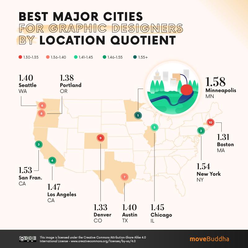
Major, large, mid-size and small cities are covered separately, with infographics based on the various data sets. Above, we've given you a glimpse of a major city with the highest location quotient. This means there aren't many graphic designers already living there (meaning minimal competition). If that sounds good, Minneapolis, Minnesota is the hottest ticket in America.
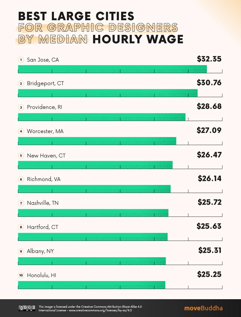
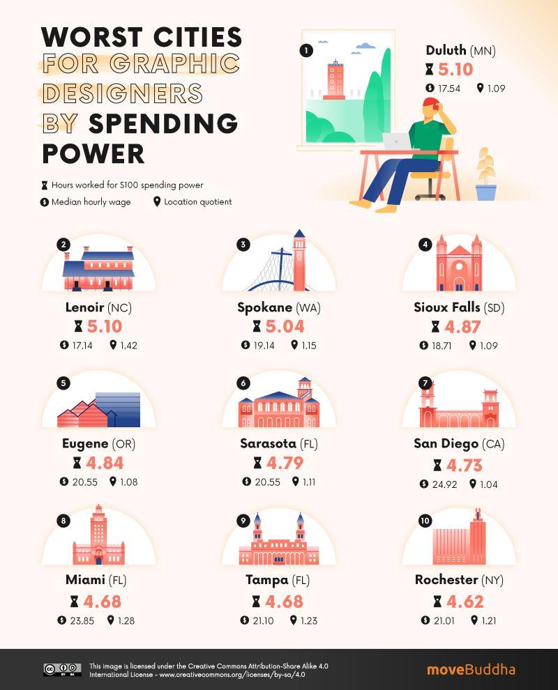
Looking for a large city with a high median hourly wage? The above infographic says San Jose, California is the place for you. Want to avoid a city where your money won't stretch far? According to the below graphic, you should give Duluth, Minnesota a wide berth.
You can check out the full range of infographics, created by MoveBuddha, right here. They're presented in easy-to-understand styles, which vary from fun graphics to useful charts depending on the type of data being handled. Plus, all data was taken from three separate federal bureaus so you know you're in reliable hands. Warning: you may want to move after exploring these.
If you're feeling inspired, you can use one of these brilliant infographic makers to create your own.

